Power users need powerful statistics
That’s why I’m pleased to introduce more advanced statistics for every single feed. The Statistics dialog now shows a heat graph of the times of day that stories are published as well as the days of the weeks.
Take a look at the NewsBlur support feed, which you can subscribe to here: http://www.newsblur.com/site/644144/get-satisfaction-for-newsblur

You can see the post-Google Reader shutdown bump starting in March 2013 and will notice that most of NewsBlur’s support happens during the week. (I like to take weekends off and work on side projects and the occasional NewsBlur feature.) But due to NewsBlur’s international audience, support comes in at all hours of the day.
And of course one of NewsBlur’s most popular publishers is Kottke.org, home of fine hypertext products. You can subscribe to kottke.org here: http://www.newsblur.com/site/39/kottke.org.
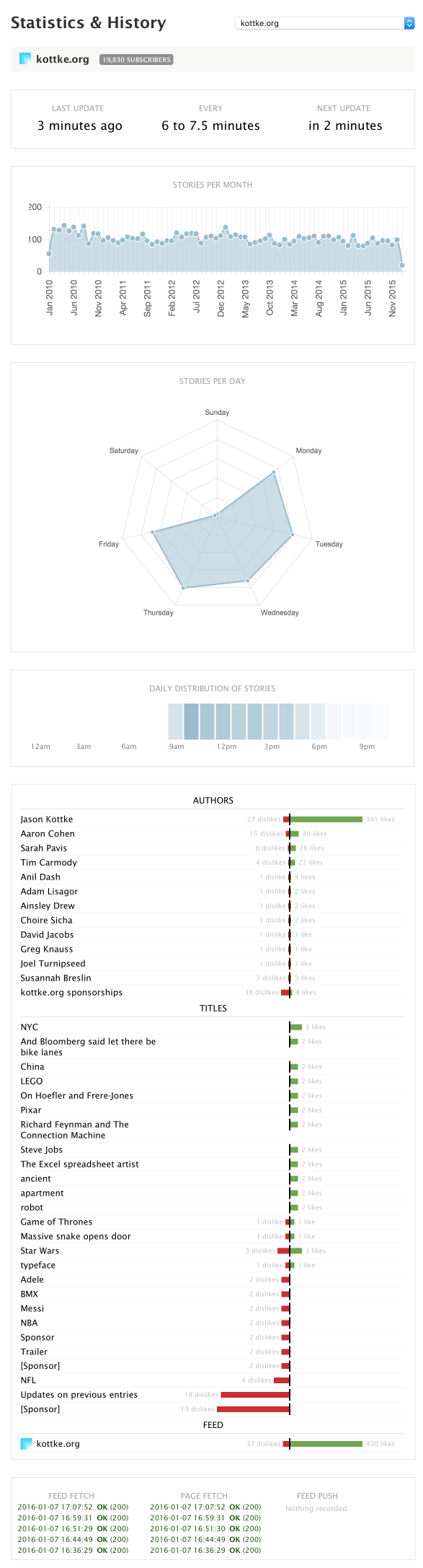
Amazingly, over the lifetime of NewsBlur’s statistics feature (which launched originally in 2010), Jason Kottke has been both prolific and regular in his postings of what’s good on the web. He sticks to a 9-5 schedule and works only on weekdays.
Anything else you’d like to see on the statistics panel? Post an idea over on NewsBlur’s Get Satisfaction support site.