NewsBlur goes dark ... on iOS
It’s like a whole new app. There’s so much to tell you about in the latest release of the NewsBlur iOS app. This is the release of all releases.
The biggest addition are the new themes. We have a total of four themes now: white, sepia, grey, and dark.
The dark theme is for when the lights are low (or off) and you want to read without disturbing anybody around you.

The grey theme gives you the best of both worlds. It’s a dark theme that gives you low light, but still bright enough to easily see.

Sepia is the paperback you carry around everywhere so you always have something to read. Preparation pays.

The iPad Pro gets full support and that means that keyboard shortcuts have been instrumented all over the app.

Maybe you’re thinking about how much the app just advanced. Maybe you’ve been waiting a long, long time for a dark theme ever since Android got it a year ago. Who knows, maybe you’re 100% on your iphone and that there’s just one or two tasks that you still need the website for.
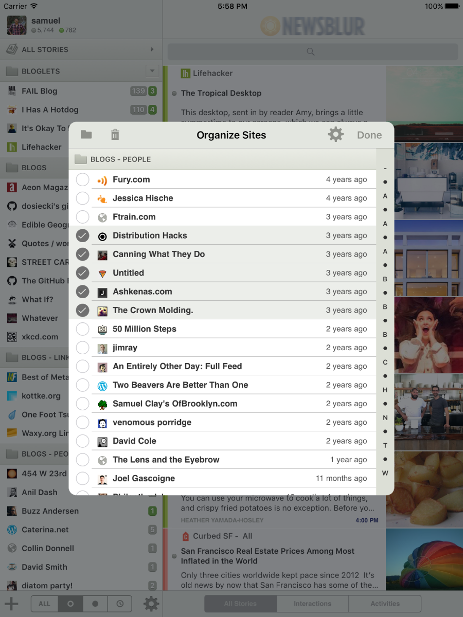
Get ready for this. The Organizer is now on the iOS app. And this isn’t just any organizer. You can see all of your feeds, sorted in or out of their folders, ordered by number of subscribers, how often you read them, how often they publish, and even how recently they published.
Use these lists to find feeds that no longer publish or the feeds that publish too much. Move and delete whole groups of feeds at once. This organizer is the real deal. Try finding this feature anywhere else.

And if there’s an organizer, that means there’s a way to mute and unmute sites directly from your iPhone.

There’s plenty of other new features too:
- New icons app-wide
- New menus for deleting and muting feeds
- Custom domain support
- Mark all as read by long pressing
- Search and Subscribe improvements
And check it out, NewsBlur now has two additional developers working on the iOS app, David Sinclair and Nicholas Riley. They have worked for the last few months on making this update the biggest yet. Their mugs are now on the About page and I’m extremely pleased with their work. Nicholas built the keyboard support that iPad Pro owners will appreciate. And David gives us the new themes, new organizer, and all of the other goodies we’ve got.
This is the one to beat.
