
-
When a story has a podcast episode in it, the iPhone, iPad, Mac, and Android apps used to play it with the plain audio control built into the story. It had no skip buttons and no lock screen controls, and it started from the beginning every time you came back to it. Now episodes play in the same player as Listen, with everything that comes with it. Listen itself can now read over your music, and take turns between voices from one story to the next.
Play, Play Next, Play Last
Each episode in a story is now a card with three buttons. Play audio starts it right away, Play Next puts it at the top of Up Next, and Play Last puts it at the end.
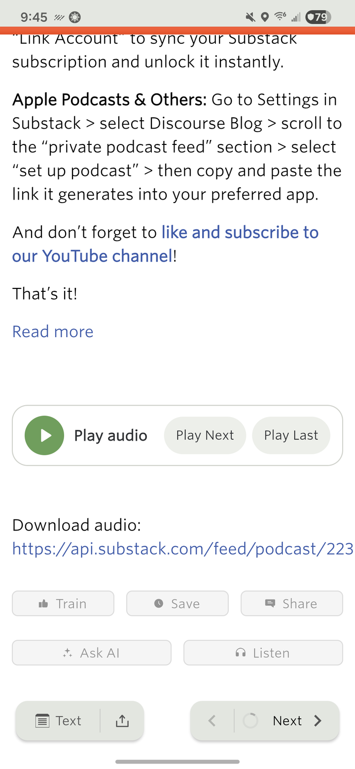
The episode plays in the mini player above the bottom bar. Tap it to open Now Playing, with the scrubber, the skip buttons, speed, and Up Next. It keeps playing with the screen off, with controls on the lock screen, in Control Center and Android’s media controls, and on your headphones. iPhone and iPad have an AirPlay button, and Android shows its output picker. The skip buttons use the same intervals you set in the web’s player.
Videos and YouTube embeds still play inside the story.
Pick up where you left off, on any device
Your place in an episode is saved to your account every few seconds while it plays, and again whenever you pause, skip, or leave the app. Start an episode on your phone and the web picks it up at the same spot, or the other way around. Finished episodes move to History, and Up Next holds podcast episodes and Listen stories in one queue. Starting an episode stops a Listen story that’s playing, and the other way around.
This turned up a bug on the server. When you came back to an episode, the web resumed from the last place you paused or started it, not from where you’d actually gotten to while it played. Every device, the web included, now resumes from the latest position.
Listen over your music
Listen used to pause whatever else was playing. On iPhone, iPad, and Android it can now read your stories over music from another app, like Apple Music or Spotify. Open Now Playing and turn on Play over other audio in the new Music section.
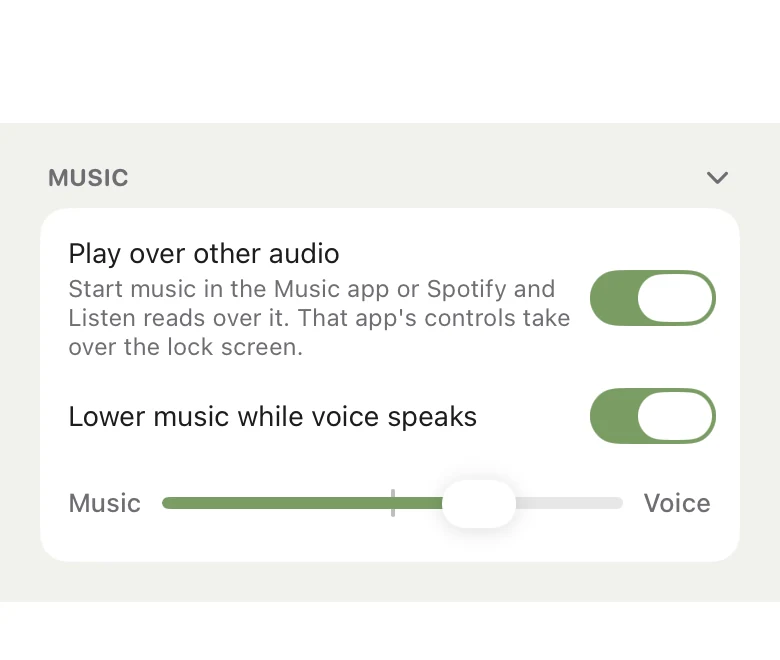
Lower music while voice speaks is on by default. It dips the music while a story is being read and brings it back up when you pause.
The Music and Voice slider sets the balance between them. Neither iOS nor Android lets one app turn down another app’s music, so the slider works on the voice instead. Toward Music the voice gets quieter, and toward Voice it gets louder than it would normally play, with a limiter so it doesn’t distort.
These settings stay on each device and don’t sync. The Music section folds away with the arrow in its header, and stays folded. Podcast episodes still pause your music like before. On the Mac, apps already play over each other, so there’s nothing to turn on.
A different voice for each story
Listen can also take turns between voices, one per story. In the voice picker, the + next to a voice adds it to your rotation, and the list at the top shows the order. The first story gets the first voice, the next story gets the second, and so on. Each time you start listening, the rotation starts again from the top.
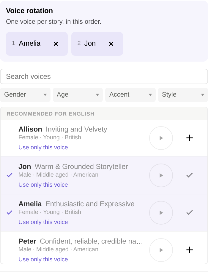
The × on a voice takes it out of the rotation, and Use only this voice goes back to a single narrator. Click a name in the rotation to find that voice in the list. Each language has its own rotation, and your list syncs between the web and the apps.
Availability
Podcasts in Listen’s player and Listen over your music are in NewsBlur 16.2 and later for iPhone, iPad, and Mac on the App Store, and for Android on Google Play. Voice rotation is on the web now, and comes to the iPhone, iPad, Mac, and Android apps with their next updates. Listen itself is part of Premium Archive and Premium Pro.
If an episode doesn’t play the way you’d expect, or the balance between your music and Listen needs more range, let me know on the NewsBlur forum.
-
The Intelligence Trainer has always worked from whatever is in front of you. You find a tag, an author, or a phrase on a story, and you train it from there. That’s fine when the story is right there, but someone on the forum asked a fair question: what if you already know what you want? You’d like every title with “sponsored” in it hidden across all of your sites, and you’d rather not wait for one to show up first. There was no way to do that. Now there is.
Add a classifier
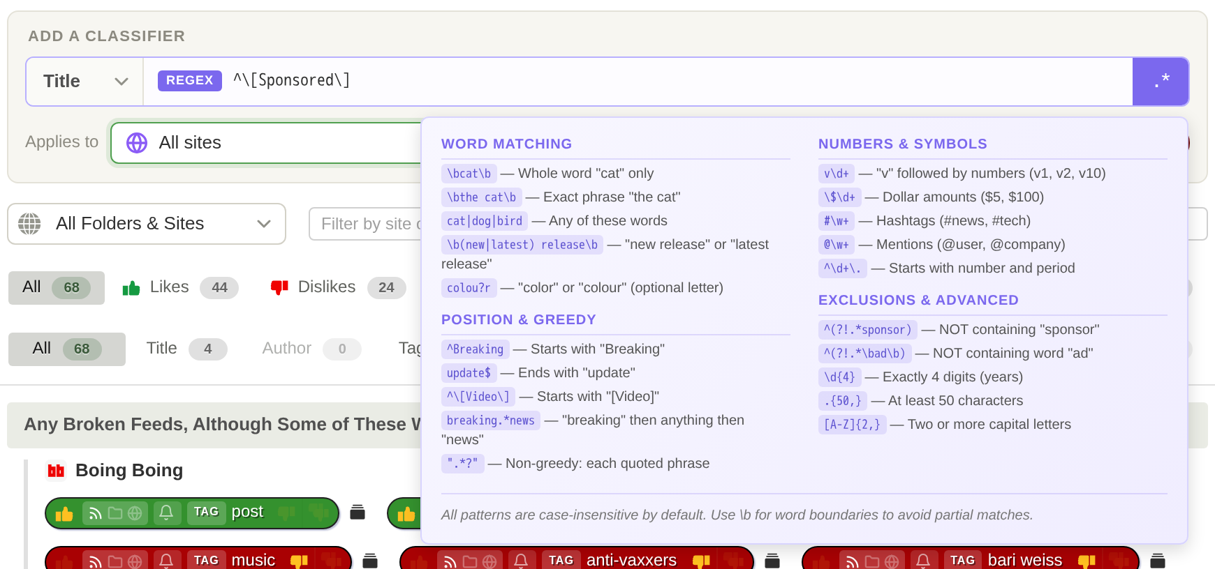
Open the Intelligence Trainer and switch to Manage Training. There’s a new panel at the top. Pick what to match (title, author, tag, text, or URL), type the phrase, choose where it applies, pick Like, Dislike, or Hide, and press Add. It saves right away, the new classifier lights up in its section below, and the field clears so you can type the next one.

Enter in the phrase field does the same thing as Add, and the little ↵ on the button reminds you while you type. Your choices stick between adds, so putting a dozen tags into the same folder is just type, Enter, type, Enter.
The same panel sits at the top of the site and story trainers, and on every Site by Site page. There it starts on the site you’re training, or on the folder you were reading if you opened the trainer from a folder. The new classifier shows up trained in its section right away, and the stories behind the dialog are rescored before you even close it.
Where it applies
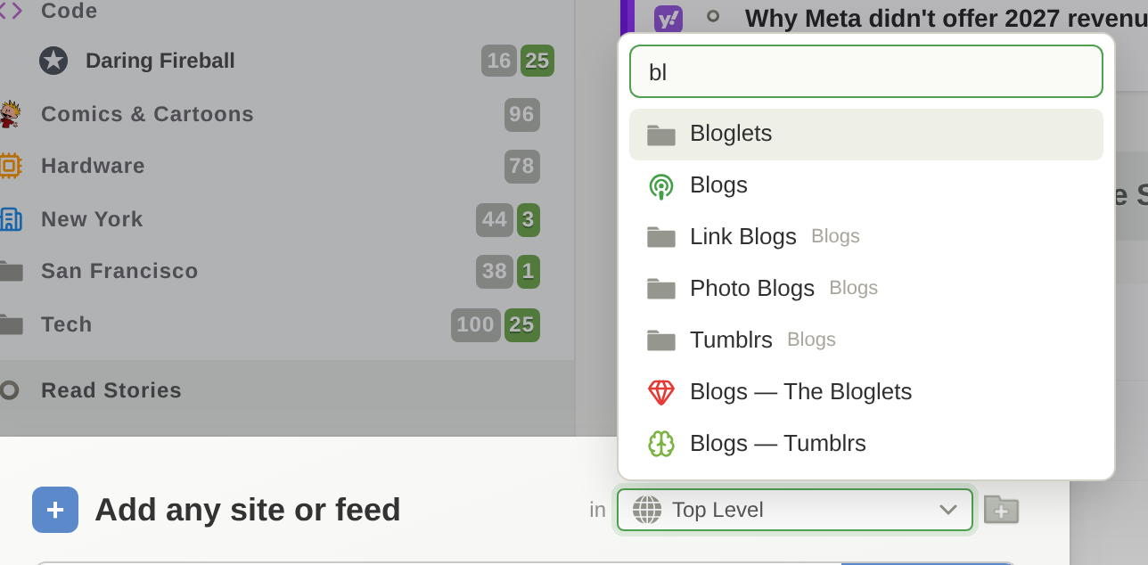
Applies to sets the scope: one site, a folder, or all of your sites. It’s a new picker rather than a plain dropdown, so it shows your custom folder icons and each site’s favicon, and it has a search box at the top. With a few hundred subscriptions, typing three letters beats scrolling. While you search, nested folders show the folder they live in, so two folders called “Podcasts” don’t look identical.
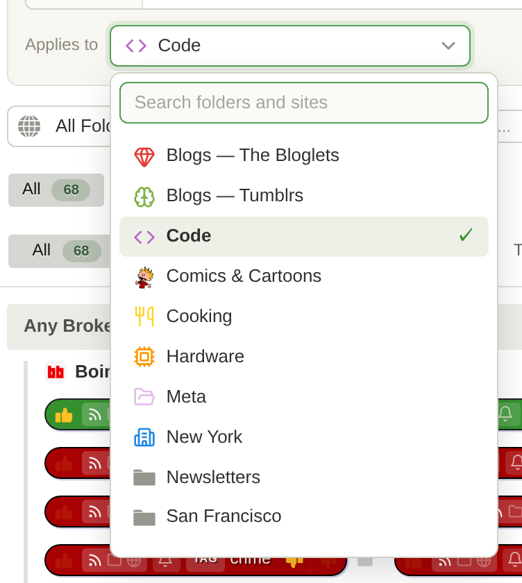
The rules are the same as everywhere else in the trainer. A single site works on every account. Folders and all sites need Premium Archive, and so do text classifiers. URL classifiers need Premium, and regex needs Premium Pro. If you pick something your account doesn’t include, the panel tells you and links to the upgrade instead of letting you save a classifier that won’t do anything.
Regex
Title, author, text, and URL classifiers can be regular expressions. Click the .* at the end of the field to turn it on. The field gets a purple outline and a REGEX badge, the text switches to monospace, and the placeholder changes to an example for that type, so you always know which mode you’re in. Hover the .* and the same regex cheat sheet from the story trainer opens right there. A pattern that doesn’t compile is caught before it can be saved.
Super Dislike is now Hide
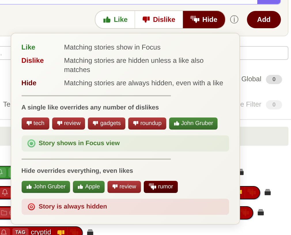
The third training level has been called Super Dislike since it launched, and I never loved the name. It says how strongly you feel, not what it does. What it does is hide the story, every time, even when the story also matches something you like. So it’s called Hide now, everywhere: on the web, on iOS and Mac, and on Android. Nothing about how it works has changed, and every super dislike you already have is a Hide.
If you ever forget how the three fit together, there’s an ⓘ next to them in the panel that lays it out with a couple of examples.
The same picker, everywhere
Once the scope picker existed, the plain folder dropdowns all over NewsBlur looked pretty sad next to it. So every folder chooser and every folder and site chooser on the web uses it now: adding a site, Add + Discover, the statistics, site settings, and notifications dialogs, Organize Sites, the default folder in Preferences, dashboard rivers, and the Daily Briefing. They all get the icons, the search, and the keyboard. Arrow keys, Enter, and Escape work the way you’d expect, or just start typing.
A few fixes along the way
- Back to trainer from a matching stories list now takes you back to exactly where you were: the same tab, the same filters, any changes you hadn’t saved yet, and scrolled to the same classifier. It used to drop you on Site by Site every time.
- The View matching stories button sits next to the classifier it belongs to instead of leaning toward the next one, and its tooltip no longer hangs around after you click it.
- In the matching stories banner, Back to trainer no longer squeezes the Train and Notify on controls on a narrow story list.
- Jump to folder in Organize Sites actually jumps to the folder.
Availability
Typing classifiers into Manage Training and the new folder and site picker are available now on the web. Hide is on the web now and comes to iOS, Mac, and Android with their next updates. Thanks to the forum for the nudge on this one. If there’s a classifier you want to type in that the panel can’t handle yet, let me know on the NewsBlur forum.
-
Every story in NewsBlur now has a Listen button. Press it and NewsBlur reads the story to you, starting with the headline and going paragraph by paragraph, highlighting each one as it goes. When the story ends, the next one starts. It works on the web, iPhone, iPad, Mac, and Android starting today, and it can read stories in all 21 languages NewsBlur speaks.
Here’s Jon, the default English voice, reading that paragraph:
And if you’re reading this in NewsBlur, you can press Listen right now and have the rest of this post read to you.
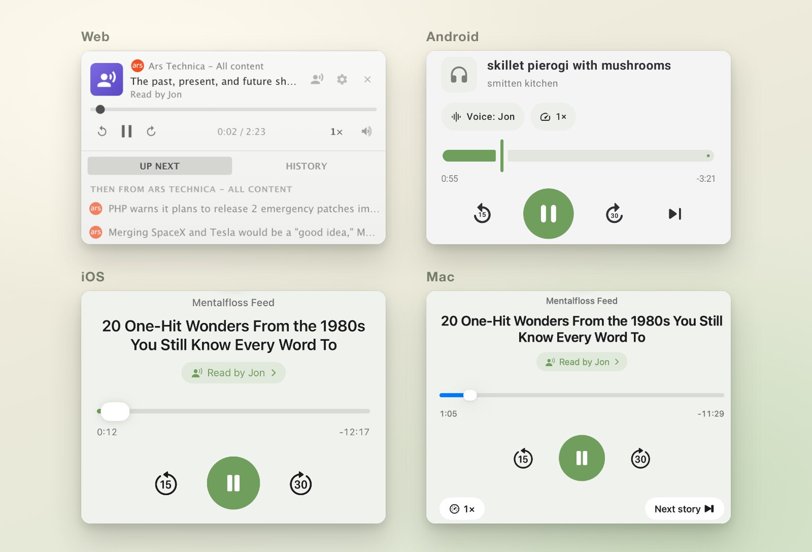
This one launched everywhere on the same day. The web, the iOS and Mac apps, and the Android app all got Listen together, with its interface translated into the same 21 languages from last week’s language launch. If you already play podcasts in NewsBlur’s media player, Listen turns any story into one more thing to queue up.
Press Listen
On the web, Listen sits with the other story buttons, and the y key does the same thing. On iPhone, iPad, and Android it’s in the row of buttons at the end of each story. On the Mac it’s in the Story menu, also on Y, with a play and pause button in the toolbar.
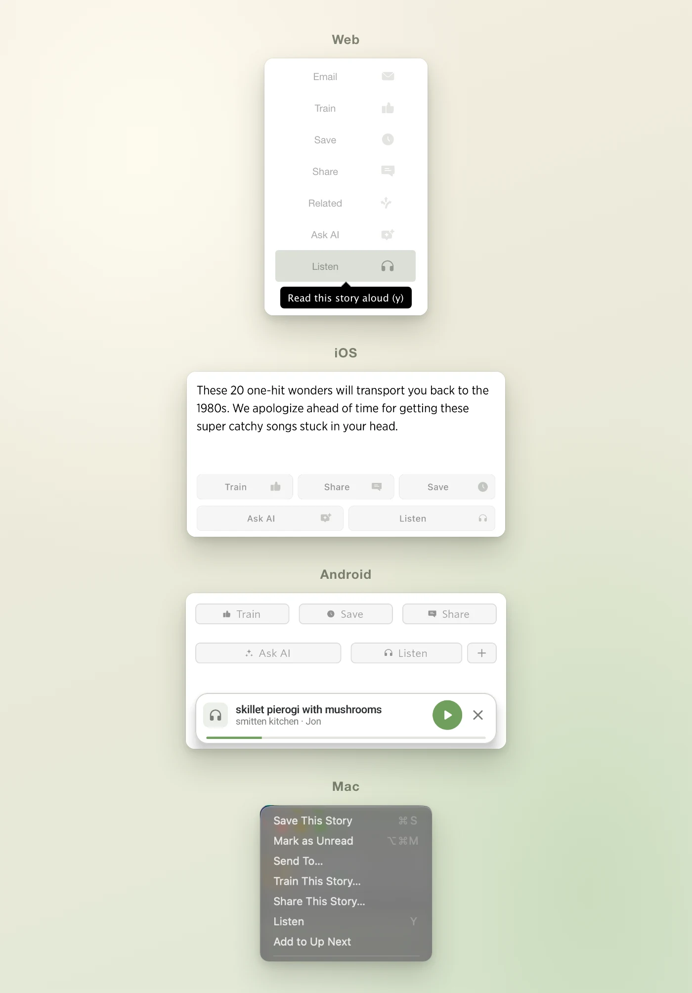
On the web, stories play in the sidebar, in the same mini player that handles podcasts and YouTube. On iPhone, iPad, and Android, a mini player sits above the bottom bar. Tap it to open Now Playing, with a scrubber, 15 seconds back, 30 seconds forward, speed, and a button to skip to the next story.
Follow along
While a story plays, the paragraph being read is highlighted and the story scrolls gently to keep it in view. If you scroll away to look at something, it waits a few seconds before following again. Click or tap any paragraph to jump straight to it, which is also the quickest way past a long intro.
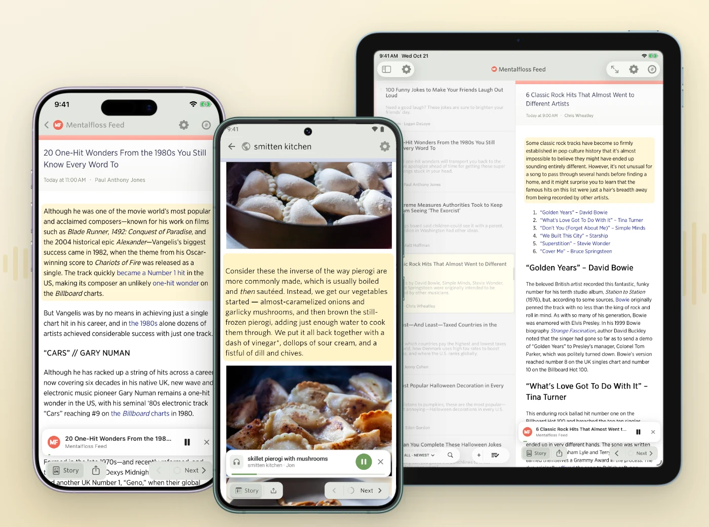
Listen reads the headline, then the article’s paragraphs, headings, lists, and quotes. It skips what doesn’t work out loud: images, captions, code blocks, tables, and embeds. And if a feed only publishes a summary, Listen fetches the full article from the site and reads that, so you hear the whole story and not just the first two sentences.
Up Next
Next to Listen is a small + that adds the story to Up Next. Queue a few stories while you read, press play, and walk away. Drag to reorder, and swipe or tap × to remove one.
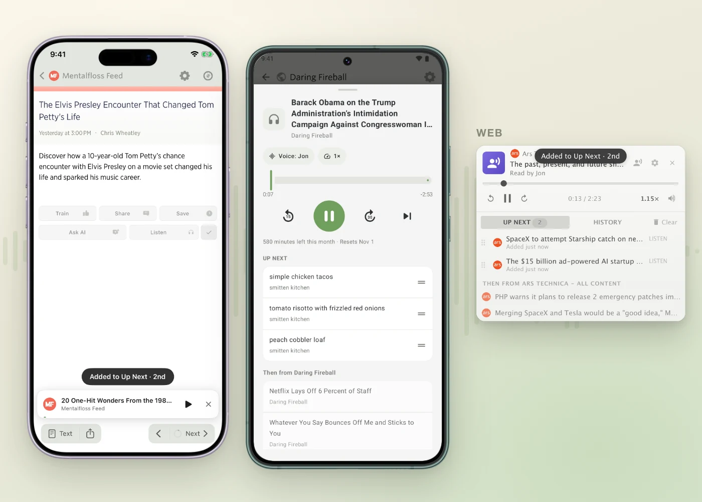
When Up Next runs out, Listen keeps going with the next unread stories in whatever feed or folder you’re in. Each story is marked read when it finishes, and the reader follows along to the next one. If you’d rather it stop after each story, turn off Auto-continue.
Up Next is the same queue your podcasts use, and it’s saved to your account. Queue a story on your phone and it’s waiting in Up Next on the web.
Pick a voice
The voices come from ElevenLabs. Each language has ten recommended voices, and you can search the rest of the ElevenLabs library by gender, age, accent, and style. Every voice has a play button so you can hear it before you choose.
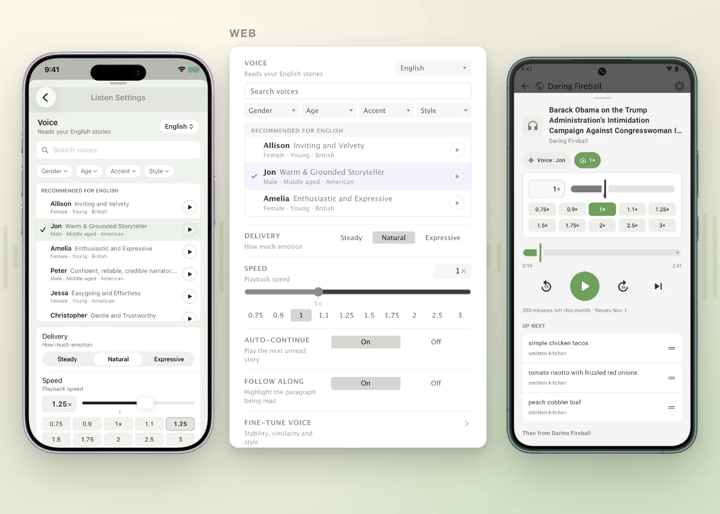
Delivery sets how much emotion goes into the reading: Steady, Natural, or Expressive. Fine-tune voice opens up the stability, similarity, and style settings behind those three if you want to tinker.
Speed goes from 0.5× to 3×, with presets and a slider for anything in between. The pitch stays put at any speed, so 1.5× sounds like a fast talker and not a chipmunk.
Every language gets its own voice
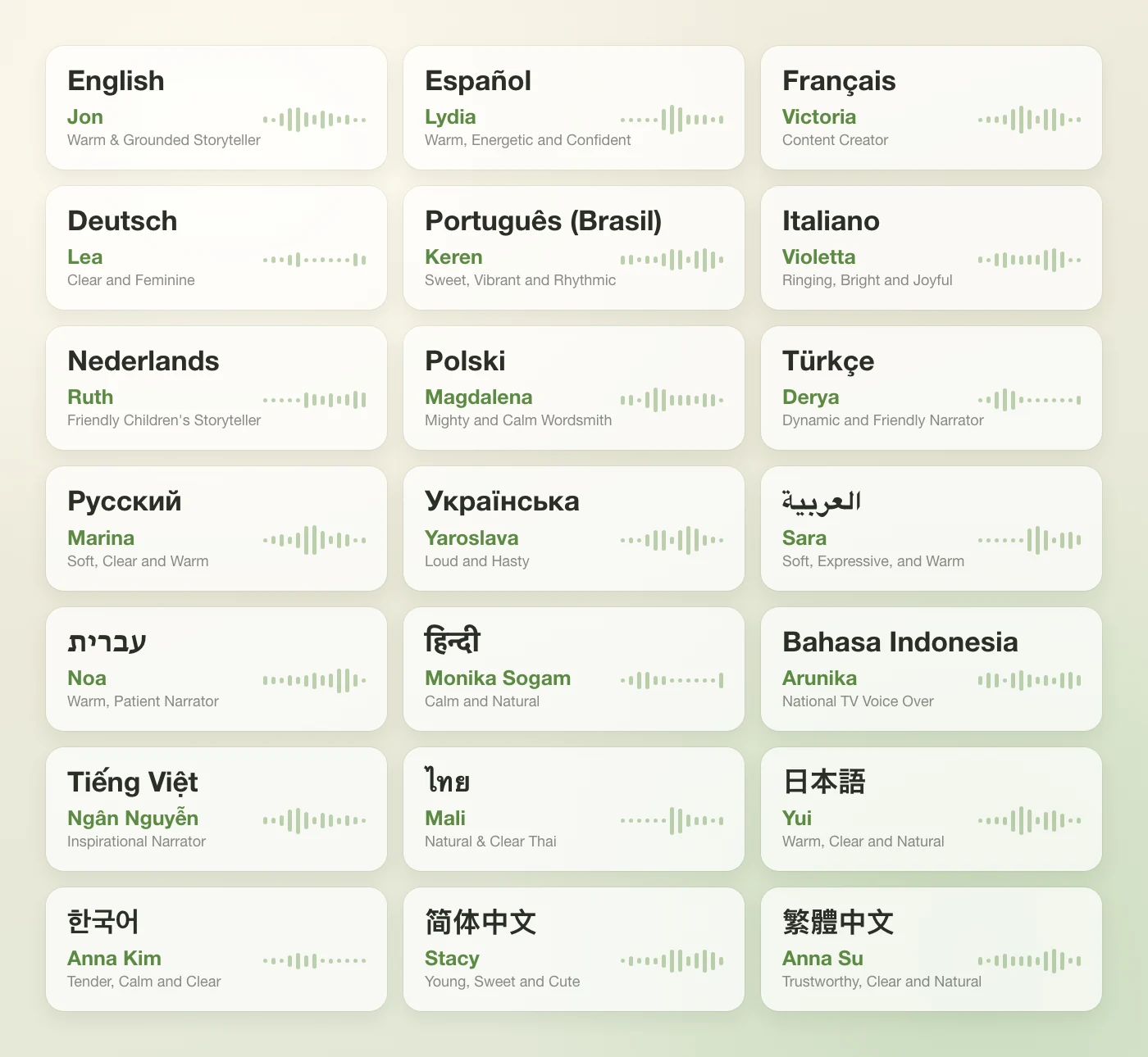
Listen works out what language each story is written in and reads it with your voice for that language. Jon reads my English stories, and when a French story comes through, Victoria picks it up. Choose a different voice for any language from the menu at the top of the voice list. These are the defaults:
Keeps playing with the screen off
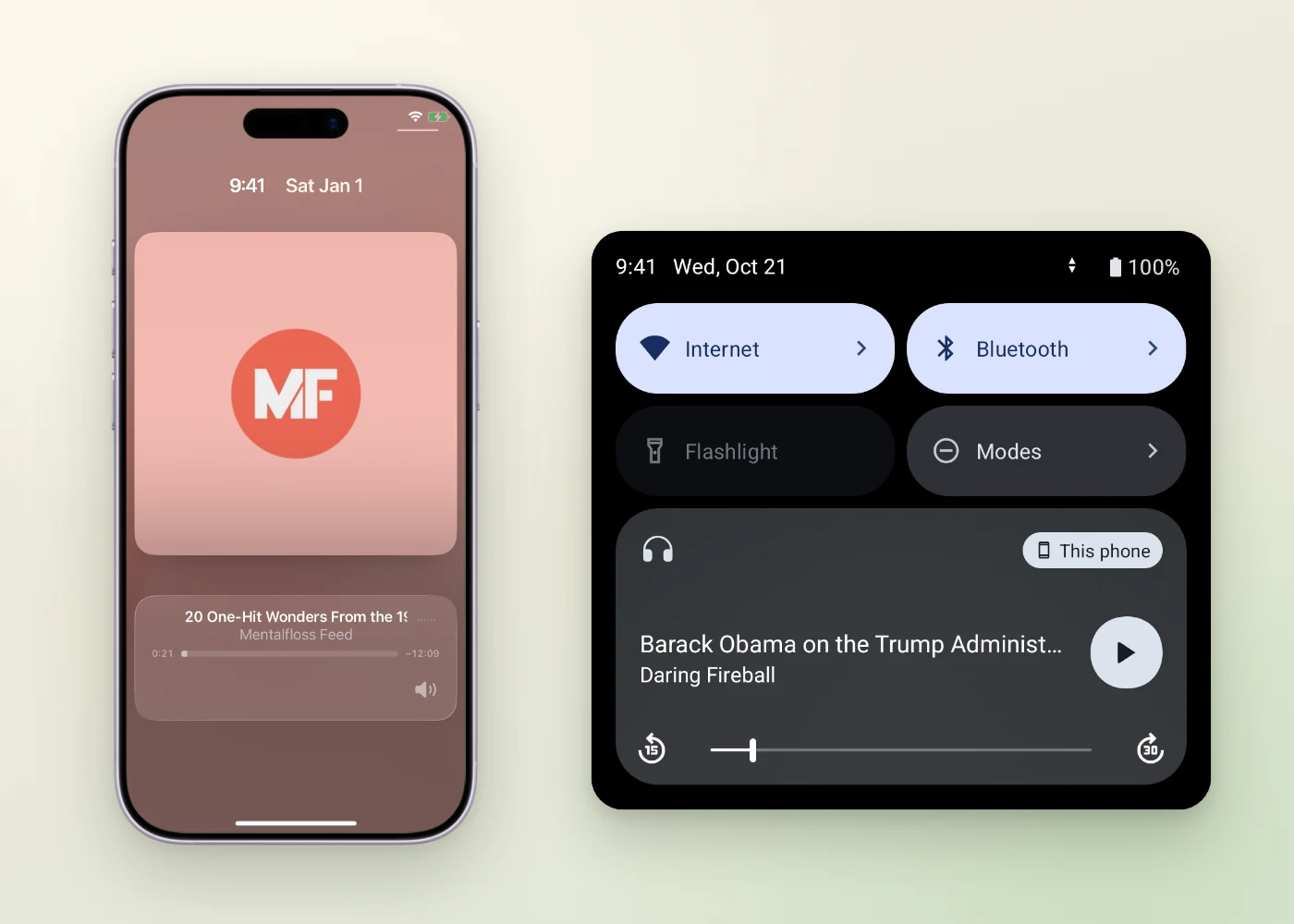
On iPhone, iPad, and Android, Listen keeps going when you lock your phone or switch apps. It shows up on the lock screen, in Control Center, and in Android’s media controls, with the same 15 and 30 second skips, and headphone buttons play and pause.
On the Mac
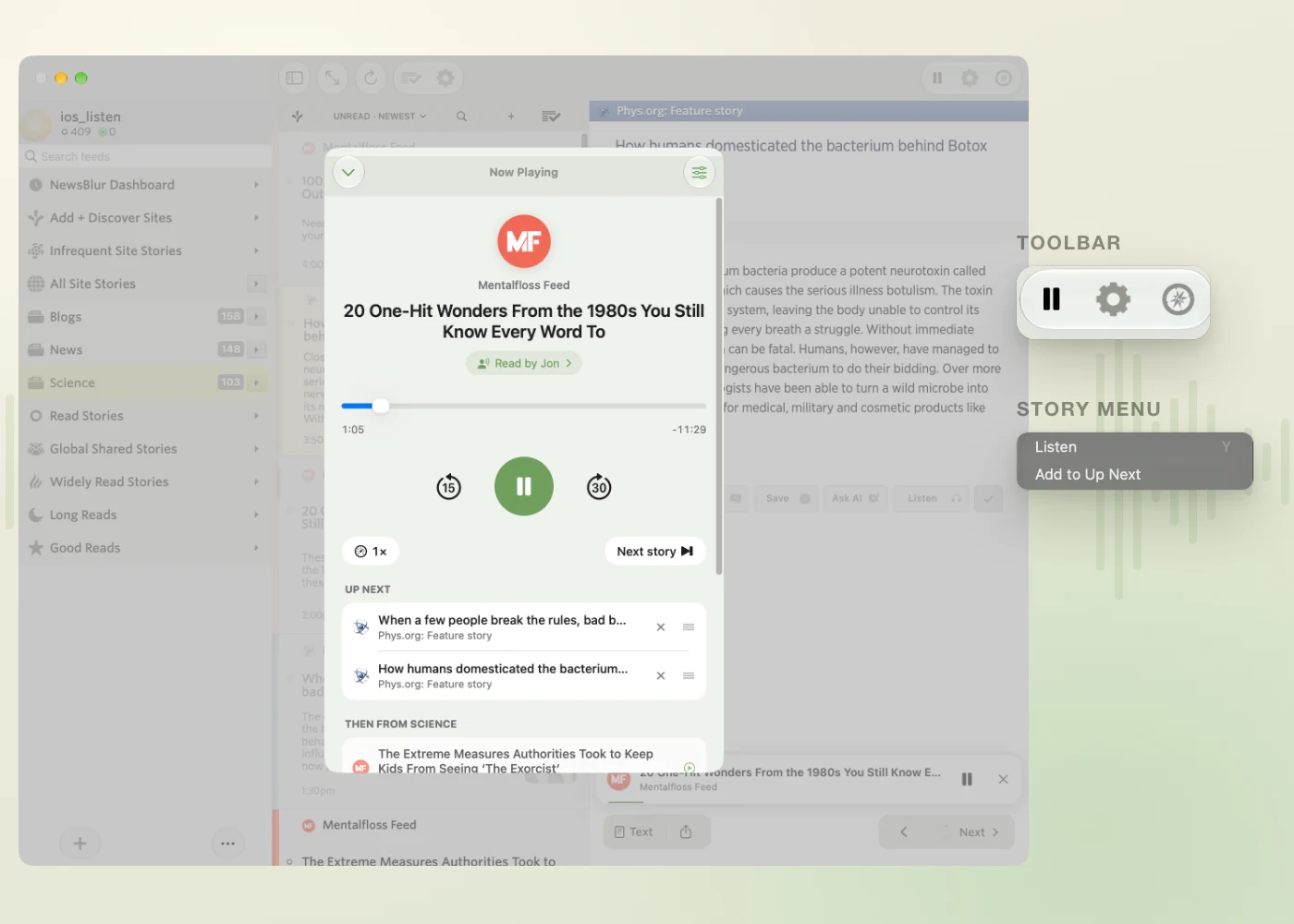
The Mac app has Listen and Add to Up Next in the Story menu, and a play and pause button in the toolbar so you can stop a story without hunting for the player. Now Playing opens as a sheet over the reader, with the same Up Next list as everywhere else.
Try it for 30 seconds
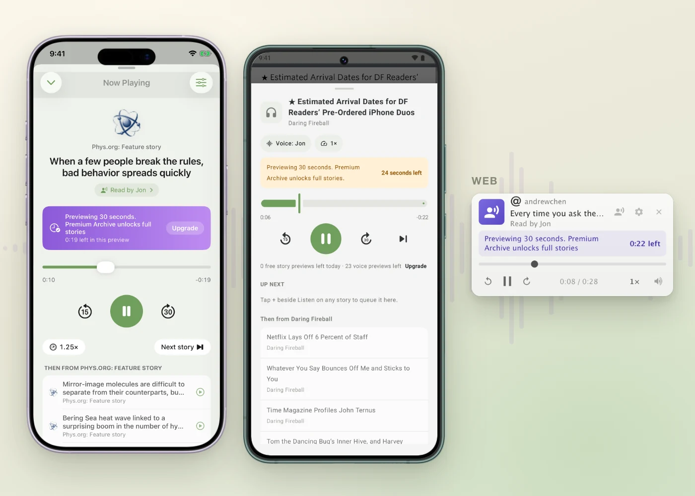
Listen is part of Premium Archive and Premium Pro. On a free or Premium account you can still try it: Listen plays a 30 second preview of a few stories a day. Voice previews in the picker work too, so you can find a voice you like first.
How it works
Reading every story in everyone’s feeds ahead of time would be a huge waste, so Listen makes the audio on demand. When you press play, NewsBlur splits the story into short segments, usually a paragraph each, and asks ElevenLabs for the first one. The audio streams to you while it’s still being generated, so it starts quickly, and the next segment is fetched while the current one plays. Each segment is sent along with the text around it so the voice keeps its rhythm across paragraph breaks.
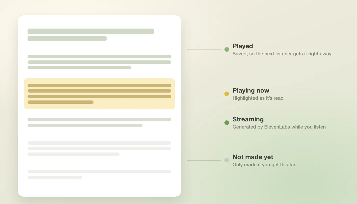
Once a segment has been read in a voice, it’s saved. The next person who listens to that story with the same voice gets it right away, and if you stop halfway through a story, the rest of it never gets made at all.
Availability
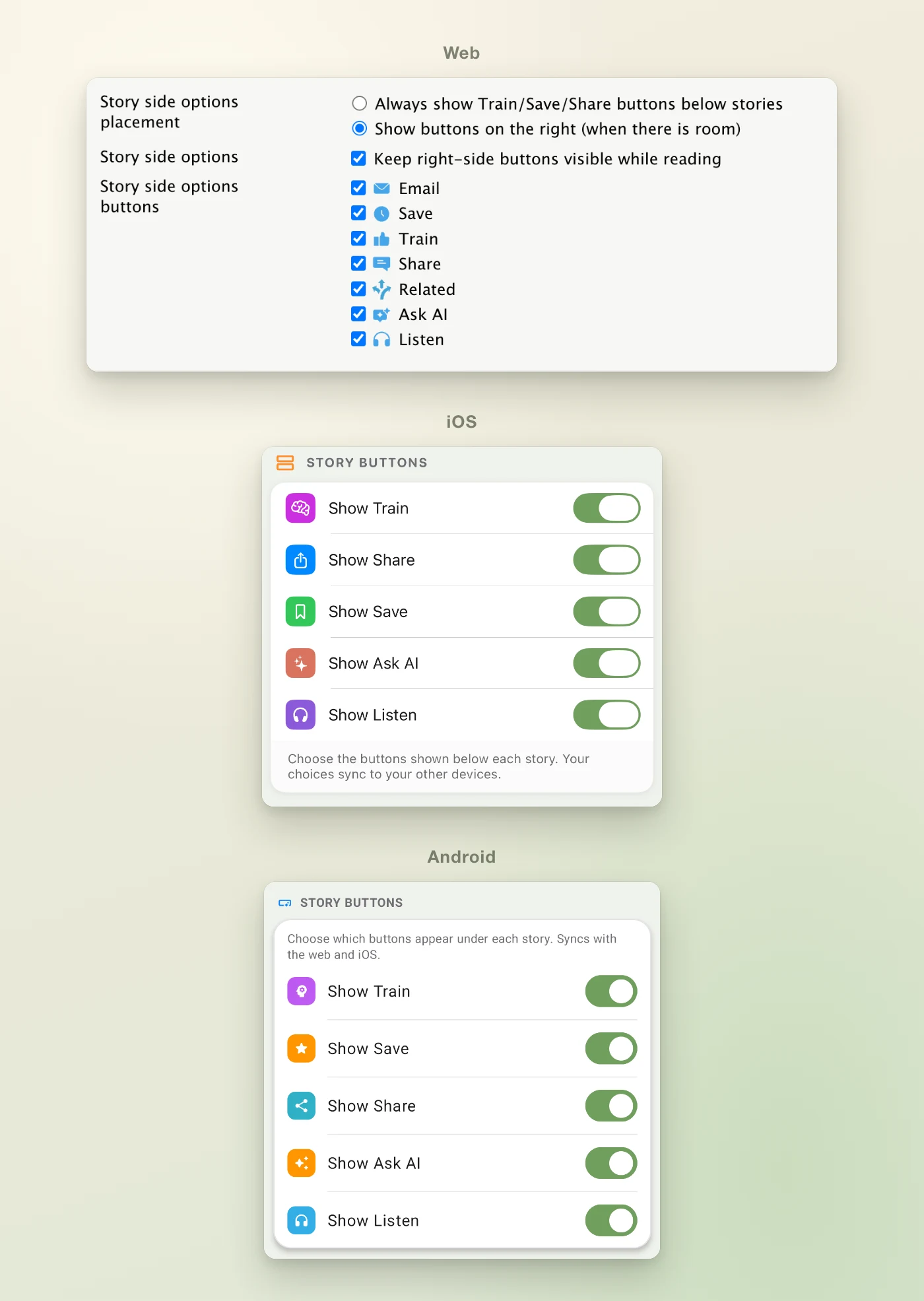
Listen is available today on the web, in NewsBlur for iPhone, iPad, and Mac on the App Store, and in NewsBlur for Android on Google Play. If you don’t want the button, you can hide it, along with any other story button, in Preferences on the web and in the apps, and that choice syncs between them.
I’d love to hear which voice you picked and how Listen handles your feeds. Let me know on the NewsBlur forum.
-
When you right click a site and choose Change folders, NewsBlur shows a list of your folders. For years that list was a tiny box about four rows tall, no matter how big your screen was. A reader on the forum who files a lot of newsletters wrote up what was wrong with it: the box was too small, it ignored the custom folder icons they use to find things at a glance, and checking a new folder added the site there instead of moving it. They were right on all three, so I rebuilt it.
The list now grows to show every folder you have, as many as your window has room for, with the same icons you see in your sidebar. It opens scrolled to the folder the site is in now, and the text follows your sidebar’s text size.
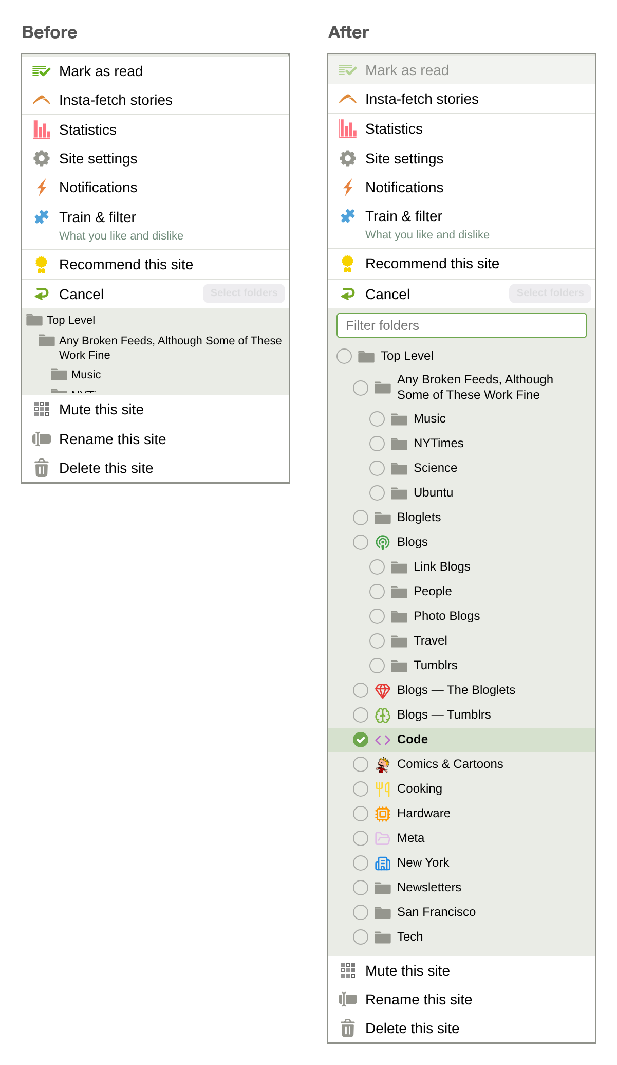
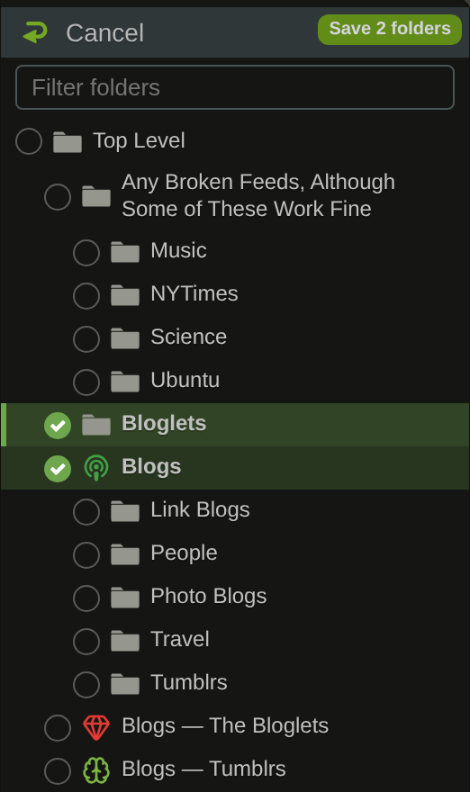
Click a folder’s name and the site moves there. The old folder unchecks itself, and the button at the top reads Move to Tech, so you know exactly what’s about to happen. If you keep a site in more than one folder, click the circles beside the folders instead. Each circle adds or removes just that folder, and the button reads Save 2 folders.
Type to find a folder
There’s a filter box at the top of the picker, ready for typing as soon as it opens. Type a few letters and the list narrows to the folders that match, with their parent folders kept in place. The arrow keys move between matches, Enter picks one, and Enter again moves the site. So moving a site from Newsletters into Cooking can be a right click, a few letters, and two presses of Enter.
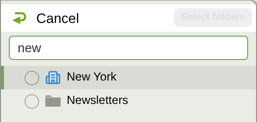
The new folder picker is available now on the web. If something about it doesn’t feel right, let me know on the NewsBlur forum.
-
On the web, I keep NewsBlur’s dashboard open all day with a few folders side by side, so I can glance over and see what’s new. On my Mac I wanted that same glance without a browser tab or the app sitting in front of me. NewsBlur 16 for Mac gets there with two pieces that work together: widgets that each show a folder or site of your choice, and native Mac notifications from the sites you pick.
Put together, they give you a way to follow the news while you work. Headlines from the folders you care about sit one swipe away, and new stories from the handful of sites you never want to miss show up in the corner of your screen. You don’t have to pick up your phone to check, and you don’t have to open a reader and lose twenty minutes in it.
A dashboard made of widgets
Every NewsBlur widget now has its own source. Add one for All Site Stories, another for your Tech folder, and another for a single site you follow closely. Each one shows its own newest unread stories. Stack them in Notification Center or put them on your desktop, and you’ve got the NewsBlur dashboard living right in macOS.
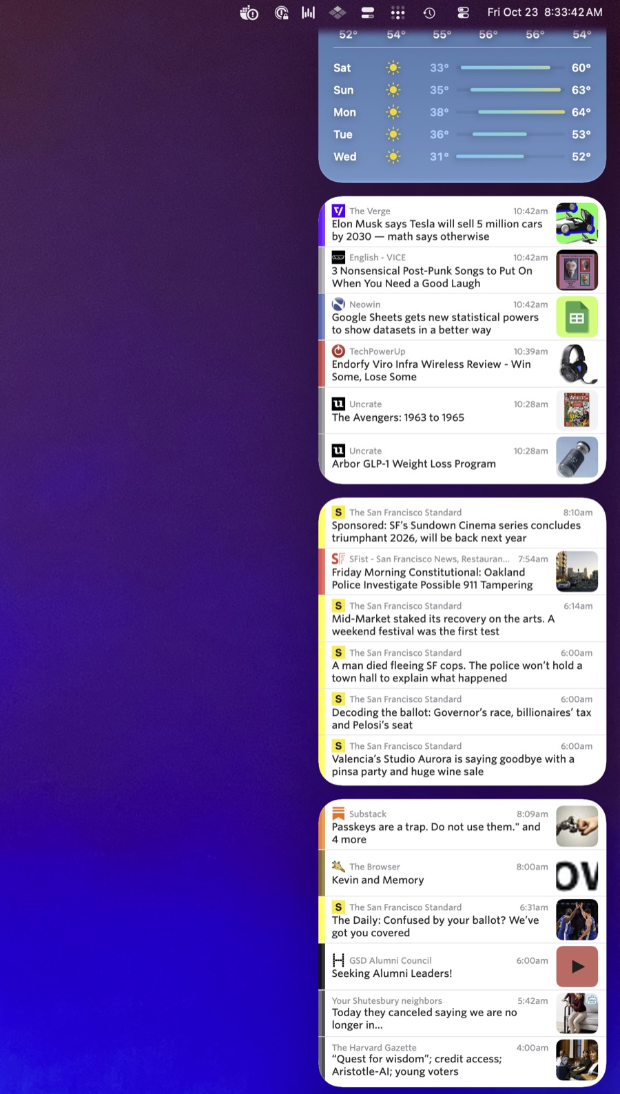
Widgets come in two sizes. Medium shows three stories and large shows six. They follow your training, so stories you’ve trained away stay out of them. Click a story and it opens right in the Mac app.
Setting up a widget
Click the date and time in the menu bar to open Notification Center, then click Edit Widgets at the bottom. Search for NewsBlur, pick a size, and add it. If you’d rather have it on your desktop, right click the desktop and choose Edit Widgets instead.
New widgets start with All Site Stories. To change that, right click the widget, choose Edit Widget, and pick a folder or site. Folders are listed first, then every site you subscribe to, and there’s a search field if your list is long. Each widget keeps its own choice, so you can add as many as you want.
If you already had a NewsBlur widget, remove it and add it again to get the new version.
Notifications from the sites you pick
Widgets are for glancing. Notifications are for the stories you don’t want to wait on. NewsBlur can send a native Mac notification for new stories on any site, and clicking one takes you straight to that story in the app.
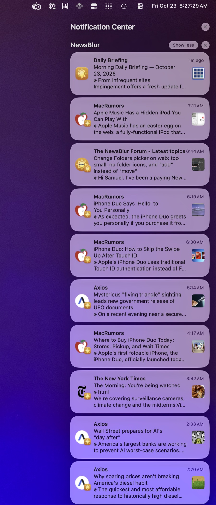
To turn them on, open a site and choose Site > Notifications… from the menu bar. Pick whether you want every unread story or only Focus stories, and turn on iOS, which covers both your iPhone and the Mac app. File > Notifications (Command Shift N) lists every site you’ve set up, so you can adjust them all in one place.
Focus is what keeps this from getting noisy. If you’ve trained a site, only the stories you like will reach you. And if a busy site only matters when it mentions a certain topic or author, per-classifier notifications let you get pinged for just those stories. Those are available on Premium Archive and Premium Pro.
The workflow
Here’s a setup that works well. Put a large widget at the top of Notification Center for the folder you read most, and a couple of medium widgets below it for folders you check less often. Turn on notifications for only the few sites where timing matters, set to Focus. Then get back to work.
When you want a break, swipe in from the right edge of your trackpad with two fingers and the whole dashboard is there. When something you care about is published, it comes to you. Either way your phone stays face down on the desk.
Everything else in NewsBlur 16 for Mac
- NewsBlur for Mac now speaks 21 languages. Choose one from the NewsBlur menu, or follow your Mac’s language settings. Arabic and Hebrew read right to left, and your stories stay exactly as published. More about that in NewsBlur in your language.
- Clicking a story slides to it in the right direction.
- The sidebar has more balanced spacing and compact filters, with Add Site and Settings kept separate.
- Command W closes the window while NewsBlur keeps running. Click the Dock icon to bring it back, or press Command Q to quit.
- Keyboard shortcuts work while the story list has focus, and N opens the first unread story.
- Space pages down through a story, and when you reach the bottom it opens the next unread story, just like on the web. Shift Space pages back up and opens the previous story at the top. You can set how far each press scrolls in Preferences or in the Keyboard Shortcuts dialog.
NewsBlur 16 is available now on the Mac App Store. If you’ve found a widget setup you like, or something isn’t working the way you’d expect, I’d love to hear about it on the NewsBlur forum.
-
Since 2009, NewsBlur has only spoken English. Plenty of you read feeds in other languages every day, and you’ve still had to find your way around the reader in English. Starting today, NewsBlur’s interface is available in 21 languages on the web, iOS, and Android. Menus, buttons, settings, dialogs, and the first-time setup all appear in your language, picked up automatically from your browser or phone.
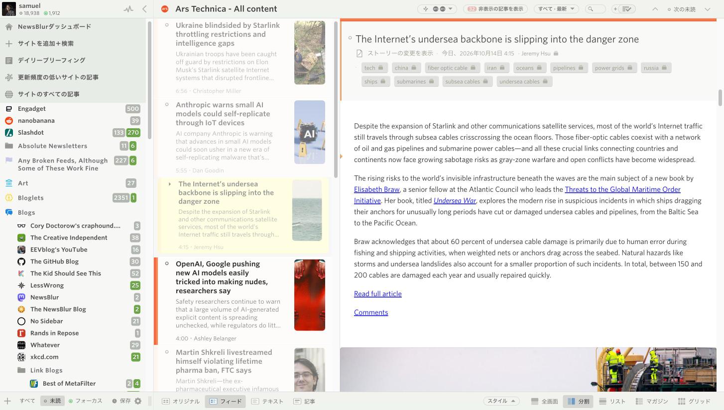
Your stories stay exactly as they were published. NewsBlur translates its own interface, not the feeds you read. Feed titles, story text, comments, and usernames all stay in their original language. The screenshot above is NewsBlur in Japanese, reading an English article from Ars Technica.
Picked up automatically
You don’t need to do anything to switch. On the web, NewsBlur uses your browser’s language. On iOS and Android, it uses your phone’s language list. If your language isn’t one of the 21, everything stays in English.
Because a new language can be a surprise, NewsBlur tells you which one it picked the first time you open it. The dialog shows the same message side by side, in the language it detected and in English. One button keeps it, the other switches back to English. That way you can always get back, even if NewsBlur guessed wrong because you’re traveling, living abroad, or using a VPN.
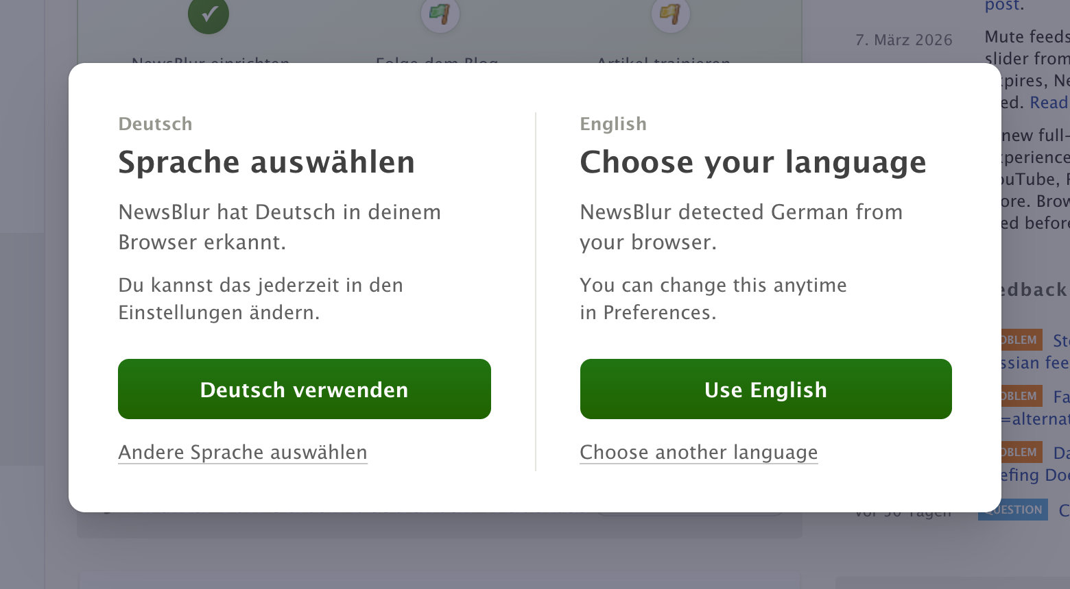
If NewsBlur picked English, you’ll see a shorter version with every language listed in its own script, in case you’d rather read in another one. New accounts get the same choice as the very first step of setup.
Choose your language on the web
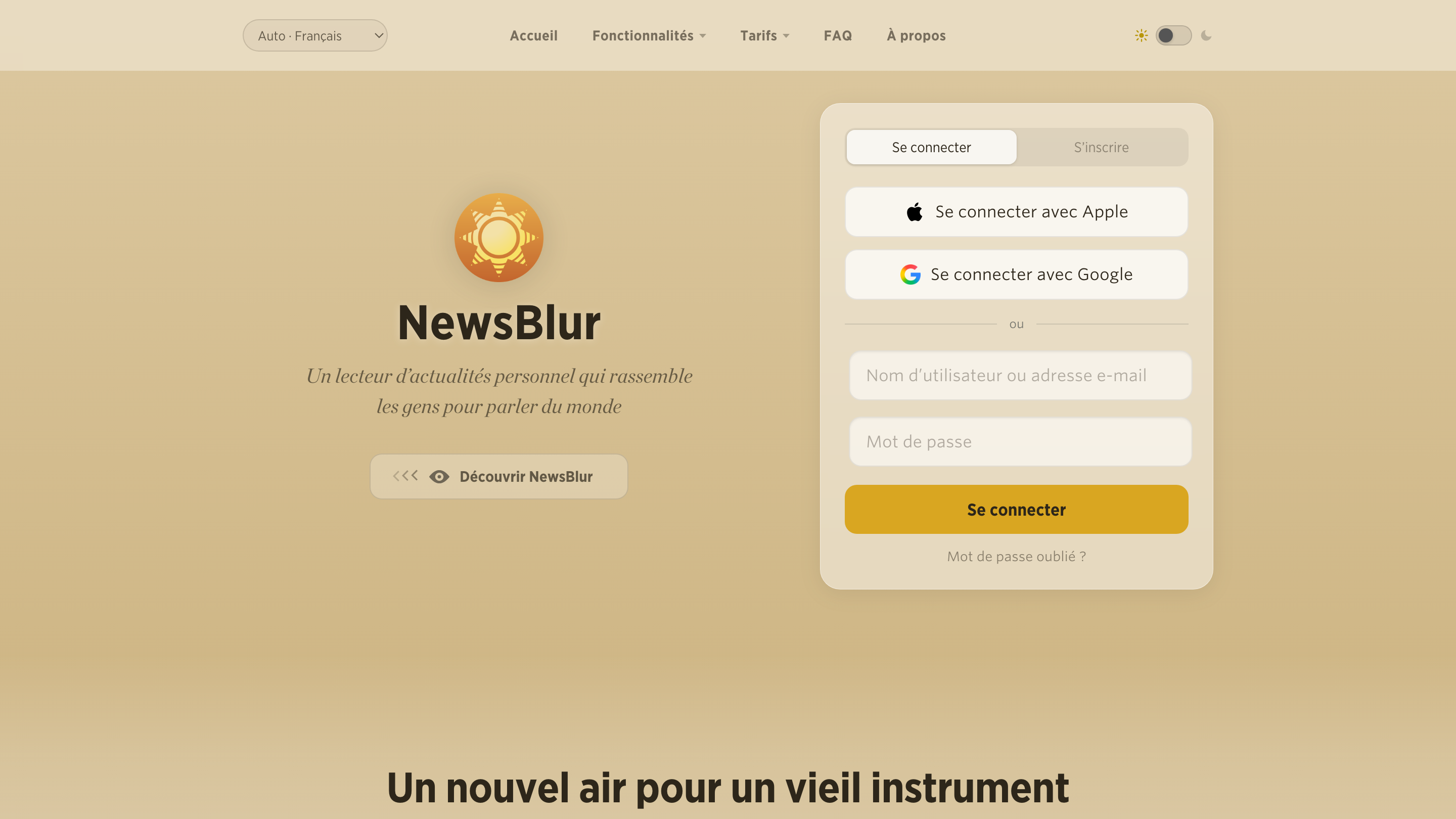
You can change your language anytime in Preferences, right at the top under Language. Automatic follows your browser, or you can pick any language. If you’re signed out, there’s a language menu at the top of the home page, so the sign in and sign up forms are in your language before you even have an account.
Choose your language on iOS
On iPhone and iPad, open Preferences and choose Language at the top. Pick a language and the app switches right away, no restart needed.
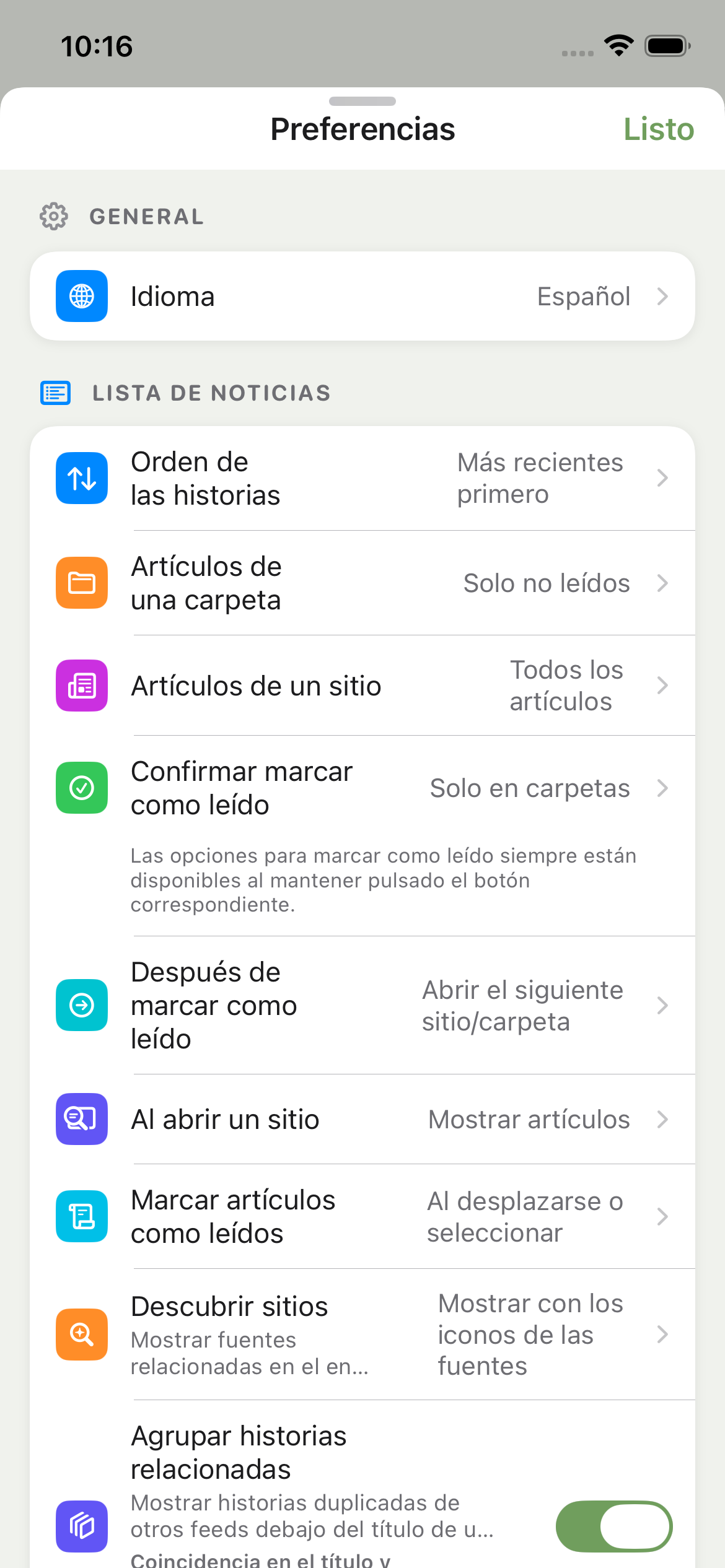
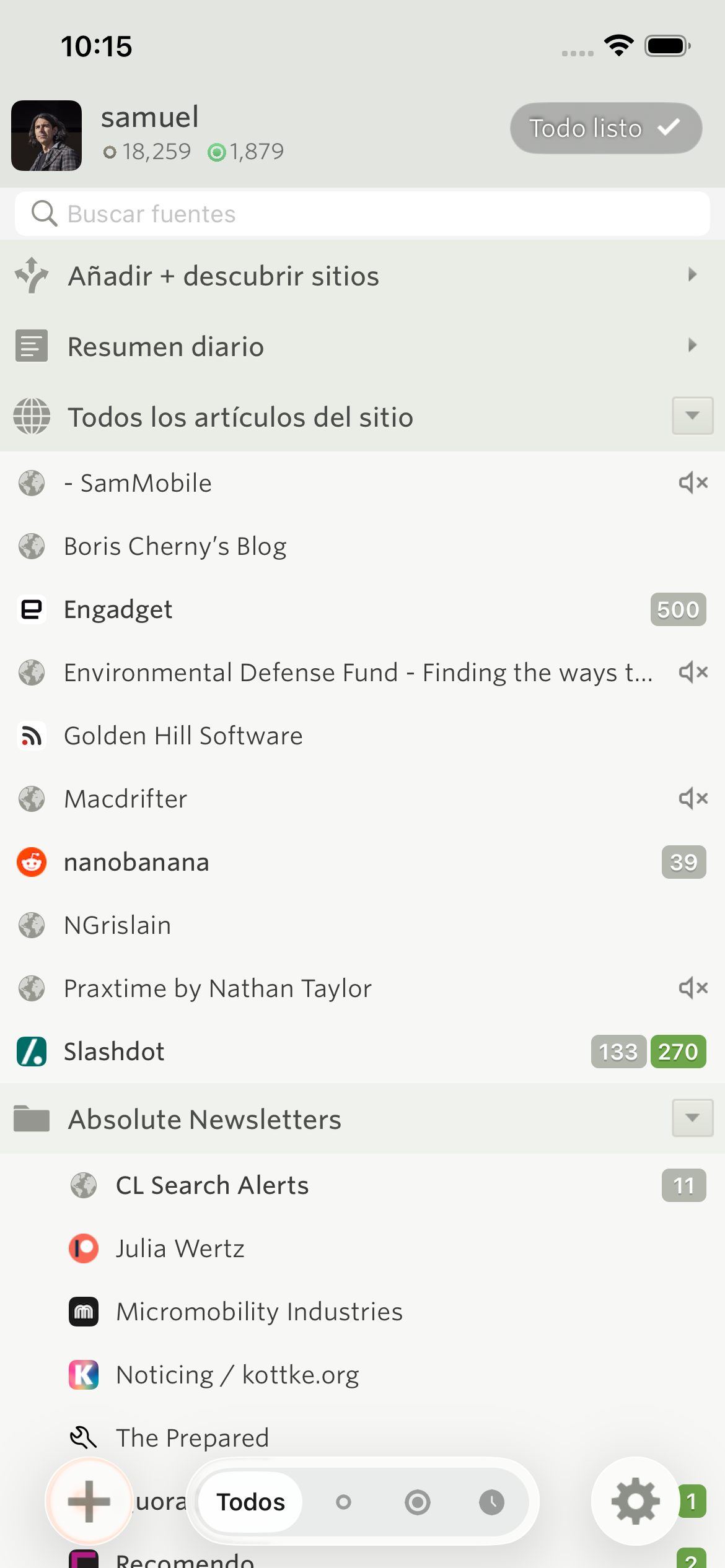
Everything follows along, from your feed list to the story controls.
Choose your language on Android
On Android, it’s the first row in Settings. The app switches as soon as you choose, and Android also lets you set NewsBlur’s language from the system’s per-app language settings.
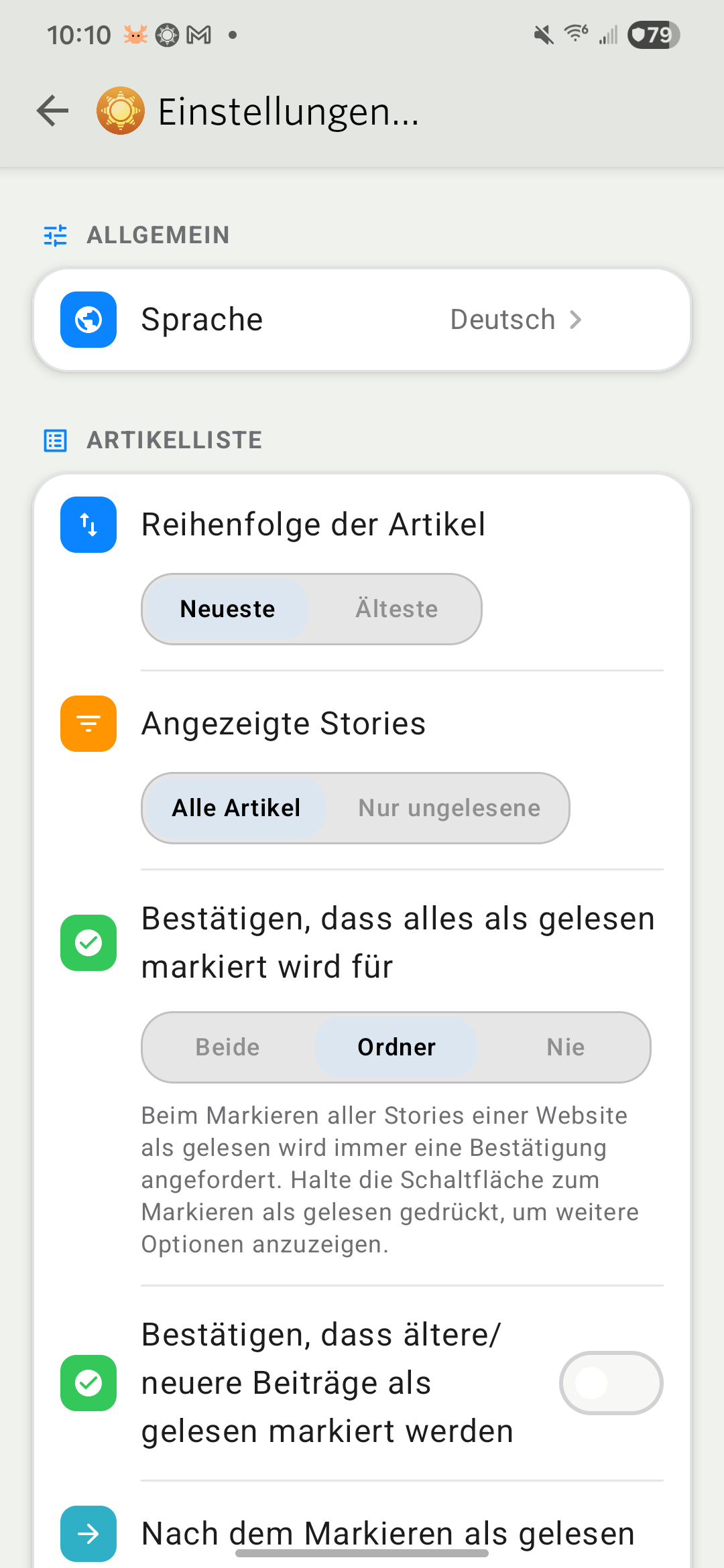
Menus and numbers follow your language too.
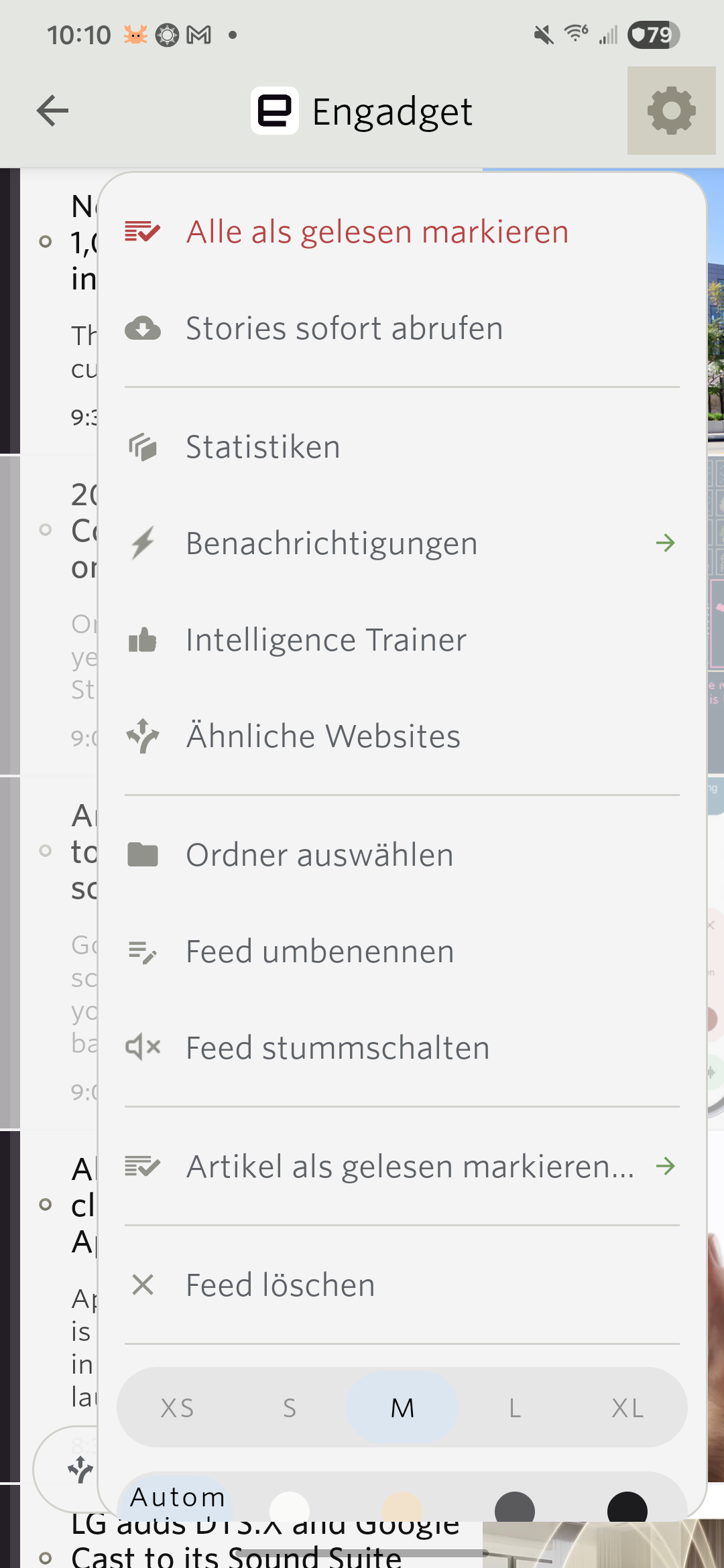
One language, everywhere you read
When you pick a language, it’s saved to your account, so your phone and the web stay in sync. If you leave it on Automatic, each device follows its own language settings. That’s handy if your laptop is in English and your phone is in Spanish.
Here are all 21 languages:
- English
- Español
- Français
- Deutsch
- Português (Brasil)
- Italiano
- Nederlands
- Polski
- Türkçe
- Русский
- Українська
- العربية
- עברית
- हिन्दी
- Bahasa Indonesia
- Tiếng Việt
- ไทย
- 日本語
- 한국어
- 简体中文
- 繁體中文
Arabic and Hebrew switch the whole interface to read right to left.
Help me get the words right
If you read NewsBlur in one of these languages, I’d love your help. If a button reads awkwardly, a term sounds wrong, or a phrase doesn’t fit, tell me on the NewsBlur forum. Mention the language, where you saw it, and what it should say, and I’ll get it fixed.
Native language support is available now on the web and coming in the next iOS and Android updates.
-
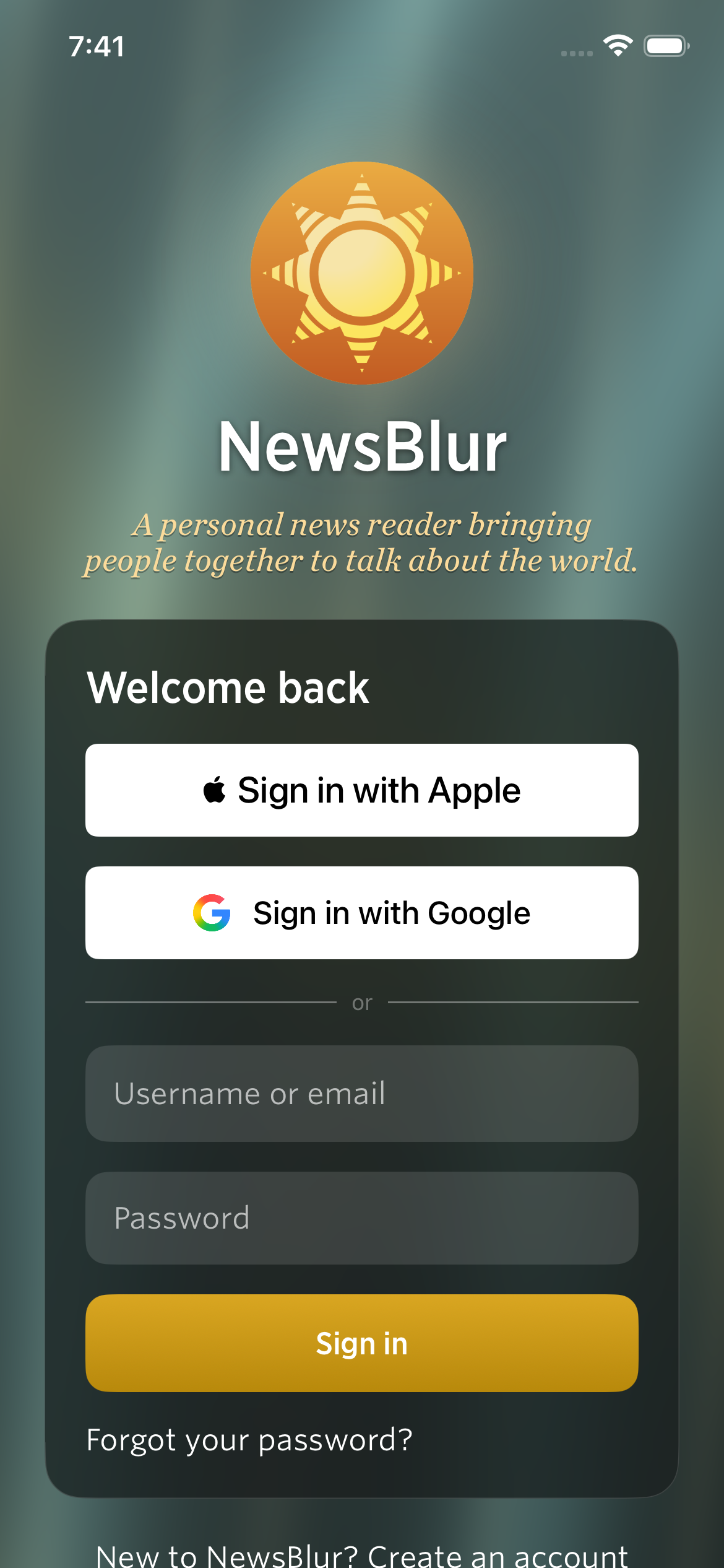
NewsBlur has asked for a username and password since the beginning. That still works, but I wanted getting into your reader to be easier, especially on a new phone. I’ve added Sign in with Apple and Sign in with Google on the web, iOS, and Android. You can use either to create an account or connect to the NewsBlur account you already have.
Apple and Google sign-in on the web
The welcome page, login page, and signup page now have Apple and Google buttons above the usual username and password fields. Choose either provider to sign in or create a NewsBlur account. For a new account, you’ll choose a NewsBlur username so you still have your own name when sharing stories and commenting.
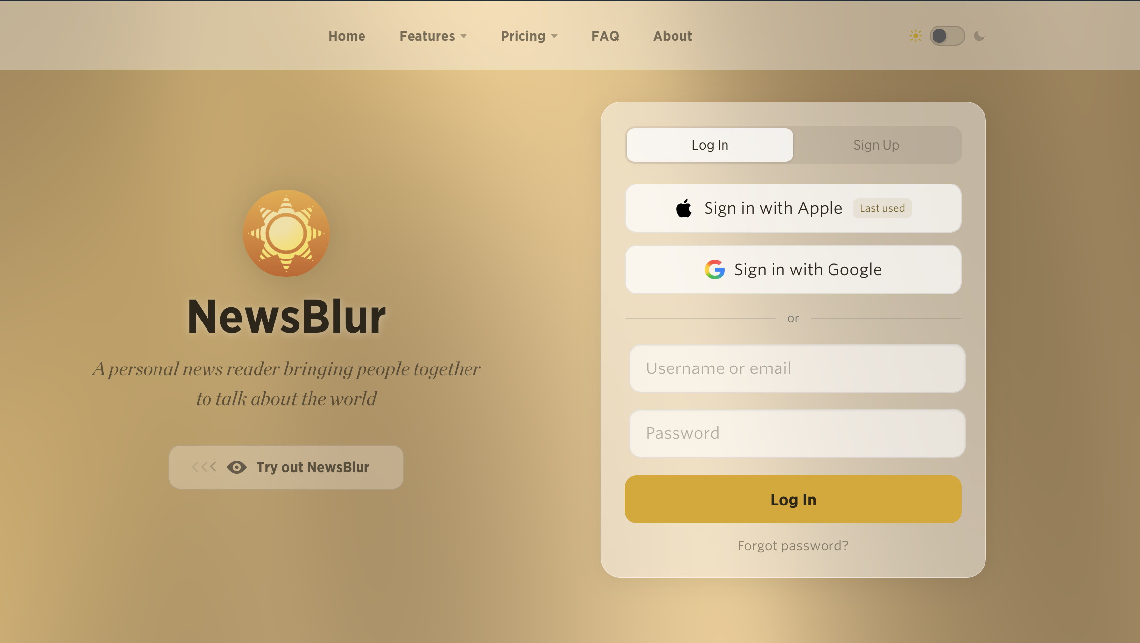
If you already have a NewsBlur account, you can connect it instead of starting over. Choose Connect an existing account and enter your NewsBlur username and password. If you try to create an account with a username that’s already taken, NewsBlur brings you to that connection step and explains what to do.
You only need to confirm your NewsBlur password when making that connection. Afterward, the Apple or Google button takes you back to the same feeds, saved stories, and subscription.
Different email addresses, one NewsBlur account
Your Apple email doesn’t have to match your Google email, and neither has to match your NewsBlur email. You can connect a personal Apple account and a work Google account to the same NewsBlur username. Connecting them leaves your NewsBlur email address unchanged.
Open Manage > Account on the web and look under your email address. The new Connected accounts section lists each connected Apple or Google account and its email. Use Connect Apple or Connect Google to add another, or the little × beside a connection to remove it.
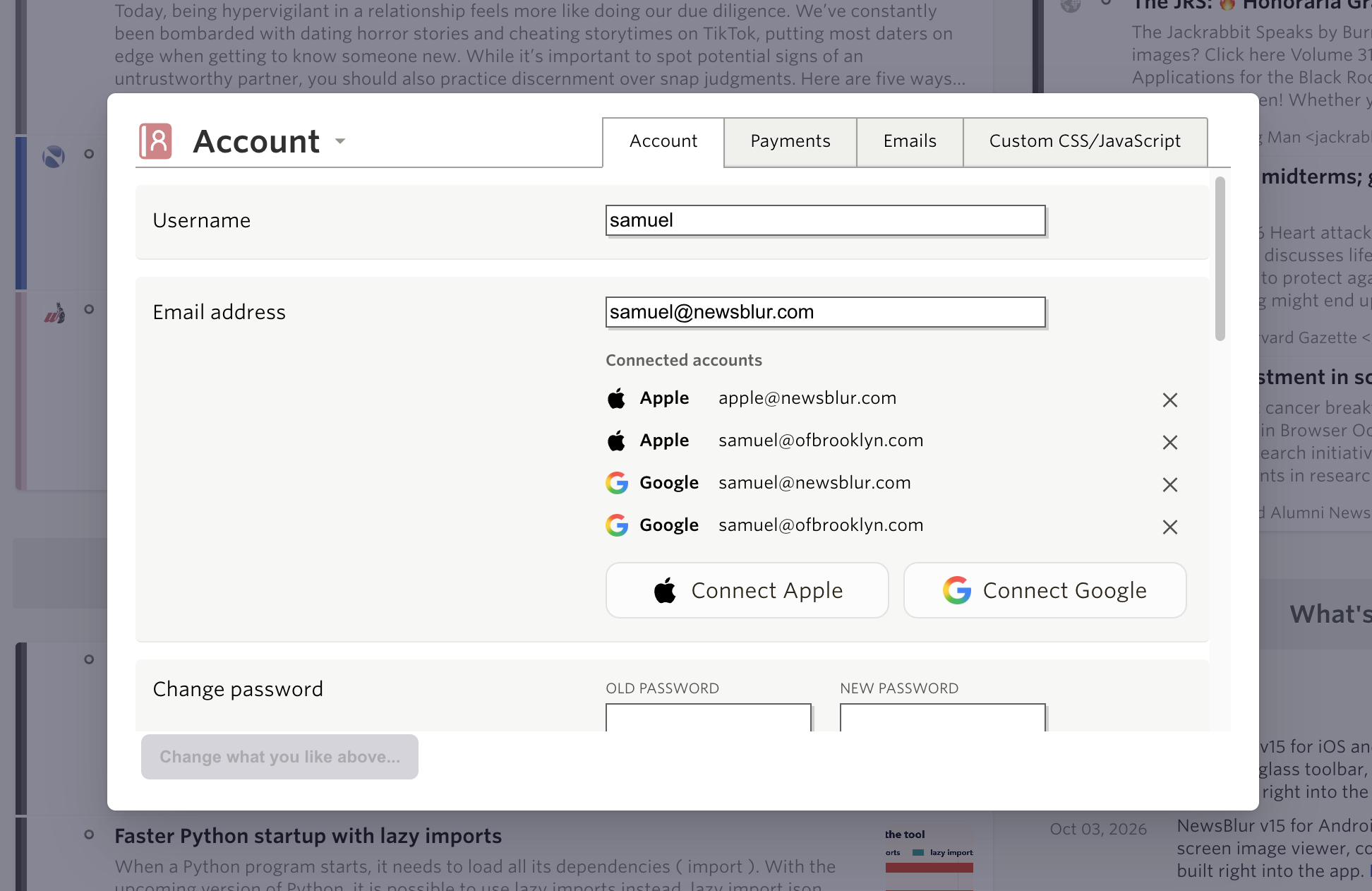
An Apple or Google account can belong to one NewsBlur account at a time. To move it, disconnect it from the old account first. NewsBlur also makes sure you keep a way to sign in before removing your last connection.
Sign in on iOS
The iPhone and iPad apps get the same Apple and Google sign-in choices. You can also create an account with an email, username, and password right on the welcome screen.
Sign in on Android
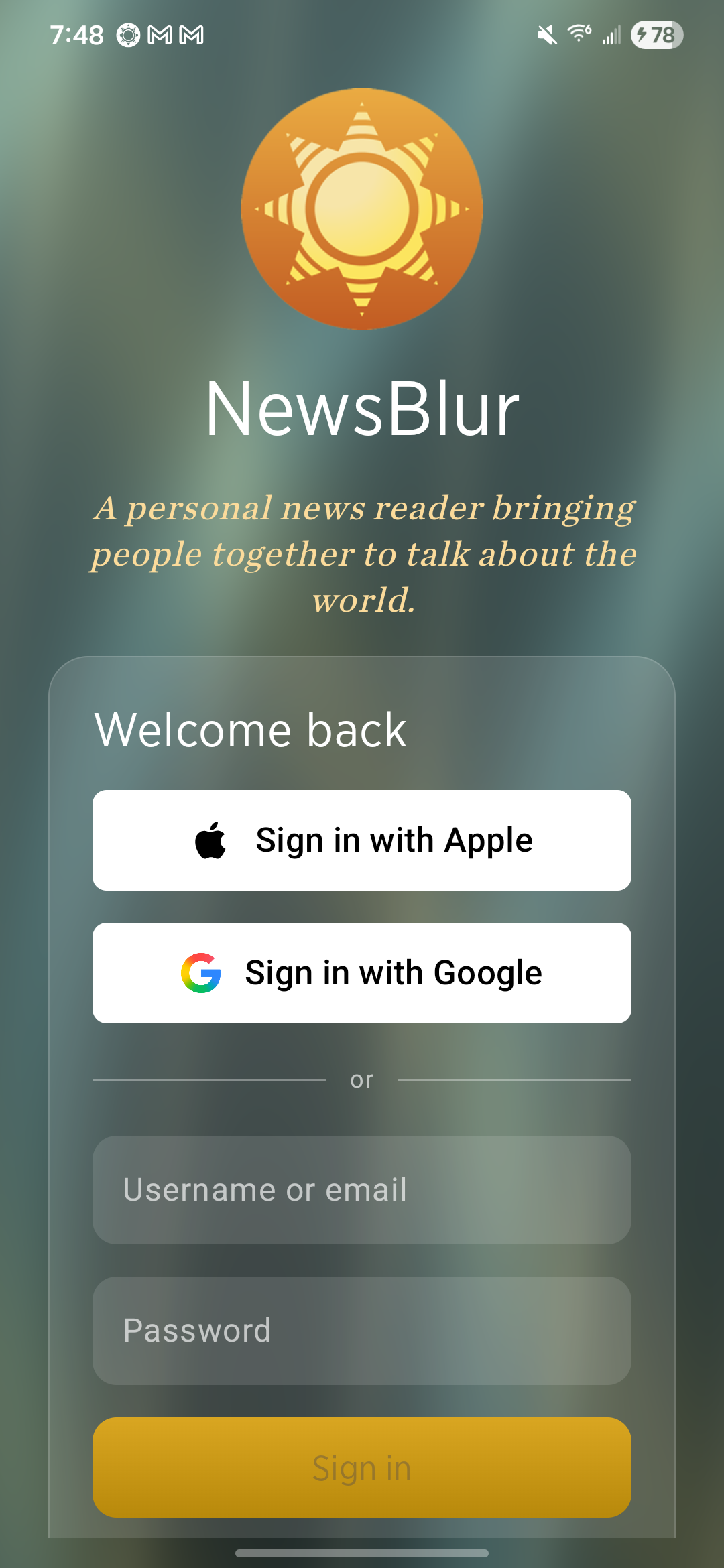
Android gets both provider buttons as well, including Sign in with Apple. The account connection works across platforms: connect a provider on the web and use it to sign into that same NewsBlur account on your phone.
For new readers, both mobile apps also have a new first-time experience that helps you choose your first feeds and get reading.
Apple and Google sign-in are available now on the web and coming in the next iOS and Android updates. If you have feedback, let me know on the NewsBlur forum.
-
An empty reader is a hard place to start. If you already know which sites you want to follow, adding them is straightforward. But if you’re trying RSS for the first time, finding those first few feeds is part of the work. I wanted NewsBlur to help with that, right inside the app.
I’ve rebuilt the first-time experience on iOS and Android around exploring interests, previewing feeds, and choosing what goes into your reader. You can put together a few folders of things you care about, or bring your existing collection from another app with an OPML import.
Explore your interests on iOS
After creating your account, the iPhone and iPad apps open a setup screen with Explore interests. Browse categories such as science, books, cooking, and technology, or search for a topic. A little of everything gives you a starting point if you’d rather sample a mix.
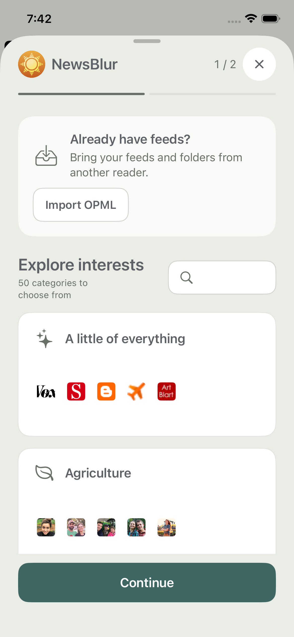
Each category opens a bundle of feeds. You can see what the sites actually publish through recent story previews, rather than choosing from names alone. Deselect feeds you don’t want, give the folder a name, and add the ones you like.
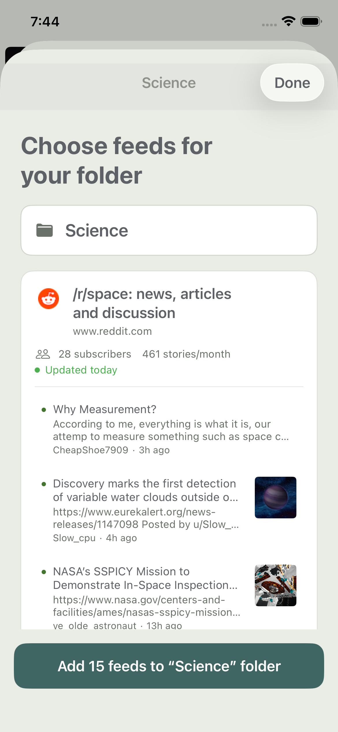
You can keep exploring and add another bundle before heading into the reader. The idea is to make those first subscriptions your own, with enough context to decide whether a feed belongs in your daily reading.
Build your first folders on Android
Android gets the same interest-based setup. Browse or search the catalog, open a bundle, and look through its feeds before subscribing. The import option is right at the top if you’re coming from another reader.
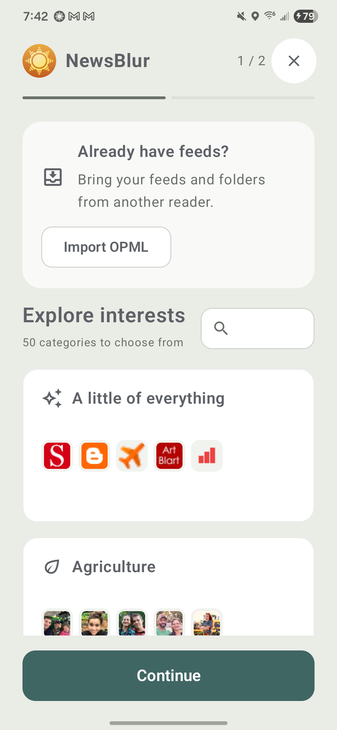
Feed cards show recent stories, how often a site publishes, and when it last updated. Choose the feeds you want and name the folder they’ll go into. A science folder, a cooking folder, and a handful of personal blogs can give you plenty to read without having to assemble every subscription one at a time.
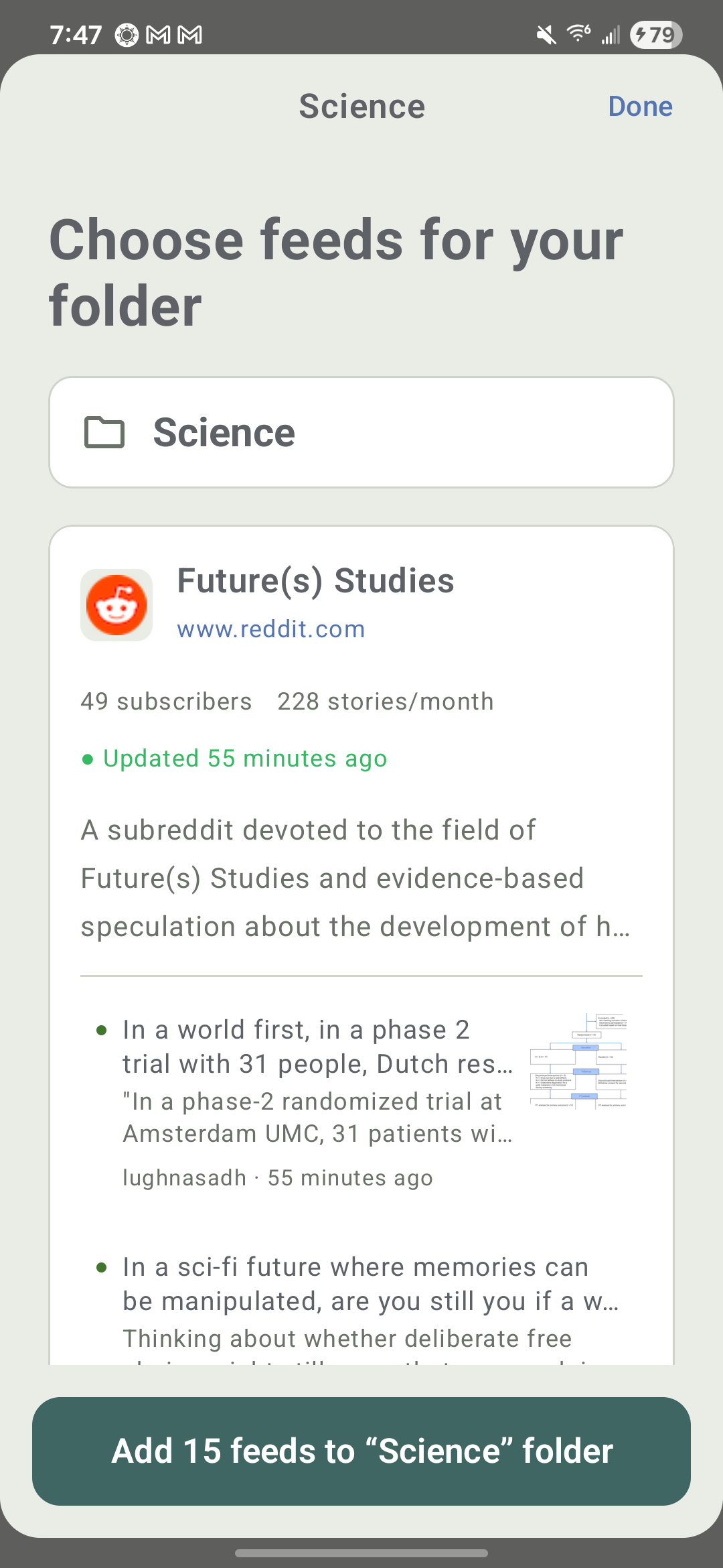
The final setup step shows what you’ve added. Tap Start reading to head into your reader with your folders ready.
Bring your feeds, or come back for more
On both platforms, Import OPML brings your feeds and folders from another reader. Export an OPML file from your old app, save it somewhere your phone can access, and select it during setup.
You don’t need a new account to use the bundles. Existing readers can open Import or upload sites from the iOS menu or Import and feed bundles from the Android menu. It’s a way to explore a new interest whenever you want to add something to your reading.
The new setup experience is coming in the next iOS and Android updates, alongside Sign in with Apple and Google. I’d love to hear how the first few minutes feel, whether you’re starting fresh or helping someone else get into RSS. Let me know on the NewsBlur forum.
-
I spent a lot of this release optimizing speed in the iOS app. Opening a big folder took over a second, scrolling would hitch whenever the next page of stories loaded, and articles flashed blank for a moment before appearing. So I measured every part of the story list and the reader, then fixed whatever the numbers pointed at.
Faster story lists
Loading the next page of a folder used to reload the entire list. Now new stories are added in place. Favicons, thumbnails, and story text get prepared in the background ahead of time instead of while you’re scrolling. Opening a feed shows its cached stories immediately while fresh ones load, and articles appear fully laid out instead of flashing blank first.
Opening All Site Stories went from 1.1s to 0.2s. A single feed went from 0.7s to 0.2s. Loading another page into a list of 5,000 stories went from 0.7s to 0.02s.
A glass toolbar
The story list toolbar is now a floating glass bar at the bottom of the screen on iPhone and iPad, and your stories scroll right behind it. Related Sites, story order, and search are on the left. Add and Mark as read are on the right. If you’d rather keep it at the top, you can move it back in Preferences. In the reader, the controls hide as you scroll down and come back when you scroll up.
Images
Tap an image in a story and it opens full screen, zooming out from its spot in the article. Pinch or double tap to zoom, drag to look around, and swipe to go back. On iPad the viewer covers all three columns, and you land right back where you were in the story.
Long press an image to see its hover text above it, which is where comics like xkcd hide the punchline. Copy Image, Save Image, and Share Image are right there with it.
Add + Discover Sites
The + button opens a Quick Add sheet. Paste an address or search for a site, pick a folder, and add it. Below that are shortcuts into every discovery source: Search, Web Feed, Popular, YouTube, Reddit, Newsletters, Podcasts, and Google News. You can swipe between them like pages. It’s the same Add + Discover Sites catalog from the web, rebuilt natively for iOS.
Each site shows its latest stories with an image and a short excerpt, along with how recently it published. Tap a story to read it, or tap Try to browse the site without subscribing. When you come back, you’re in the same spot with that story highlighted. On iPad, Try keeps all three columns, so you can browse a new site and read its stories side by side. Related Sites uses the same cards.
Offline storage that cleans up after itself
A reader on the forum noticed NewsBlur using 4.2 GB on their iPhone with no unread stories. Digging in turned up three bugs in the offline cache. Cleanup skipped pruning whenever you were all caught up, it never cleared cached article text, and it compacted the database before deleting anything, so no space ever came back.
All three are fixed. Cleanup now keeps storage within your Stories to store limit, and Delete offline stories in Preferences actually gives you the space back. Your subscriptions and any pending read or save changes are kept.
Everything else
- Long press any feed, folder, or story for a native menu.
- Mark newer as read and Mark older as read update your unread counts right away, even inside collapsed folders and while offline.
- Feed and story gestures each have their own settings.
- The Mac app gets the new discovery screen, image viewer, menus, and offline cleanup too.
- Tapping a notification opens the story instead of sometimes getting stuck.
- Reading positions are restored correctly.
NewsBlur 15 is available on the App Store for iPhone, iPad, and Mac. The Android release got a lot of the same work. If you have feedback, I’d love to hear it on the NewsBlur forum.
-
I spent a lot of this release optimizing speed in the Android app. I measured scrolling across the feed list, the story list, and long articles, then fixed whatever the numbers pointed at. Then I kept going.
It’s faster
Most of the slowness came from the app doing more work than it needed to. Marking a story read rebuilt its entire row. Background syncs could pile up on top of each other. The feed list waited on the sync service before showing anything, and the reader waited for the article to finish rendering before it appeared at all.
All of that is fixed. Janky frames while scrolling the feed list dropped from 32% to 15%, and from 14% to 7% in the story list. Opening a story you’ve read before went from 0.9s to 0.2s. Your feeds now load straight from the local cache, so they show up right away, even offline.
Controls that float
The story list controls now float at the bottom of the screen, so your stories scroll right behind them. Search, display options, and settings are all within reach of your thumb. If you’d rather have them at the top, there’s a setting for that in Preferences. In the reader, the controls tuck away as you scroll down and come back as soon as you scroll up.
Built for tablets
On a tablet or an unfolded foldable, NewsBlur now shows your story list and the story you’re reading side by side. Your feeds slide in over the top when you need them and slide back out when you pick one, and the list stays right where it is while the new stories fill in. Tap another story and the reader pages over to it, the same way it does when you swipe. It works in both portrait and landscape.
A better look at images
Tap any image in a story to open it full screen. Pinch or double tap to zoom, and swipe it away to go right back to the story.
Long press an image and you get the same viewer with a little more. The image’s hover text shows up above it, which is where comics like xkcd keep the punchline. Below it are Copy Image, Save Image, and Share Image. Saving keeps the original file, so a GIF stays animated, and it lands in your Pictures folder. If the image is a link, there’s an Open Link button too.
Find your next favorite site
The + button opens a small Add Site sheet. Paste an address and pick a folder, or tap one of the shortcuts into discovery: Web Feed, Popular, Trending, YouTube, Reddit, Newsletters, Podcasts, and Google News. It’s the same Add + Discover Sites catalog from the web, built right into the app. Web Feed can even turn a site without RSS into a feed.
Every site shows its latest stories with images and excerpts, along with how recently it published. Tap a story to read it, or tap Try to browse the whole site before you subscribe. When you come back, discovery is right where you left it. Related Sites uses the same cards, so you can explore outward from a site you already like.
Everything else
- Gestures are configurable. In Preferences you can choose what swiping left and right does on feeds and on stories, and what a long press does.
- Long press a feed or a story for a grouped menu that includes Mark newer as read and Mark older as read.
- Nested folders show up as an indented tree.
- The Previous button no longer gets stuck disabled.
- Jumping to the next folder no longer loops forever when nothing is unread.
NewsBlur 15 for Android is available on Google Play. The iOS and Mac release got a lot of the same work. If something doesn’t feel right, let me know on the NewsBlur forum.
subscribe via RSS