Magazine view offers a new perspective
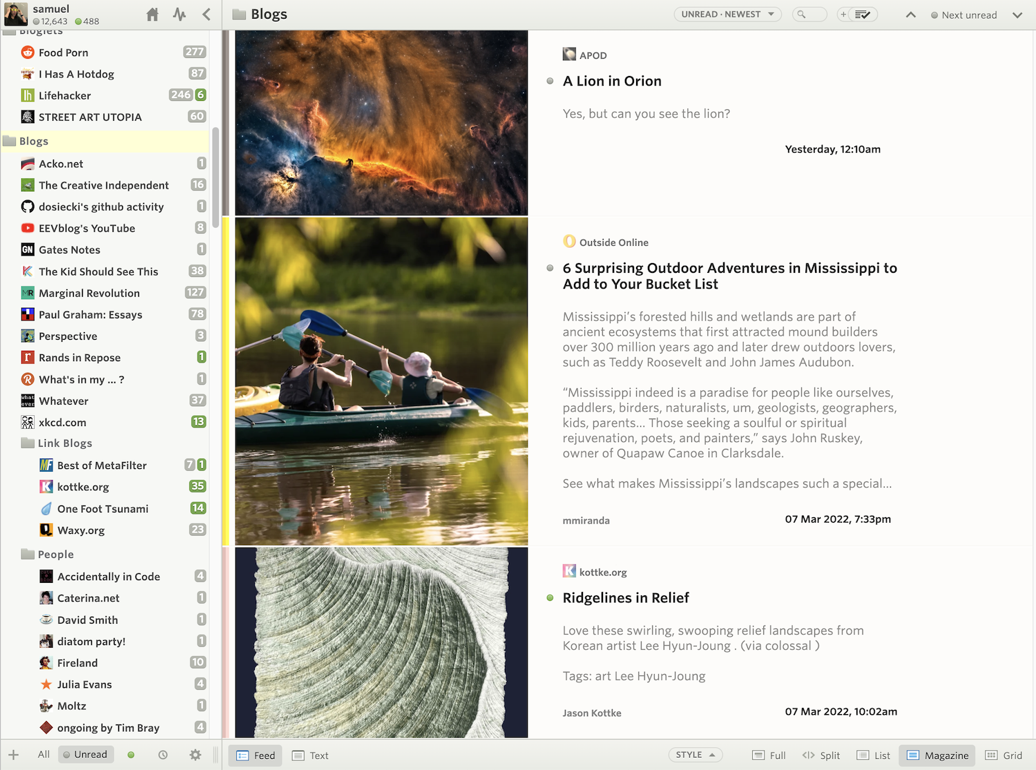
Here’s a nice feature that brings a new perspective to your stories. It’s called the Magazine view and features larger images, longer story content previews, and improved legibility of text.
Take a look and see how the Magazine view shwocases stories in a new way:

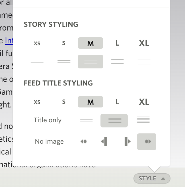
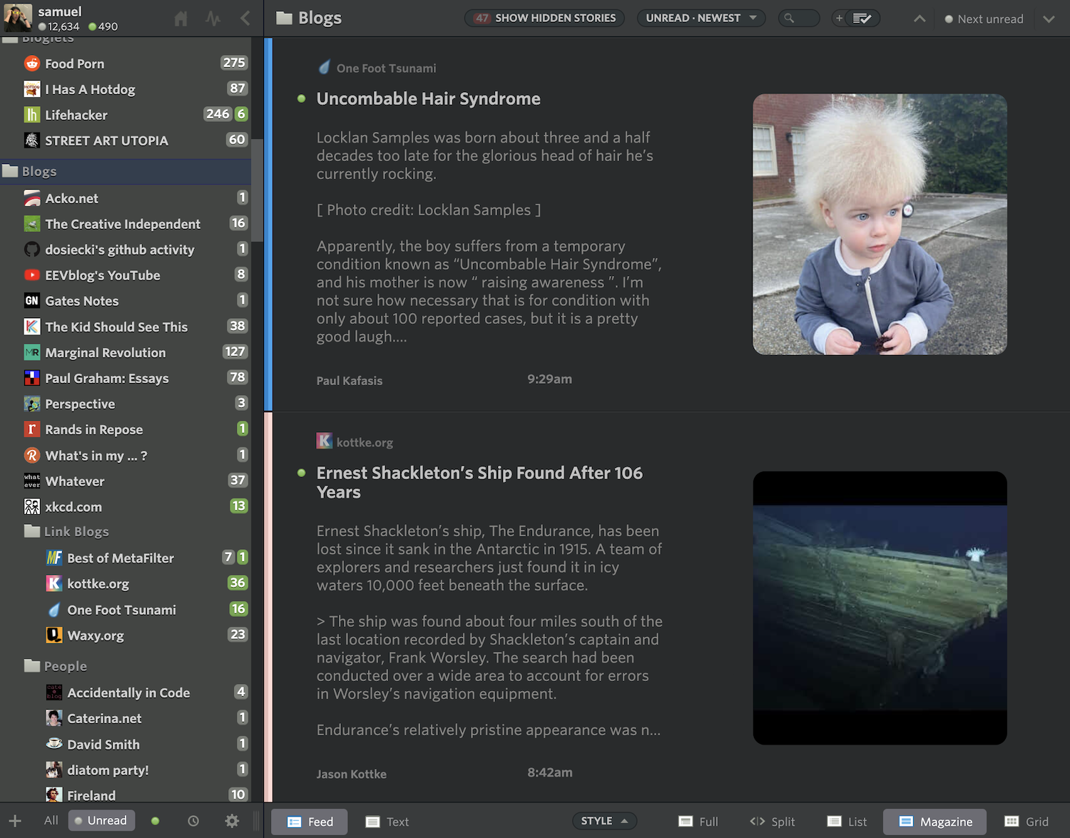
The Magazine view is also customizable. By default, fonts are a bit larger in the Magazine view. You can still change font sizes as well as customize the position and size of the image preview. There is also a control for how long the story content previews are, all found inside the Style popover.

And in dark mode, these customizations show how tailored you can make NewsBlur look.

You can access the new Magazine view next to the other story title view layouts.

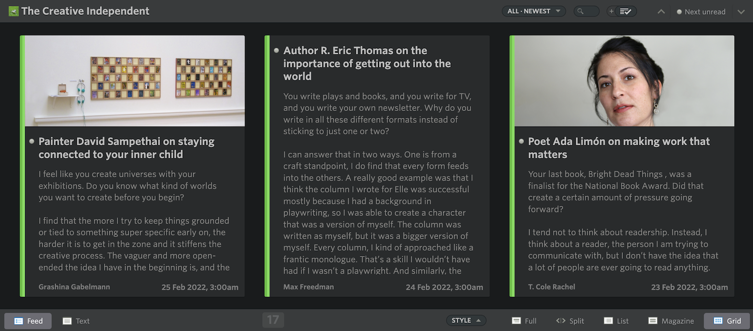
The Grid view also features improvements to the story content preview. New lines are now preserved in both Magazine and Grid views, so you can capture a bit of longer form stories without opening them up.

Also included are some backend changes to how YouTube videos thumbnail are found, so you should see even more image previews in your feeds.
