-
Introduced and announced only last week by open web pioneers Manton Reece and Brent Simmons, JSON Feed is a new RSS-like spec that lets websites publish their stories in a much easier and human readable format.
From the JSON Feed spec authors:
We — Manton Reece and Brent Simmons — have noticed that JSON has become the developers’ choice for APIs, and that developers will often go out of their way to avoid XML. JSON is simpler to read and write, and it’s less prone to bugs.
Starting today, NewsBlur now officially supports the new JSON Feed spec. And there’s nothing extra you have to do. This means if a website syndicates their stories with the easy-to-write and easy-to-read JSON format, you can read it on NewsBlur. It should make no difference to you, since you’re reading the end product. But to website developers everywhere, supporting JSON Feeds is so much easier than supporting XML-based RSS/Atom.

Daring Fireball, as pictured above, supports the new JSON Feed. To you, the reader, it should look no different than any other RSS feed. But to the developer, publishing this as a JSON Feed instead of XML is an order of magnitude easier and quicker.
This spec is a terrific effort by open web advocates to make it easier to keep the web open and free by lowering the cost to writing and publishing.
Try it for yourself, just subscribe to this feed: https://daringfireball.net/feeds/json. Even viewing it in a web browser is more pleasant than its XML counterpart.
-
Ever wanted to customize NewsBlur on the web but didn’t want to install custom browser extensions so you could shoe-horn in monkey-patched code? And if you did use a browser extension, didn’t you just hate having to keep it synchronized between your computers? Just for you, NewsBlur now has two new fields: Custom CSS and Custom Javascript.
Head to Manage > Account > Custom CSS/JS. And here’s what you can do with this new feature.
Install an unofficial dark theme for NewsBlur

Over on Stylish, a community for custom CSS, there are a bunch of stylesheets that change how NewsBlur looks. Have you ever wanted a dark theme? There’s a few and the most popular is made by NewsBlur user Splike. (Note: you will have to remove the @moz delcaraction along with the surrounding {}’s at the top and bottom lines.)
Hide that module or link that you don’t want to see on NewsBlur

Don’t like seeing Global Shared Stories or the River of News on the Dashboard? You can hide them with this little bit of CSS:
/* Hides the Global Shared Stories feed */
.NB-feeds-header-river-global-container {
    display: none !important;
}

/* Hides the Dashboard River */
.NB-module-river {
    display: none !important;
}
Run a custom script
Ok, to be 100% truthful, I have no idea why you’d want to run custom JavaScript on NewsBlur. But if you figure out a reason please let me know! Either shoot me an email or mention it to @newsblur on Twitter.
-
It was a little under a year ago that I declared Twitter back, baby on this blog. In that time, NewsBlur users have created over 80,000 Twitter feeds in NewsBlur. Since it’s such a popular feature, I decided to dive back into the code and make tweets look a whole lot better.

Notice that NewsBlur now natively supports expanding truncated URLs (no more t.co links).
And NewsBlur also supports native quoted tweets, where a user links to a tweet in their own tweet. NewsBlur expands the quoted tweet and blockquotes it for convenience.
Plus retweets now show both the original tweet author and the retweeting author. This means that you can quickly scan tweets and see where the retweet originated from. And retweeted tweets that quote their own tweets also get expanded.

It’s almost as if NewsBlur is inching closer and closer to becoming its own full fledged Twitter client. While NewsBlur already hit Zawinski’s Law (“Every program attempts to expand until it can read mail. Those programs which cannot so expand are replaced by ones which can.”) by supporting email-newsletters-to-rss, Twitter is coming up fast.
Speaking of which, I have this idea I’ve been noodling about better supporting Twitter habits that need to become less of a habit. I want to be able to automatically follow people from my Twitter tweetstream in NewsBlur based the frequency of their posting. I want to be able to infrequently dip into Twitter but still read the tweets from people who only post once a week or once a day.
In other words, I want Twitter, the RSS killer, to better integrate with an RSS reader so that I can pull out the good stuff from the unending flow of tweets. RSS means never missing anything, but Twitter’s main use case is anathema to how we use RSS. I don’t like to preannounce features, but this one intrigues me and if you agree, please share this story to let me know or to give me feedback on how you would like to see NewsBlur be a better Twitter client.
-
You can now save a search as a saved search feed. This works for individual sites, folders, All Site Stories, saved stories, and blurblogs.

Saved searches are great for creating custom feeds with just the stories you want. Think of these new feeds as spotlights on parts of a folder or feed, ways to keep track of stories that share a theme across different sites.

Or use saved searches to keep a single tag together for handy reference.
-
This is it, the final countdown!
Tonight at 8pm PT the Turn Touch campaign will end and the project will be successfully funded. Judging from the $50,000 raised already, I think Turn Touch has a long life ahead of it.
Watch the 2 minute demo on Vimeo
Apart from being the only remote control in the world built for a news reader, Turn Touch is the handiest shortcut for your lights, music, and apps. It’s basically a customizable remote with a knack for smart homes.
Supporting Turn Touch is a way of supporting NewsBlur. They are part of the same suite of productivity tools made by the same person. By buying a Turn Touch and backing this Kickstarter, you’re continuing to fund the development of great tools.
So please head to Kickstarter and buy yourself the $59 mahogany remote, even if you do not yet have any smart home devices. This remote is the easiest way to start connecting your home.
-

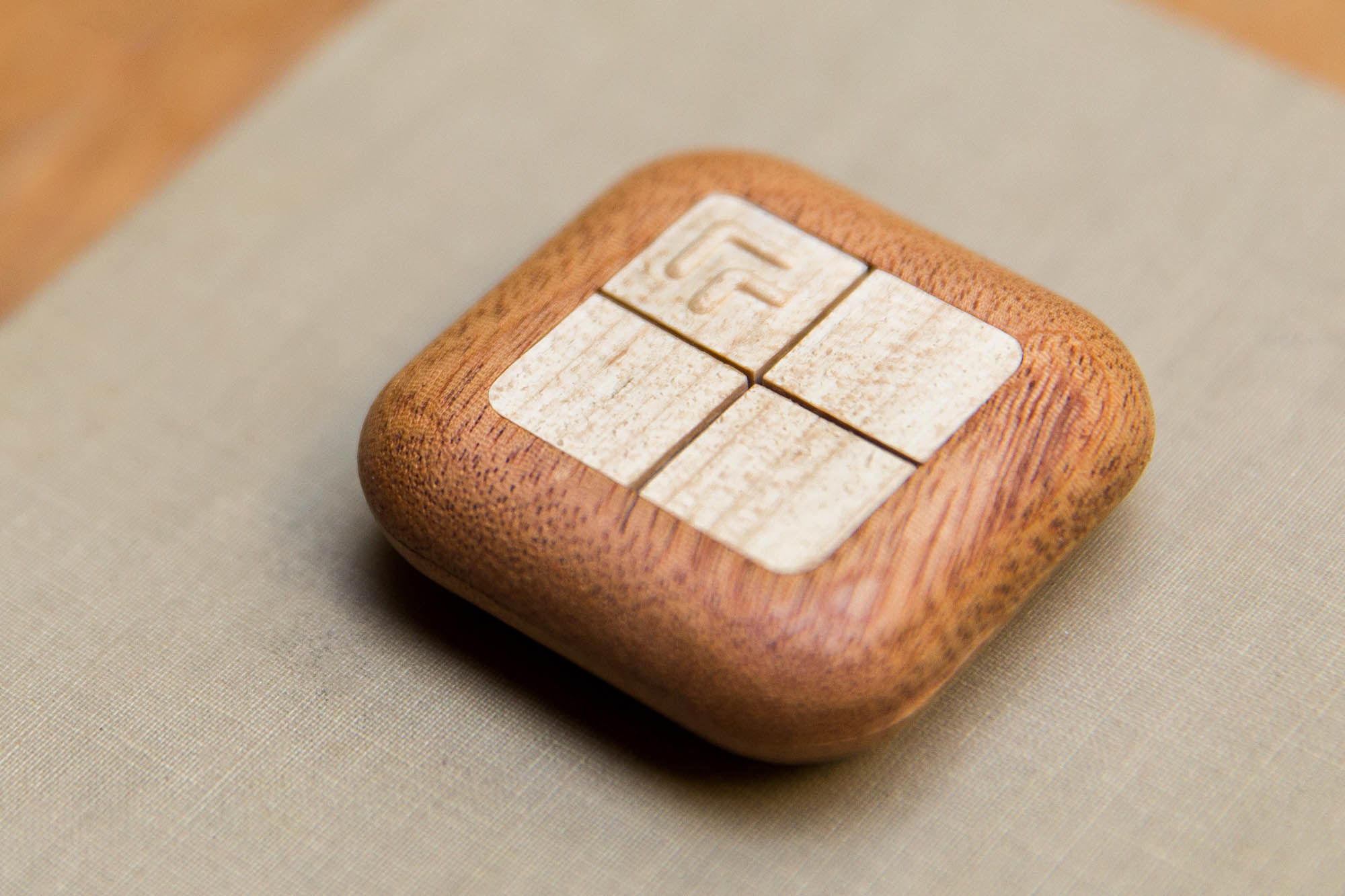
Turn Touch is a solid wood remote… and it’s about to change the way you use NewsBlur.
Change how?
Here’s how. Turn Touch connects to apps and devices in your home. Think Hue lights and Sonos speakers. Your Mac, your phone, etc.
It also connects to NewsBlur.

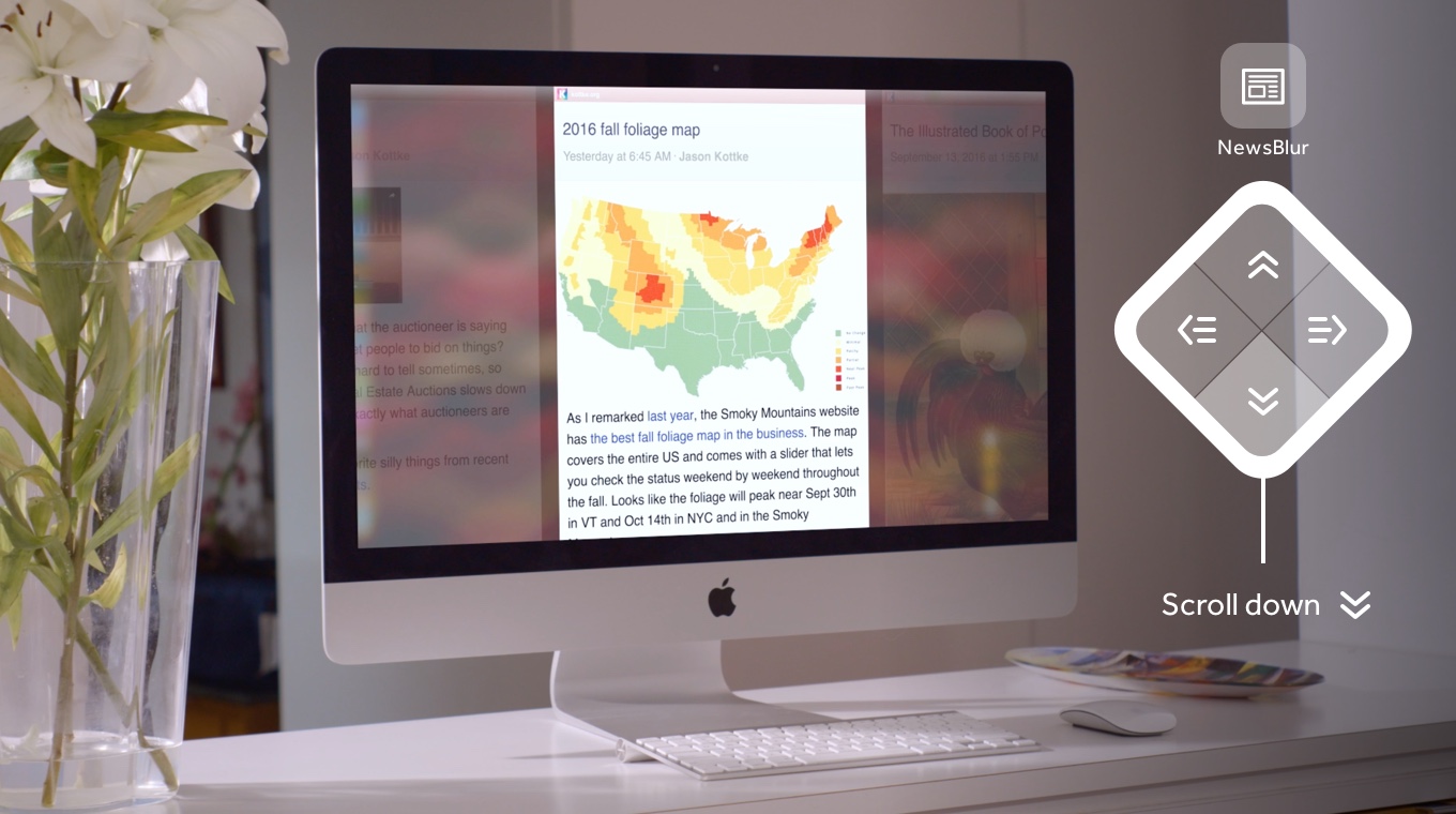
This is big. It means you can wake up in the morning, grab a cup of coffee, and cycle through news from across the room. Or, hook your Mac up to a display (maybe your living room TV) and skip through photo blogs, headlines, and the day’s best writing.
It’s kind of like getting a new set of speakers. Where before, you’d be chained to your computer with headphones; now, you can listen to music from anywhere you’d like. With Turn Touch, you can leave your computer and read the news no matter what you’re doing— laundry, the dishes, or enjoying a lazy Sunday on your couch.

Get one. Or all three.
Turn Touch is on Kickstarter. Back the project to get your very own. Or—and this is my sincere recommendation—get the complete set, save some money, and give one away to a friend.
I’ve been working on Turn Touch for years and I hope it shows.
-
I have something very exciting to share with you today. I’ve been working on a secret project called Turn Touch and I’m just about ready to show it to you. Signup on turntouch.com to find out.
It’s a new kind of device and it’s machined out of solid wood. I built it to last, much like my other projects (for instance the news reader you’re likely reading this in). Turn Touch is built for NewsBlur, among many other things.
Turn Touch will be launching on Kickstarter next week and I want to ask for your help. When I launch my campaign I’m going to need people like you to share it with people who look to you for recomendations on what’s good. You already use NewsBlur, so you’re already known for having good taste.
Now, you probably want to know what Turn Touch is and actually looks like, yeah? Then signup on turntouch.com.
You’ll get to preview the Kickstarter campaign and offer me any feedback you have. You’ll get to see Turn Touch and find out what it offers you.
I’ve been working on this as a side project for that past few years. And by signing up you’ll have the first access to it.
-
Version 5.0 has a bunch of new features. It’s got new gestures, better looking icons and thumbnail previews, and little UI design details to better match the rest of NewsBlur.
Take a look:

The full feature list:
- New gesture to mark a story as read and unread by swiping on the story title
- UI updates to story titles
- New preferences for the font size of feed titles and story titles
- Fleuron on the bottom of story lists better help you keep tracking of where you are in a feed.
- Thumbnails in story lists
- Recover a forgotten password
- Higher resolution icons
- Mute feeds
- Option to enable confirmation for destructive mark-reads
- Custom server support
What a good way to close out January.
-
This is a seriously cool feature and I’m glad it’s ready to launch. The dashboard river, the real-time stream of the top five stories of All Site Stories, is now on the dashboard of the web app.

After testing this feature for the past few weeks I now realize that I could not live without it. By having the latest stories always loaded and instantly ready to go, I leave NewsBlur open and just take a quick glance to see if the top of my list is interesting.
It also loads instantly, which means that if you see a story you want to read, clicking on it brings up the text without taking a single moment.
One big change that this necessitated was the handling of the Text view when reading by folders. Used to be that a folder got its own feed/text/story view and every feed had to stay with the same story view. But on iOS and Android it’s different. Every feed gets to keep its own feed/text/story setting.
This is now how it works on the web. If you read on feed by its Text (extracted original text) view and another by its Feed view, then you are automatically switched between the two views. Quite a bit of logic had to accomodate scrolling (you don’t automatically switch, since that would throw you from one scroll viewport into another) and switching between stories.
Enjoy the dashboard river. And if you look closely you might even see the next big feature that itself is about to launch soon.
-
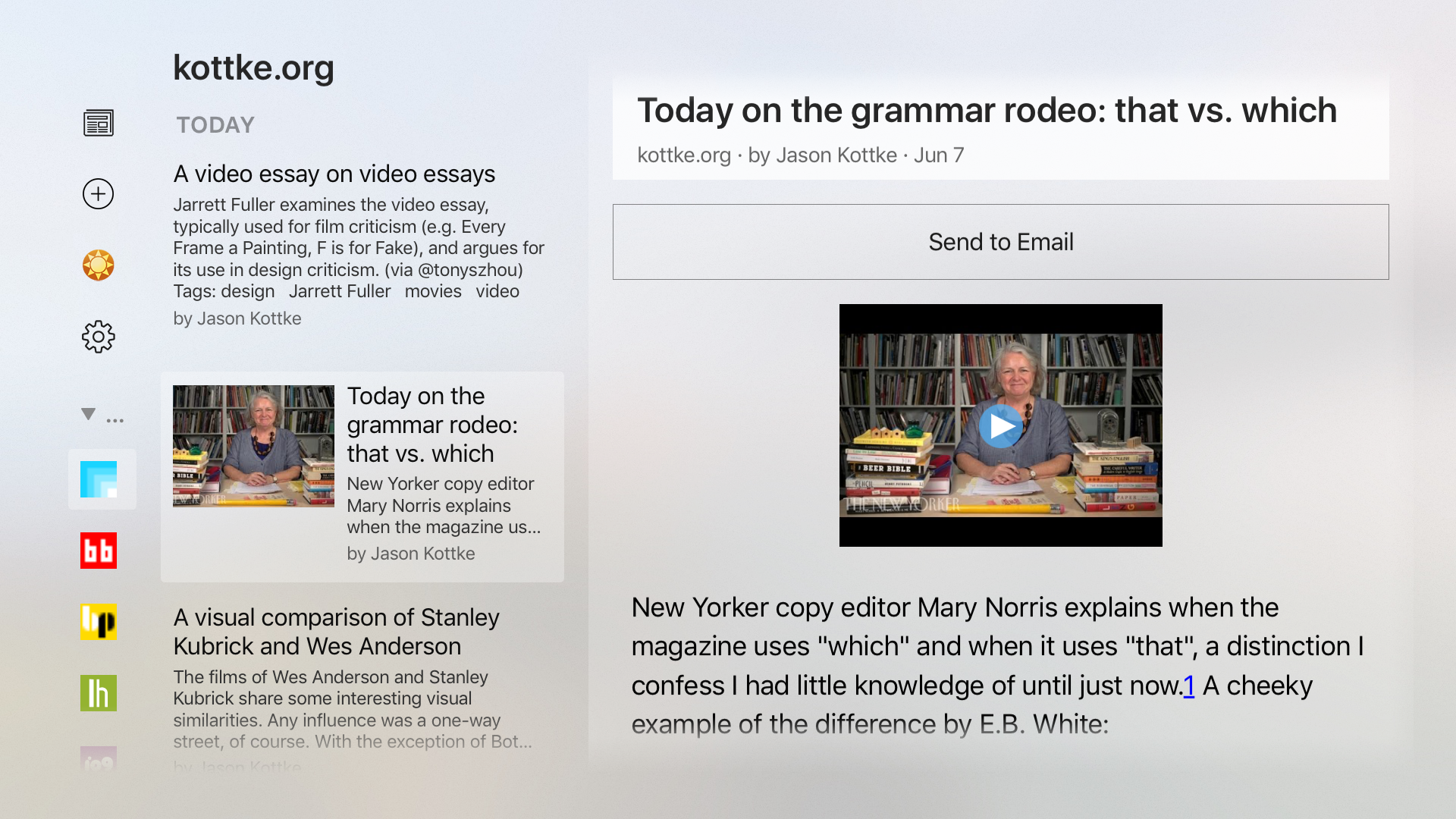
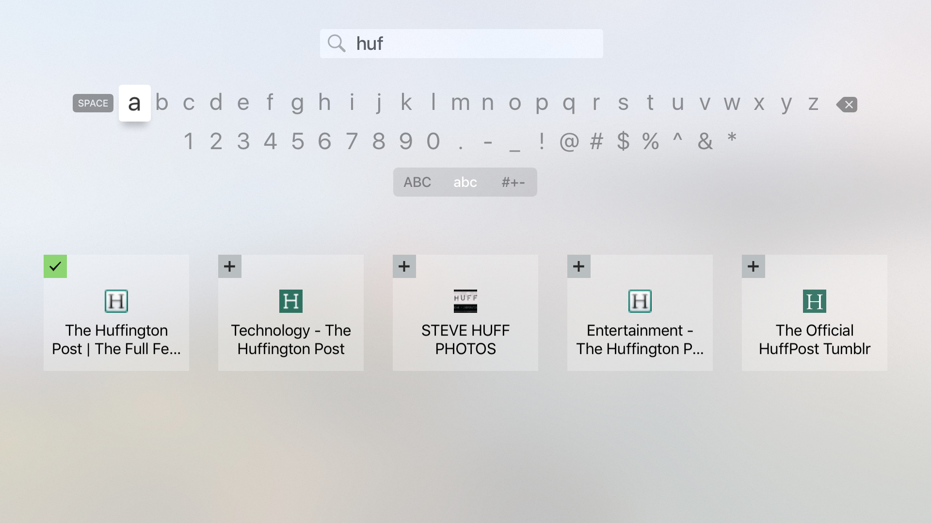
Check it out, David Berlin built Newsreel, a NewsBlur client for Apple TV. And from my first impression, it rocks. Just take a look at these screenshots.

You can read your subscriptions as well as subscribe to new sites, right from your television.

Not only does it look polished, but it’s smooth and seamless. Take a look at how it works in practice.
<
video src=“https://s3.amazonaws.com/static.newsblur.com/blog/newsreel-780.mp4” style=“width: 650px; margin: 0 auto; border: 1px solid #606060” autoplay=“true” muted=“true” loop=“true”>
You can download download Newsreel on the App Store. What a beautiful app and it goes to show how nice it is to be able to read your news on a big screen.
subscribe via RSS


