-
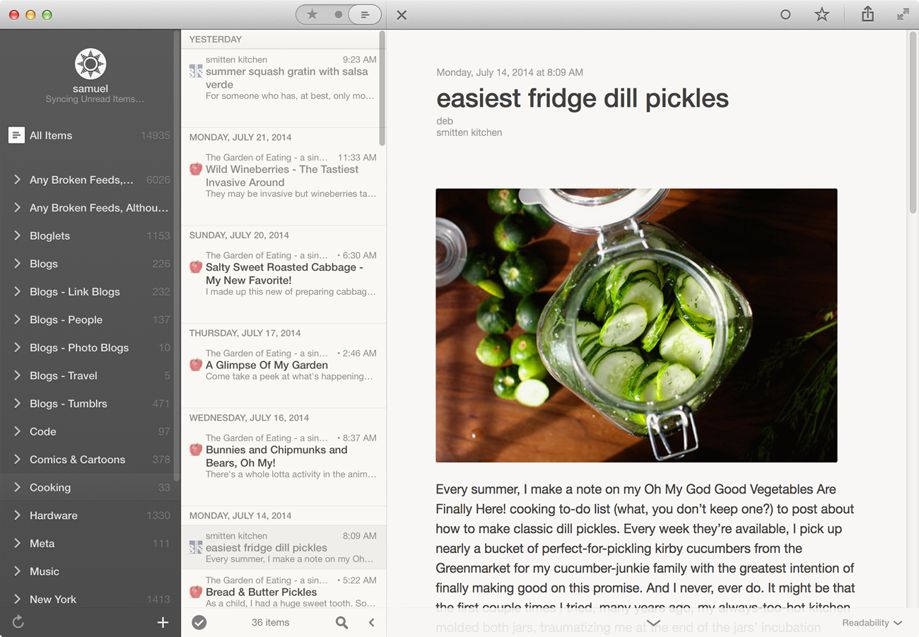
This is a huge release for the NewsBlur Android app. So much has happened in the last six months. We’ve had a big backend rewrite that makes the app feel like new. It’s faster, which is necessary to make the new offline reading feature really shine. Now you can read on your Android phone or tablet while on the train, underground, or just in airplane mode to save battery.
Better yet, not only can you read while offline, but you can better read at night with the new dark theme. Take a look.

Here’s what’s new in version 4.0:
- Offline reading and story syncing. Stories read while offline will sync as soon as you’re back online.
- Option to also store images from stories for offline reading. They do take space, though.
- A dark theme for reading at night.
- The Text mode can be set to automatically fetch, so you can get to the full text quicker.
- An option to mark stories newer than a story as read.
- Major backend improvements for faster story loading and transitions. This app should feel like new.
The NewsBlur Android app is a free download. And as always, there’s more big ticket features coming soon for Android.
-
Modern browsers are taking your privacy and security seriously with new restrictions for sites that use https. You can choose to use NewsBlur over https, which will encrypt your communications with NewsBlur and prevent eavesdroppers—hackers, the government, other people on the same wireless network as you—from seeing what you see. While that’s not necessary for everybody, SSL/https is a priority for some and NewsBlur supports this beautifully.
However, what modern browsers like Chrome and Firefox do is not allow you to embed an insecure http-only site in an iframe from a secure https site. That means that the Story view in NewsBlur does not load a thing for many users who are reading NewsBlur over an https connection.
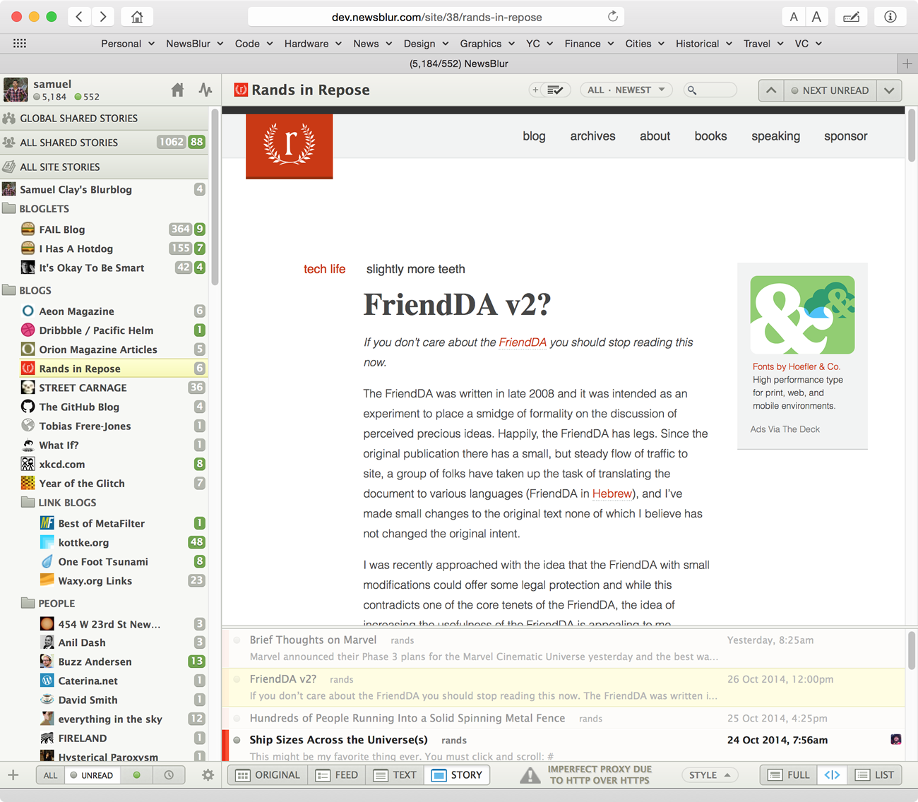
Today I’m launching a fix for this. It’s not perfect, but this will allow you to still get at some of the content while getting around the https-only issue. This feature will proxy http-only sites in the Story view, resulting in a hacked-together but workable view of the original story.
At best, the Story view will look like this:
At worst, the Story view will look like this:
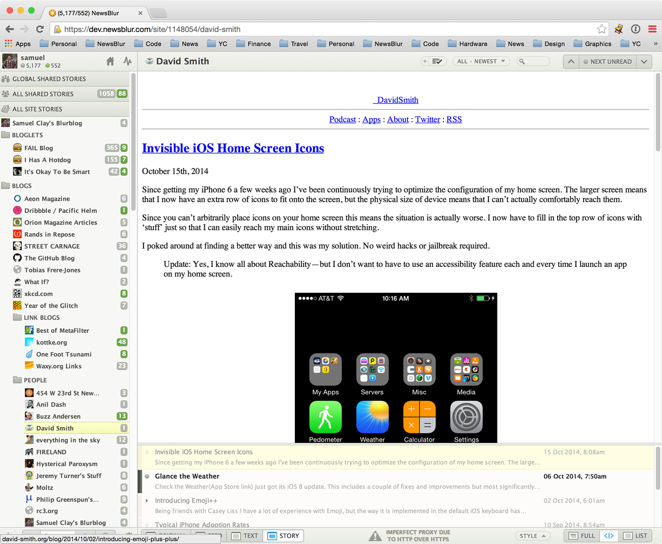
While it’s not ideal, it’s a whole lot better than a blank page. Let me know how this new proxied Story view works for you. And if you want it to work flawlessly and are willing to use an unencrypted connection, just use the http version of NewsBlur instead of the https version.
-
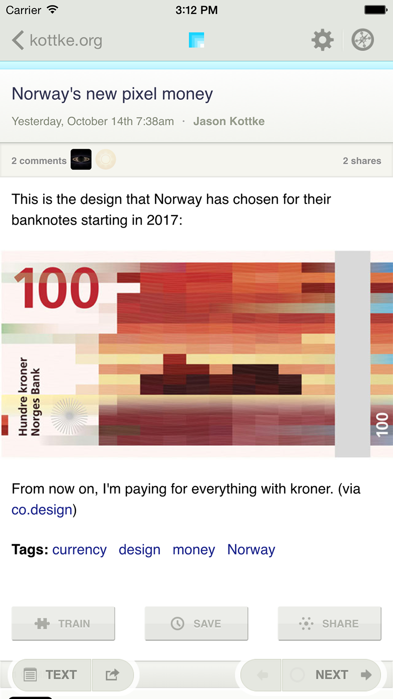
This week’s update to the official NewsBlur iOS app brings a whole lot of oft-requested features and improvements. Here’s what’s new this month:
<table cellspacing=”0” cellpadding=”0” border=”0”><tr><td>
 </td> <td>
  </td> </tr></table>
- iPhone 6 and 6 Plus are now fully supported
- iOS 8 is also now fully supported (as well as iOS 7)
- Moving between the feed list, story list, and story detail is now much faster
- Images are now “full bleed”, extending to the entire width of the screen
- New preference for hiding feeds after they are read
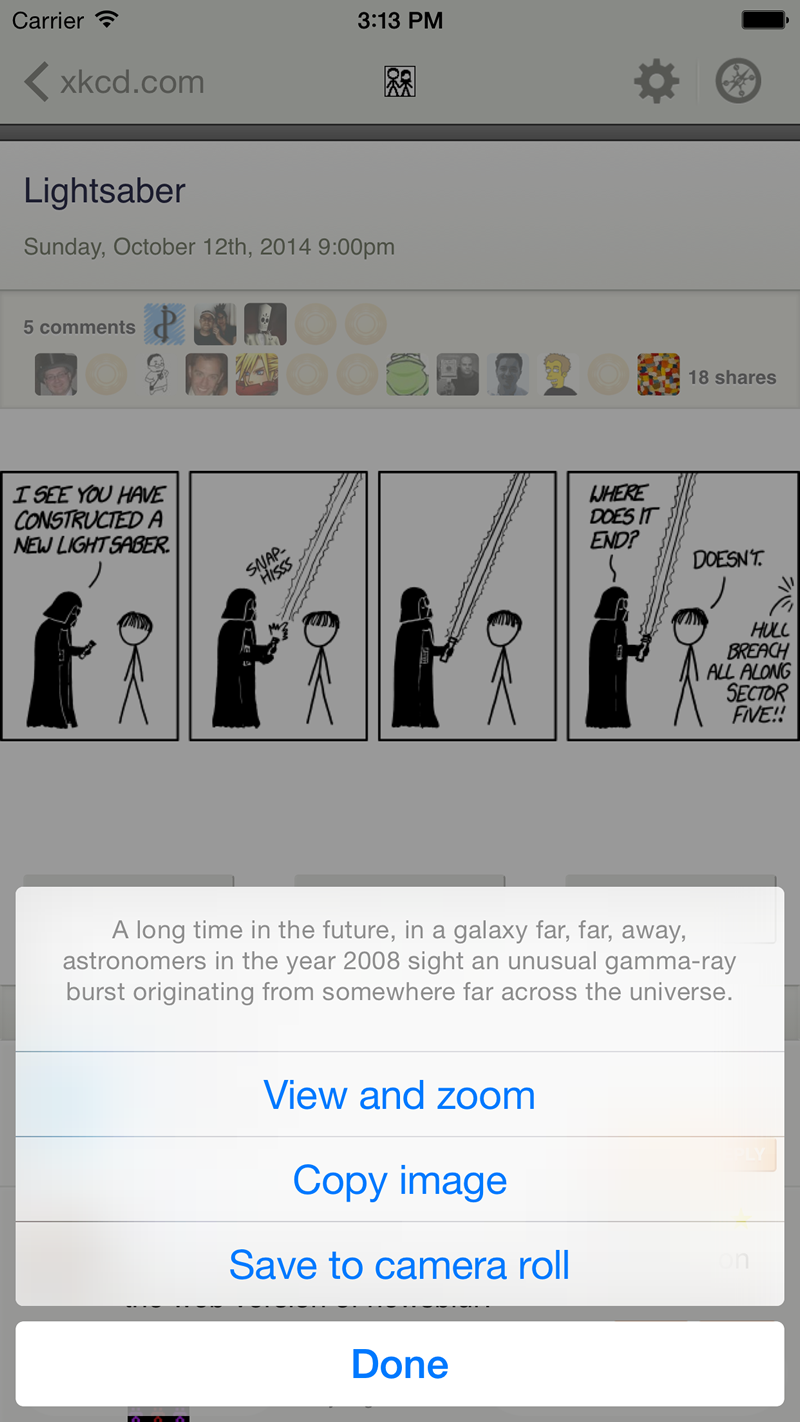
- Long press images in a story to read the alt text
- Long press images in a story to save it to your camera roll
- Long press images in a story to zoom into it
- Long press links in a story to get an actions menu (safari, instapaper, bookmark, etc)
- Fixed all iOS 8 issues (preference panes, profile popovers)
- OvershareKit updated for iOS 8
- Pull to refresh updated to match theme
- Pull to refresh date is now localized
Next to come will be a native iOS share dialog, saved story tag editing, search, and possibly some features requested by users like you. If you have a feature request, post it as an idea on the NewsBlur forum on Get Satisfaction.
-
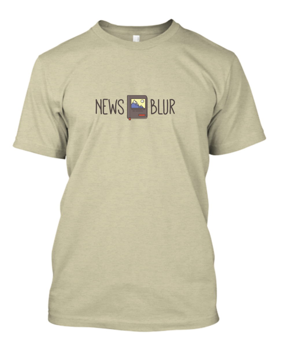
NewsBlur is more than just a website. It’s a daily link to the far away world. This t-shirt captures the essence of NewsBlur’s appeal. For those days when you’re planing adventures and reading about what’s happening where you’re not, NewsBlur is your guide.
Buy the 2014 NewsBlur t-shirt for only $16.30.
Unlike Teespring’s preview, the graphics on this t-shirt are crisp. And this t-shirt is being sold at cost. Also know that this is a premium blend t-shirt. That means it’s a bit stretchy and will make you look pretty good in a t-shirt. It will look great today and for years to come. Well, at least one year to come. If you wear this t-shirt as often as I’m planning to, it may only get a couple good years and then will have to come out only for special events. But then 2015’s NewsBlur t-shirt will be there for you.
This year’s t-shirt is designed by Meg Robichaud.
-
So many things can go wrong and often do, but I spend a good third of my time working on infrastructure, monitoring, and analytics so that they don’t.
Here’s what happened: At approximately 4:30pm PT feed fetching ceased. The feed fetchers were still working, which is why my monitors didn’t fire and alert anybody. But I have a second large Mongo database server used exclusively for collecting data about feeds being fetched. There are approximately 75 servers dedicated to feed fetching. These analytics look at average fetch times on a per task server basis. I use these analytics to ensure that my task servers are humming along, as they each use a ton of network, cpu, and memory.
This Mongo analytics servers works in a curious way. If you right-click on a feed and go to Statistics you’ll see the feed fetch history for a feed, stretching back a hundred fetches if the feed has had any issues in fetching. I keep these statistics on an analytics server separate from the regular Mongo server. I do this so that if the mongo analytics server goes down, everything will operate normally.
But the mongo server didn’t go down. It merely gave this error:
OperationError: Could not save document (Can't take a write lock while out of disk space)Mongo continues serving read queries while not allowing write queries. I didn’t plan for that! And it gets worse. The way MongoDB stores data is that is just keeps growing, even as you delete data. NewsBlur only saves the last few fetches, but deleting old fetches doesn’t give you back any disk space. Every other database server I use has an autovacuum process that takes care of this maintenance work (PostgreSQL, Redis, Elasticsearch, but not MongoDB). It’s unfortunate that this is yet another instance of MongoDB being the cause of downtime, even though the fault lies with me.
The server that is meant to only be used to ensure things are working correctly was itself the culprit for feeds no longer being fetched. This is the ironic part.

NewsBlur’s developer during happier times wearing the 2013 NewsBlur t-shirt in Big Sur
Now comes the painful part. On Wednesday morning (yesterday) I packed my car and headed down to Big Sur to go backpack camping for the first time. I’ve car camped plenty of times, but I felt confident enough to pack my sleeping bag and tent into a big bag and head ten miles into the woods of coastal California.
I headed out, away from cellular service, at 4pm PT, half an hour before the analytics server ran out of disk space. And then returned nearly 24 hours later to a bevy of alarmed tweets, emails, direct messages, and a voicemail letting me know that things were haywire.
But the real problem is that I set a vacation reply on both my personal and work email accounts to say that I’d be out until September 3rd. Now, I hired a firm to watch the servers while I’m at Burning Man starting this Saturday. But I figured I could get away with leaving the servers for twenty four hours. And I neglected to tweet out that I’d be gone for a day, so theories cropped up that I was injured, dead, or worse, ignoring the service.

Brittany, NewsBlur’s developer’s girlfriend, can handle any situation, including driving a hysterical developer three hours back to San Francisco without breaking a sweat.
If you’re wondering, I think about NewsBlur first thing in the morning and last thing at night when I check Twitter for mentions. It’s my life and I would never just give up on it. I just got cocky after a year and a half of nearly uninterrupted service. NewsBlur requires next to no maintenance, apart from handling support requests and building new features (and occasionally fixing old ones). So I figured what harm could 24 hours of away time be? Boy was I wrong.
If you made it this far then you probably care about NewsBlur’s future. I want to not only assure you that I will be building better monitoring to ensure this never happens again, but to also offer anybody who feels that they are not getting their money’s worth a refund. Even if you are months away from payment, if you aren’t completely satisfied and think NewsBlur’s just about the best thing to happen to RSS since Brent Simmons released NetNewsWire back in 2004, then I want to give you your money back and let you keep your premium account until it expires.
I would like to also mention how much I appreciate the more light-hearted tweets that I read while on the frenetic three hour drive back to San Francisco from Big Sur. I do this for all of your happiness. If I did it for the money I’d probably find a way to juice the data so that I could at least afford to hire an employee. This is a labor of love and your payment goes directly into supporting it.

Big Sur is where a good many new ideas are thought.
-
…S-Y-N-C-I-N-G.
First comes feeds, then comes training, then comes social for those days when its raining.
That’s not it! That’s not all! Runs on iOS and Mac, so have a ball!
The world’s most popular RSS feed reader now supports the world’s best RSS feed reader backend. Download Reeder 2 for Mac and iOS.
-
It was only a few months ago back in April that I launched the new font and style manager. Today I’m coming back to finish the job.
The style manager now has a new control for choosing the font size of feed titles and story titles.
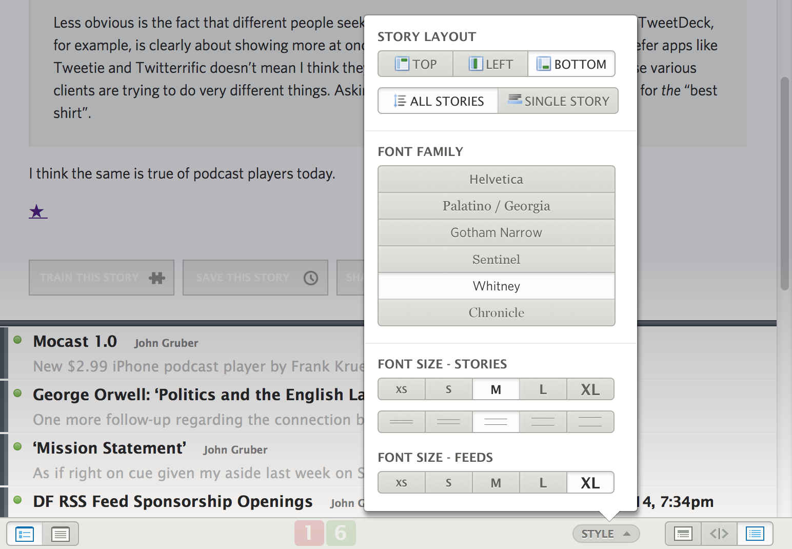
Choose from extra small to extra large. These new font sizes not only give you extra customization, but they allow you to have bigger touch sizes for folks using touch screen monitors.

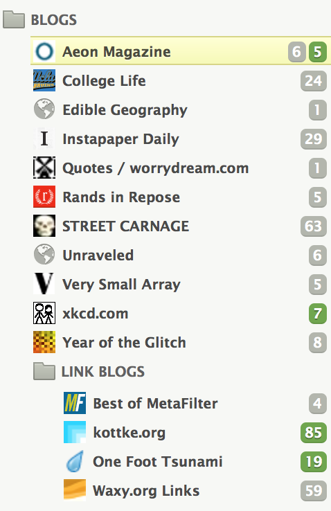
If you spot anywhere else that you’d like to see additional customization, please shout out to the @newsblur account on Twitter or post an idea on NewsBlur’s Get Satisfaction support site.
And please continue to talk about how much you use NewsBlur. Every tweet that talks positively about NewsBlur makes all of this work worthwhile.
-
Like it says on the tin, you can now go back and see what you’ve read with the Recently Read Stories feed. It’s on the bottom of your feed list, just above the saved stories.

This feed records all of the stories you’ve read in feeds, shared blurblogs, and even in feeds you’re not subscribed to. It does not record stories that are marked read as part of a mark all/previous as read action.
-
You can now temporarily turn off sites by going to Manage > Mute Sites. This is for those feeds you want to keep but ignore for a while.
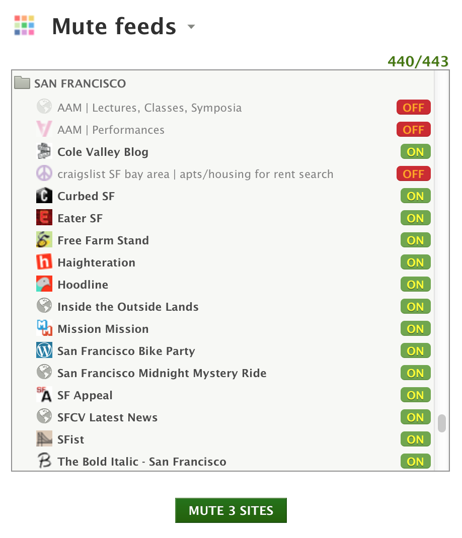
I use this to mute craigslist feeds that I no longer want to see in my unread stories list, but I want to keep just in case I need to perform a specific craigslist search without having to go through the whole process of recreating the RSS feed.
It’s also useful for subscribing to high volume sites and only reading them when you want to know what’s happening but without having to remember to re-subscribe. Such a simple feature but with a ton of utility.
-
After launching Saved Story Tagging earlier this year, I realized that there is an inherent categorization to every saved story: the site. But instead of just allowing you to search by site, I created a new view that you can now use to see stories saved by site.
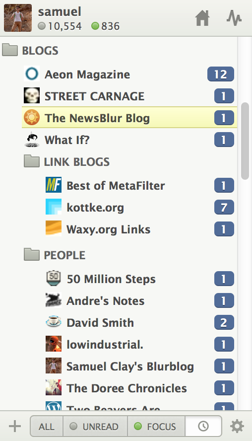
The neat thing about this new view is that it works for folders, too. If you click on a containing folder, you’ll see the saved stories from all of the sites inside that folder. And thanks to last month’s full text search, you can search all of these saved stories.
And you should expect that these features will eventually make their way to iOS and Android.
subscribe via RSS


