-
Some feeds I want to read every single story. Others I’m happy to skim once a week. And a few high-volume feeds I only check occasionally, so stories older than a day or two aren’t worth catching up on. Premium Archive subscribers get the site-wide “days of unread” setting, but it was too blunt, applying the same rule to everything. Now you can set how long stories stay unread on a per-feed and per-folder basis.
How it works
Open the feed options popover (click the gear icon in the feed header) and you’ll see a new “Auto Mark as Read” section. Choose how many days stories should remain unread before NewsBlur automatically marks them as read:

The slider goes from 1 day to 365 days, with a “never” zone at the far right for feeds where you truly want to read every story regardless of age. Choose “Default” to inherit from the parent folder or site-wide setting, “Days” to set a specific duration, or “Never” to disable auto-marking entirely.
Folder inheritance
Settings cascade down from folders to feeds. Set a folder to 7 days, and all feeds inside inherit that setting unless they have their own override. This is perfect for organizing feeds by how aggressively you want to age them out:
- Must Read folder: Set to “Never” so nothing ages out
- News folder: Set to 2 days since news gets stale fast
- Blogs folder: Set to 30 days for long-form content worth revisiting
- Individual feeds can still override their folder’s setting

The status text below the slider shows where the current setting comes from: the site-wide preference, a parent folder, or an explicit setting on this feed.
Site settings dialog
You can also configure auto-mark-read from the site settings dialog (right-click a feed and choose “Site settings”). The same controls are available there, redesigned to match the popover style.

Availability
Per-feed and per-folder auto-mark-as-read settings are a Premium Archive feature, available now on the web. They work alongside the existing site-wide “days of unread” preference in Manage → Preferences → General → Days of unreads, which is also a Premium Archive feature.
If you have feedback or ideas for improvements, please share them on the NewsBlur forum.
-
The Intelligence Trainer is one of NewsBlur’s most powerful features. It lets you train on authors, tags, titles, and text to automatically sort stories into Focus, Unread, or Hidden. But until now, there were limits—you couldn’t train on URLs, regex support was something power users had been requesting for years, and managing hundreds of classifiers meant clicking through feeds one by one.
Today I’m launching three major improvements: URL classifiers, regex mode for power users, and a completely redesigned Manage Training tab.
Train on URLs
You can now train on story permalink URLs, not just titles and content. This opens up new filtering possibilities based on URL patterns.
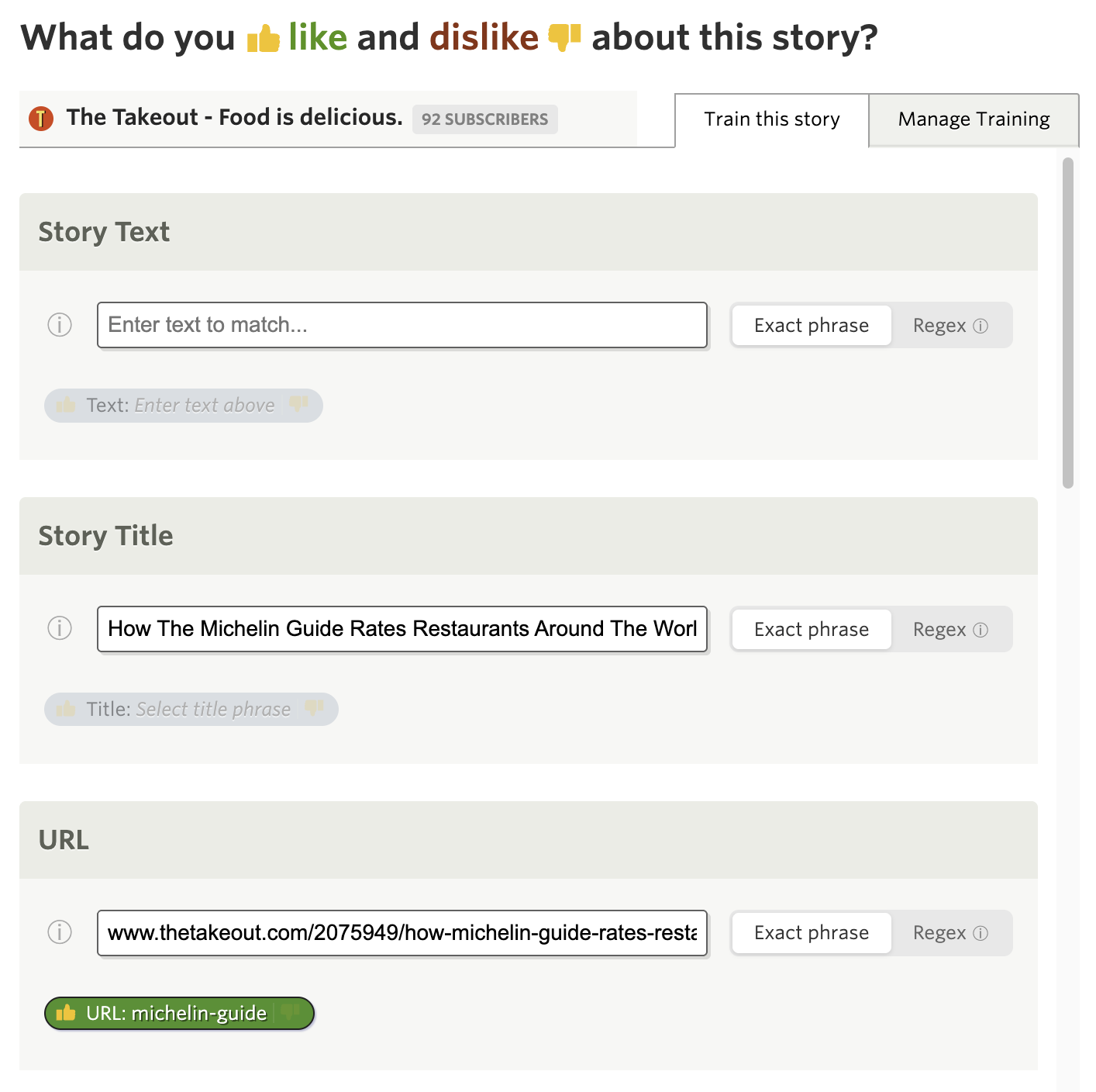
The URL classifier matches against the full story permalink. Some use cases:
- Filter by URL path: Like or dislike stories that contain
/sponsored/or/opinion/in their URL - Domain sections: Match specific subdomains or URL segments that indicate content types
- Landing pages vs articles: Some feeds include both—filter by URL structure to show only what you want
URL classifiers support both exact phrase matching and regex mode. The exact phrase match is available to Premium subscribers, while regex mode requires Premium Pro.
When a URL classifier matches, you’ll see the matched portion highlighted directly in the story header, so you always know why a story was filtered.
Regex matching for power users
For years, the text classifier only supported exact phrase matching. If you wanted to match “iPhone” and “iPad” you needed two separate classifiers. Now you can use regex patterns in the Title, Text, and URL classifiers.
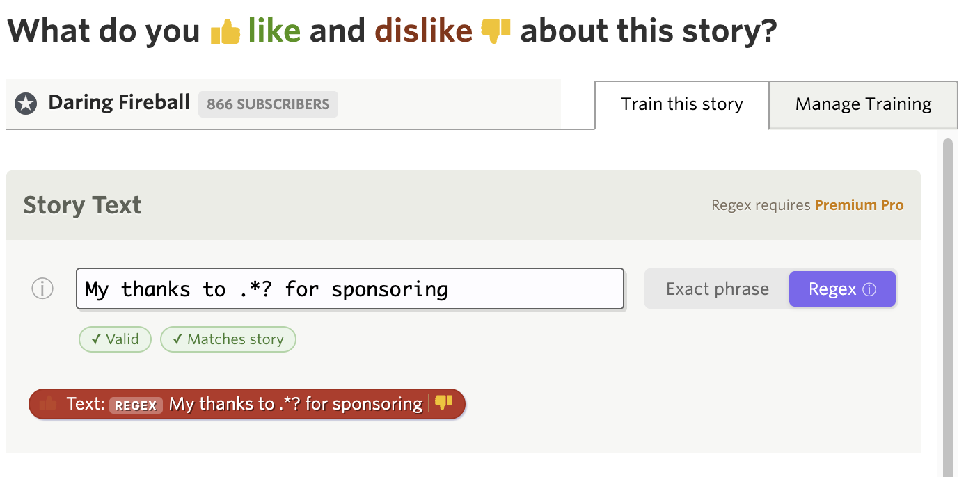
A segmented control lets you switch between “Exact phrase” and “Regex” mode. In regex mode, you get access to the full power of regular expressions:
- Word boundaries (
\b): Match\bapple\bto find “apple” but not “pineapple” - Alternation (
|): MatchiPhone|iPad|Macin a single classifier - Optional characters (
?): Matchcolou?rto find both “color” and “colour” - Anchors (
^and$): Match patterns at the start or end of text - Character classes: Match
[0-9]+for any number sequence
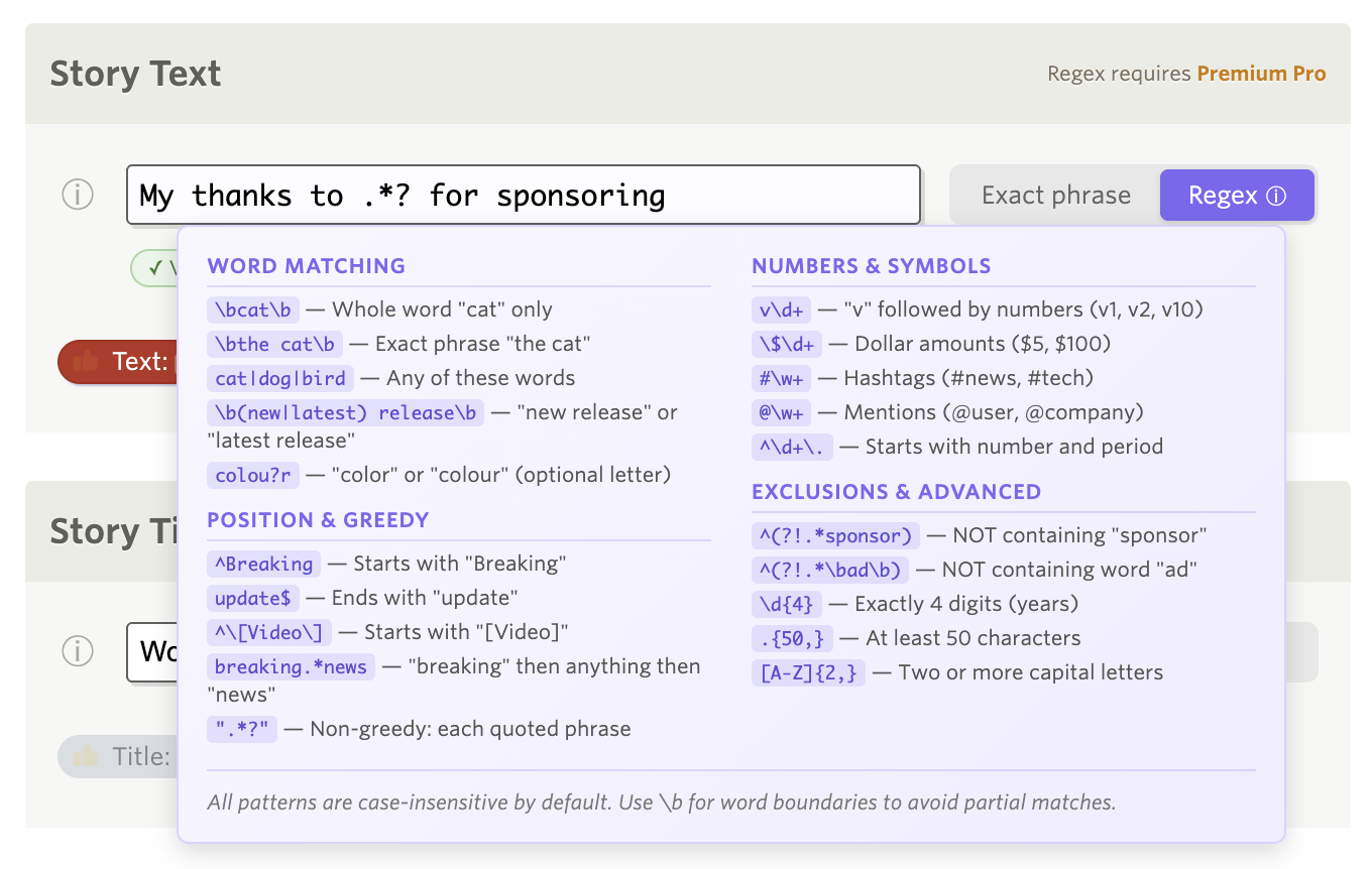
A built-in help popover explains regex syntax with practical examples. The trainer validates your regex in real-time and shows helpful error messages if the pattern is invalid.
Regex matching is case-insensitive, so
applematches “Apple”, “APPLE”, and “apple”. This mode is available to Premium Pro subscribers.Manage all your training in one place
Over the years you may have trained NewsBlur on hundreds of authors, tags, and titles across dozens of feeds. But when you wanted to review what you’d trained, you had to open each feed’s trainer individually and click through them one by one.
The new Manage Training tab provides a consolidated view of every classifier you’ve ever trained, organized by folder. You can see everything at a glance, edit inline, and save changes across multiple feeds in a single click.
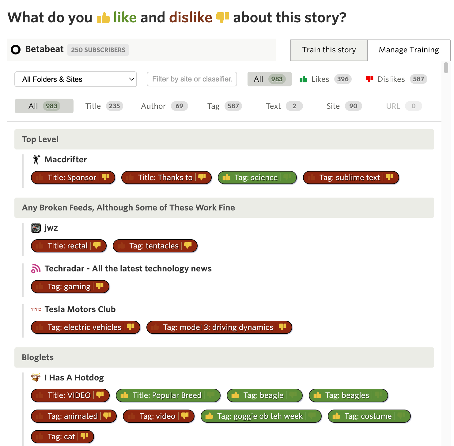
Open the Intelligence Trainer from the sidebar menu (or press the
tkey). You’ll now see two tabs at the top: “Site by Site” and “Manage Training”. The Manage Training tab is available everywhere you train—from the story trainer, feed trainer, or the main Intelligence Trainer dialog.The Site by Site tab is the existing trainer you know—it walks you through each feed showing authors, tags, and titles you can train. That’s still the best way to train new feeds with lots of suggestions.
The Manage Training tab shows only what you’ve already trained. Every thumbs up and thumbs down you’ve ever given, organized by folder just like your feed list. Each feed shows its trained classifiers as pills you can click to toggle.
Filtering made easy
The real power comes from the filtering options. At the top of the tab you’ll find several ways to narrow down your training:
Folder/Site dropdown — Only folders and sites with training appear in this dropdown. Select a folder to see all training within it, or select a specific site to focus on just that feed’s classifiers. This is especially useful when you have hundreds of trained items and want to review just one area.
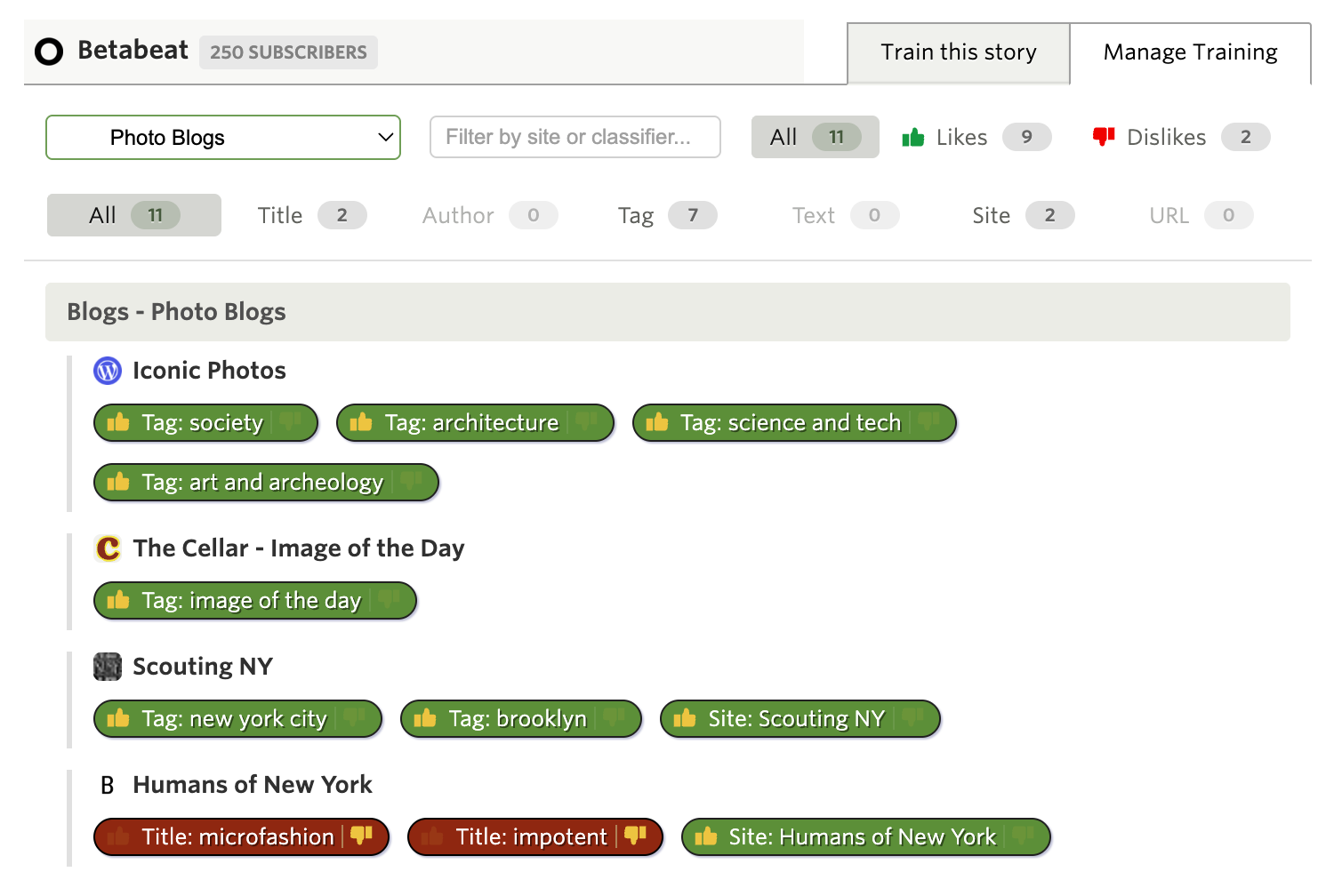
Instant search — Type in the search box and results filter as you type. Search matches against classifier names, feed titles, and folder names. Looking for everything you’ve trained about “apple”? Just type it and see all matches instantly.
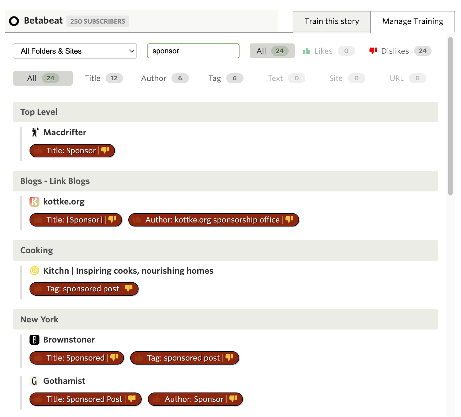
Likes and Dislikes — Toggle between All, Likes only, or Dislikes only. Want to see everything you’ve marked as disliked? One click shows you all the red thumbs-down items across your entire training history.
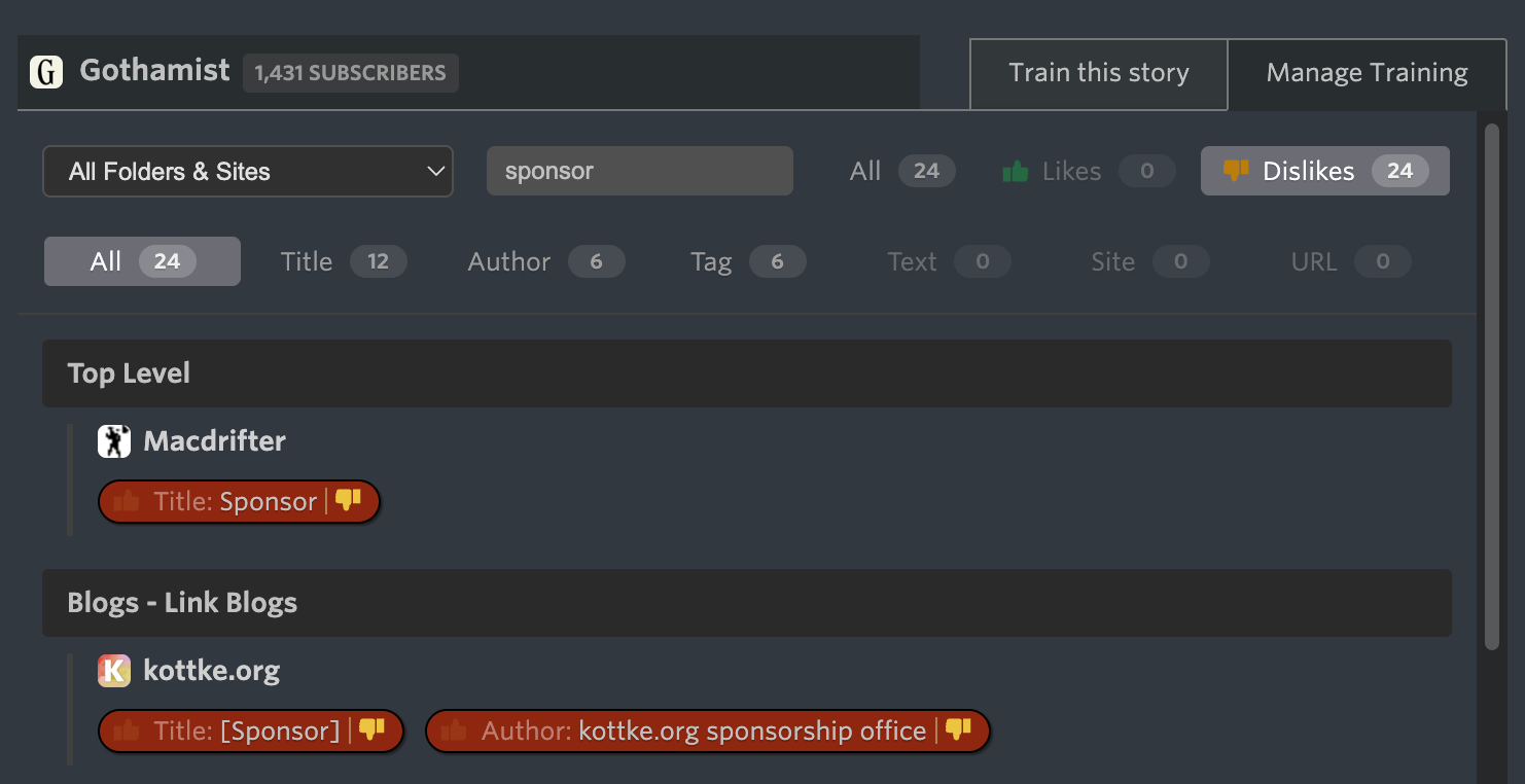
Type filters — Filter by classifier type: Title, Author, Tag, Text, URL, or Site. These are multi-select, so you can show just Authors and Tags while hiding everything else. Perfect for when you want to audit just the authors you’ve trained across all your feeds.
Edit inline and save in bulk
Click any classifier pill to toggle it between like, dislike, and neutral. The Save button shows exactly how many changes you’ve made, so you always know what’s pending. Made a mistake? Just click again to undo—the count updates automatically.
When you click Save, all your changes across all feeds are saved in a single request. No more clicking through feeds one at a time to clean up old training.
Subscription tiers
Feature Tier Required Title/Author/Tag/Feed classifiers Free Manage Training tab Free URL classifiers (exact phrase) Premium Text classifiers (exact phrase) Premium Archive Regex mode (Title, Text, URL) Premium Pro All three features are available now on the web. If you have feedback or ideas for improvements, please share them on the NewsBlur forum.
- Filter by URL path: Like or dislike stories that contain
-
Sometimes I open a story and realize I’m late to the party. Maybe it’s the fourth article in a saga I haven’t followed, maybe it name-drops people I should know, or maybe it’s dense and I just want the gist. Ask AI fills in those gaps. You can ask about any story in NewsBlur and get quick answers from the model you prefer.
How it works
Select a story and click Ask AI in the story toolbar. You’ll see quick options for getting information about the story.

Not interested? Turn it off
I know AI features aren’t for everyone. If you’d rather not see Ask AI at all, you can hide it completely. Go to Manage → Preferences → Stories and toggle off “Show Ask AI button.” The button disappears from your toolbar and you’ll never be bothered by it again. NewsBlur has always been about giving you control over your reading experience, and this is no different.
Presets for common questions
At the top of the menu, you can summarize the story in three flavors: a single sentence, bullet points, or a full paragraph. Below that are presets I use most often:
- What’s the context and background? — Fills in backstory you might have missed
- Identify key people and relationships — Who are all these names and how do they connect?
- What are the main arguments? — For opinion pieces or debates, cuts to what each side is saying
- Fact check this story — Flags claims that look worth verifying
Or just type whatever you’re curious about.
Speak your question
See that microphone button? Click it and say your question out loud. NewsBlur uses OpenAI’s Whisper to transcribe your voice, so you can keep reading without typing. Handy when you’re on the couch and don’t want to pull out the keyboard.
Pick your model
Different models have different strengths. NewsBlur lets you pick from:
- Claude Opus 4.5 — The default, most capable model from Anthropic
- GPT 5.2 — OpenAI’s latest
- Gemini 3 Pro — Google’s offering
- Grok 4.1 Fast — xAI’s speedy option

NewsBlur remembers your choice across sessions and devices. If a reply feels off, re-ask with a different model — they each have their own style.
Keep the conversation going
After the first answer, ask follow-ups. NewsBlur keeps the conversation context so you can dig deeper or ask for a clarification. It’s meant to be a back-and-forth, not a one-shot.

Your data stays yours
Your stories and questions are sent to the AI provider you choose to generate a response, but that’s it. NewsBlur doesn’t use your reading data or questions to train models or for any other purpose. The AI providers’ standard privacy policies apply, but NewsBlur itself treats your Ask AI usage the same as any other part of your reading experience — it’s your data, not ours.
Availability
Ask AI is live on the web. Here’s how many questions you get:
- Premium Archive: 100 questions per day
- Premium + Free: 1 question per week
Premium Archive limits reset daily at midnight in your local timezone. Premium and free limits reset weekly on Sunday.
If you’re not yet a Premium Archive subscriber, you can upgrade on the web to get the full Ask AI experience along with unlimited story archiving and full-text search.
As always, I’d love to hear what you think on the NewsBlur forum. If you have ideas for new preset questions or ways to make Ask AI more useful, let me know.
-
A common feature request over the years has been the ability to turn off NewsBlur’s social features entirely. For readers who just want to focus on their feeds without blurblogs, shared stories, or public comments, this is now possible with a single preference.

Head to Preferences > Feeds and look for the new “Sharing” option at the bottom. Choose “Disable social features” and all sharing, comments, and blurblog features will be hidden from your NewsBlur interface. The Global Shared Stories folder disappears, share buttons are removed from stories, and the sidebar is cleaned up. If you ever want to re-enable social features, just flip the preference back.
-
I have a lot of folders. Over the years I’ve organized my feeds into categories like News, Tech, Cooking, and Comics. But when I’m scanning my feed list, they all look the same—just folder icons with text. I wanted a way to make certain folders stand out at a glance, especially the ones I check most often.
That’s why I built custom icons for both folders and feeds. You can now personalize any folder or feed with an emoji, a preset icon in any color, or even upload your own image.
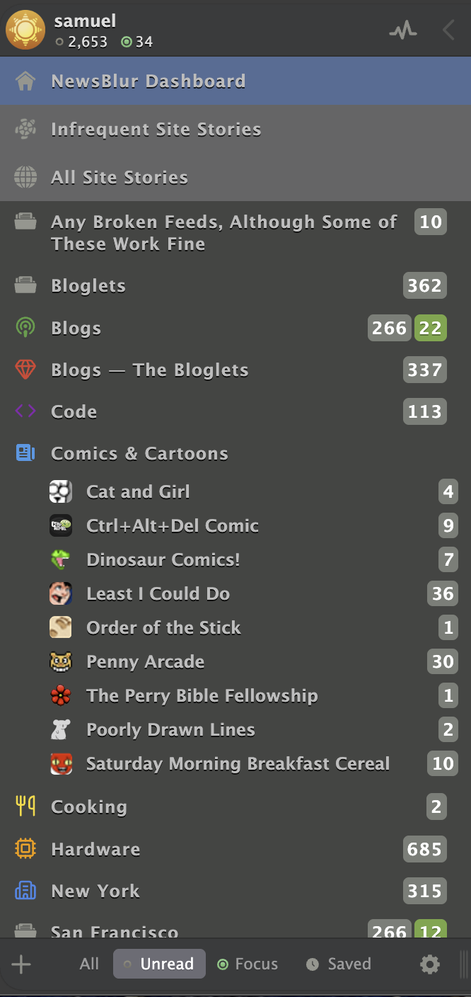
How it works
Right-click on any folder or feed in your feed list and select “Folder settings” or “Site settings”. You’ll see a new “Folder Icon” or “Feed Icon” tab where you can customize the icon.
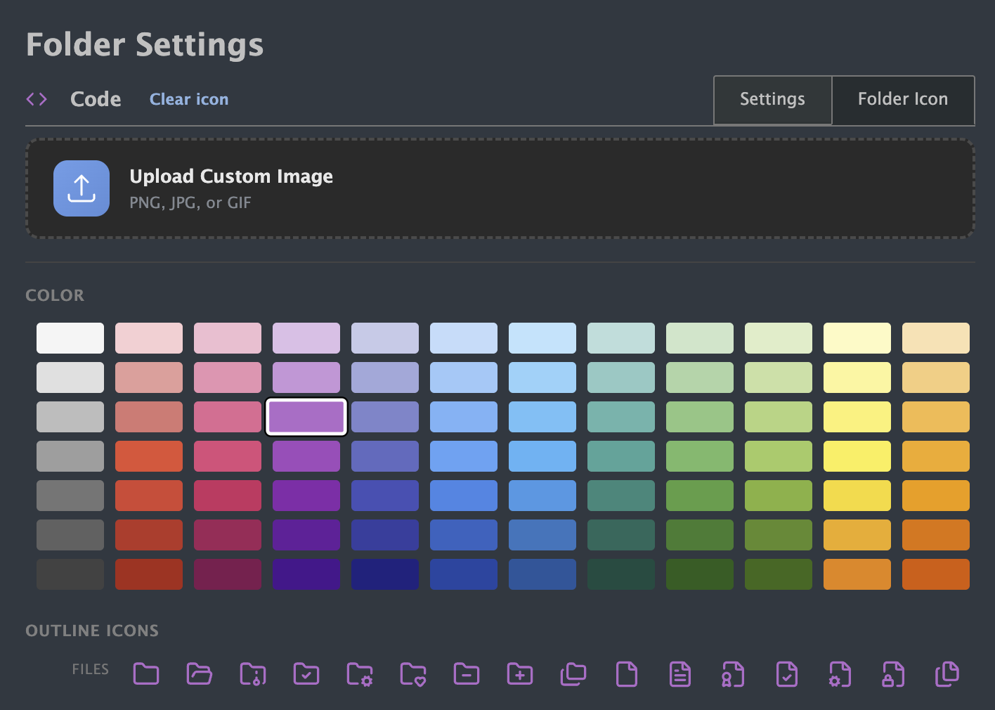
There are three ways to set a custom icon:
Preset icons: Pick from over 240 icons (a mix of outline and filled styles) and colorize them with any of 84 colors organized by hue. Want a red heart for your favorites folder? A blue code bracket for programming feeds? It’s all there.
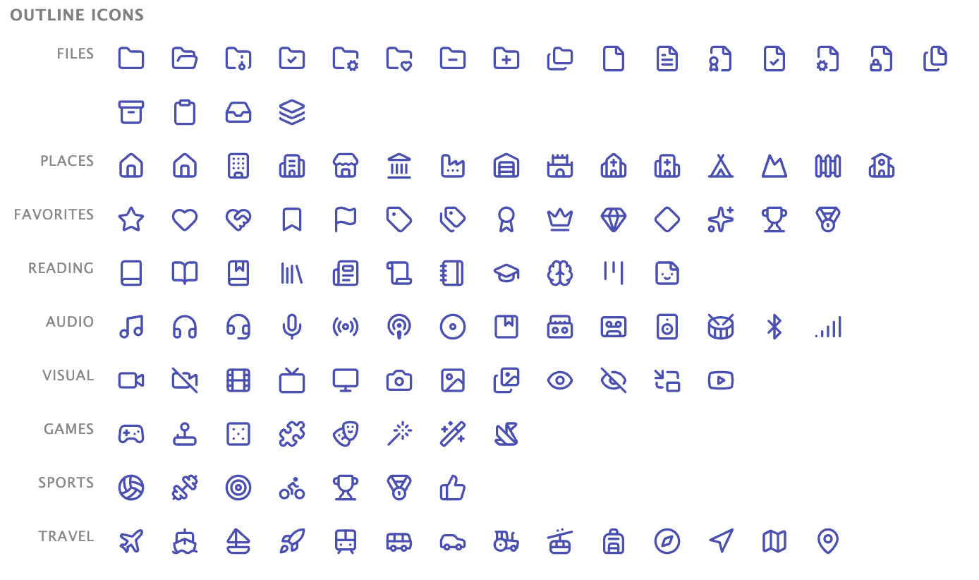
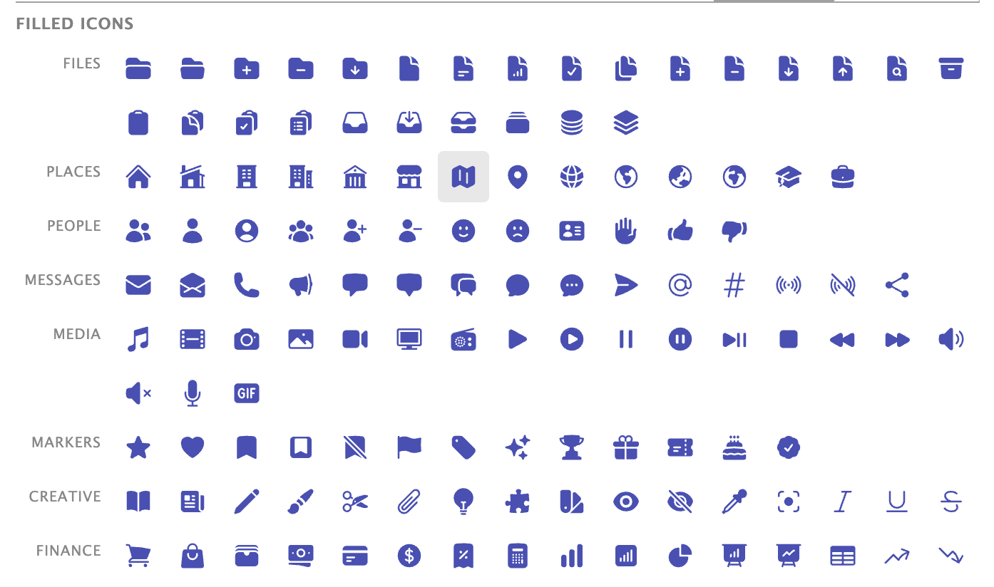
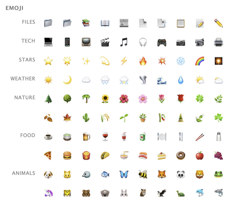
Emoji: Choose from 180 emojis organized by category. A basketball for sports feeds, a fork and knife for cooking, a newspaper for news—you get the idea.
Upload your own: Have a specific image in mind? Upload any image and it will be automatically resized to fit perfectly in your feed list.

Great for feeds without icons
Many feeds don’t have favicons, or they have generic RSS icons that all look the same. Custom feed icons let you give these feeds distinctive icons so you can spot them instantly. I’ve been using this to add icons to older blogs and newsletters that never bothered setting up a proper favicon.
Custom icons are available now on the web for all NewsBlur users. Folders and feeds both support the same icon options of emoji, preset icons with colors, or uploaded images.
If you have feedback or ideas for additional icon options, please share them on the NewsBlur forum.
-
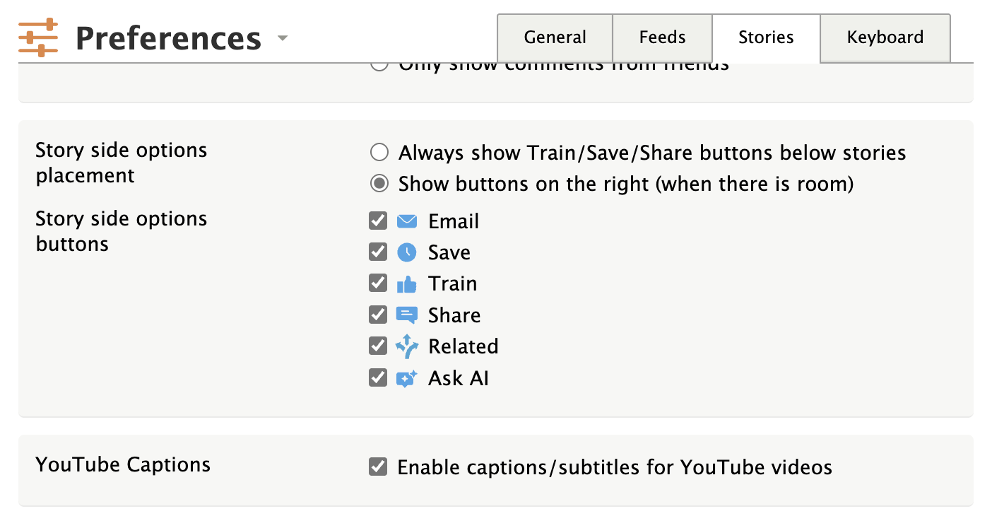
You can now automatically enable captions on YouTube videos embedded in your feeds. Head to Preferences > Stories and check the new “YouTube Captions” option.
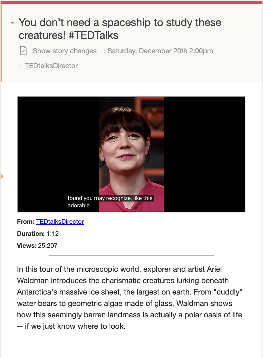
When enabled, any YouTube video in any story will automatically show captions when you start playing it (assuming the video has captions available). This is great for watching videos in noisy environments, for accessibility, or for following along in a language you’re learning.
This works by adding the
cc_load_policy=1parameter to YouTube embed URLs on-the-fly, so it applies to all your feeds without modifying the original content. The preference is off by default, so existing behavior is unchanged unless you opt in. -
Today we’re launching text-based intelligence classifiers, a powerful new way to train NewsBlur to show you exactly what you want to read. You’ve always been able to train NewsBlur’s intelligence using story titles, authors, tags, and publishers. Now you can train on any phrase that appears in the full text of a story. This feature is available exclusively to NewsBlur Premium Archive subscribers.
Text-based classifiers work just like the intelligence training you’re already familiar with. Find a phrase you care about, mark it as something you like or dislike, and NewsBlur will automatically highlight or hide future stories containing that phrase. Stories with phrases you like are marked with a green focus indicator, while stories with phrases you dislike are hidden unless you choose to view them.
How to use text-based classifiers
Reading a story and spot a phrase you want to see more of? Simply select the text with your mouse or trackpad, then click the “Train” button that appears.

This opens the intelligence trainer where you can mark the selected text as something you like (thumbs up) or dislike (thumbs down). The text classifier appears at the top of the trainer dialog, ready for you to train.

Once you’ve trained a text phrase, NewsBlur will automatically scan the full text of every story from that feed. Stories containing your phrase will be highlighted with a green focus indicator in your story list, making them easy to spot. You can also see the phrase highlighted throughout the story content itself.

Real-world examples
Text-based classifiers shine when you subscribe to broad-interest feeds but only care about specific topics. Here are some examples:
- Subscribe to a food blog that covers everything, but only want to read about vegan recipes? Train on “vegan” and similar terms.
- Reading a tech blog that writes about many frameworks, but you only want stories about your favorite language? Train on that language name.
- Following a news site with mixed content, but only interested in stories about a specific region or topic? Train on location names or topic keywords.
Since text classifiers work on the full article text and not just titles, they catch stories that might not mention your interest in the headline but discuss it in depth within the article.
Green always wins
Just like with other intelligence classifiers, green (focus) always wins. If a story matches both a phrase you like and a phrase you dislike, NewsBlur will mark it as focus and show it in your unread count. This ensures you never miss a story about something you care about, even if it also contains topics you’re less interested in.
You can view your focus stories by choosing between Unread and Focus at the bottom of the feed list. Set it to Focus to show only green stories and see everything NewsBlur knows you want to read.
Why Premium Archive only?
Text-based classifiers require scanning the full article content of every story, not just the RSS feed excerpt. The Premium Archive subscription ensures every story is fetched, archived, and available for full-text search and classification. This means your text classifiers work on every story from every feed you subscribe to, with no gaps in coverage.
The Premium Archive subscription also includes unlimited story archiving, the ability to mark any story as unread forever, full-text search across your entire archive, and the discover stories feature for finding related content across all your feeds.
Available now on the web
Text-based classifiers are available now to all Premium Archive subscribers on the web. Simply highlight any phrase in a story, click the “Train” button, and start training. iOS and Android support is coming soon.
If you’re not yet a Premium Archive subscriber and want to unlock text-based intelligence training along with unlimited archiving and advanced search, you can upgrade directly on the web.
As always, we’d love to hear your feedback on the NewsBlur forum. For every person who shares their thoughts, there are a dozen others thinking the same thing, so your input helps shape where NewsBlur goes next.
-
A few days ago was my five year wedding anniversary. I wanted to see the news from exactly five years ago, which I had clearly missed because I was not checking my phone that day. That’s where the new date filter feature comes in handy.
You can now filter stories by date range, filtering stories down to only those newer or older than some date or between some timespan. This works on individual feeds and as well as on folders, saved stories, and read stories.

The date filter lives in the feed options popover, right where you’d expect it next to other feed filtering and ordering options. You’ll see the new “Filter by date range” section with two sections: “Newer” and “Older”.
Each column has a date input field where you can manually enter a date, or use the quick duration buttons for common time ranges. Want to see the past week? Click “1w” under “Newer”. Want to see stories from a specific month? Set the “Newer” and “Older” dates to bracket that month.
This feature is particularly useful when you’re catching up after being away, or when you want to research how some event in the past was covered. Combined with NewsBlur’s full-text search, you can now both search for topics and filter by when they were published. And of course the recently launched Discover feature lets you see related stories and related feeds to follow interesting bunny trails.
The date filters work across all of NewsBlur’s views - individual feeds, folders, saved stories, and the river of news. The filters don’t persist between feeds, so you can set different date ranges for different feeds without the settings interfering with each other.
If you have any feedback or ideas for improvements, please share them on the NewsBlur forum.
-
I want to introduce you to the new Discover Stories and Discover Sites features. Sometimes you’re reading a story and want to know everything there is to know about that topic. You want other stories, but depending on the topic, you might want them from the same site, from similar sites, or from all of your subscriptions. That’s the new Discover Stories feature, and it’s only for NewsBlur Premium Archive subscribers. The Premium Archive subscription is meant for this use case of being able to peer deeply into your story archive and not just what’s been published in the last month.
Second I’m introducing Discover Sites, which is available at the top of every feed and folder to everybody, both free and premium users. Having tried all of the competing discover sites features, I built the popover dialog that has all the features I wanted. It’s an infinite scroll of related sites, showing the most recent five stories, formatted exactly as your story titles are personally styled. You can read stories from unsubscribed feeds and easily subscribe to them while scrolling through the discover stories dialog.
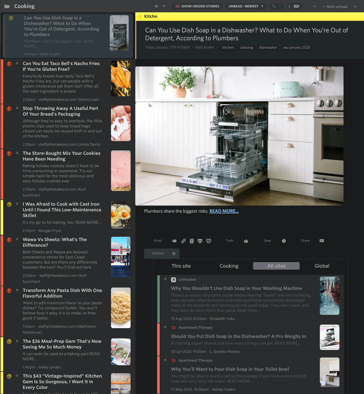
Here’s a set of features I’ve been wanting to build since the very first days of NewsBlur in 2009. I built prototypes of this feature using a few of the modern text tools at the time: nltk (the natural language toolkit), support vector machines, and LDA (Latent Dirichlet Allocation) to group stories by topic. It didn’t work, or it was too slow, and even then not accurate enough. I read the tea leaves and could tell a better tool would come out eventually that was basically a drop-in classifier and topic grouper. Out came word embeddings (word2vec initially, then sentence transformers). And now those transformers are available basically for free.
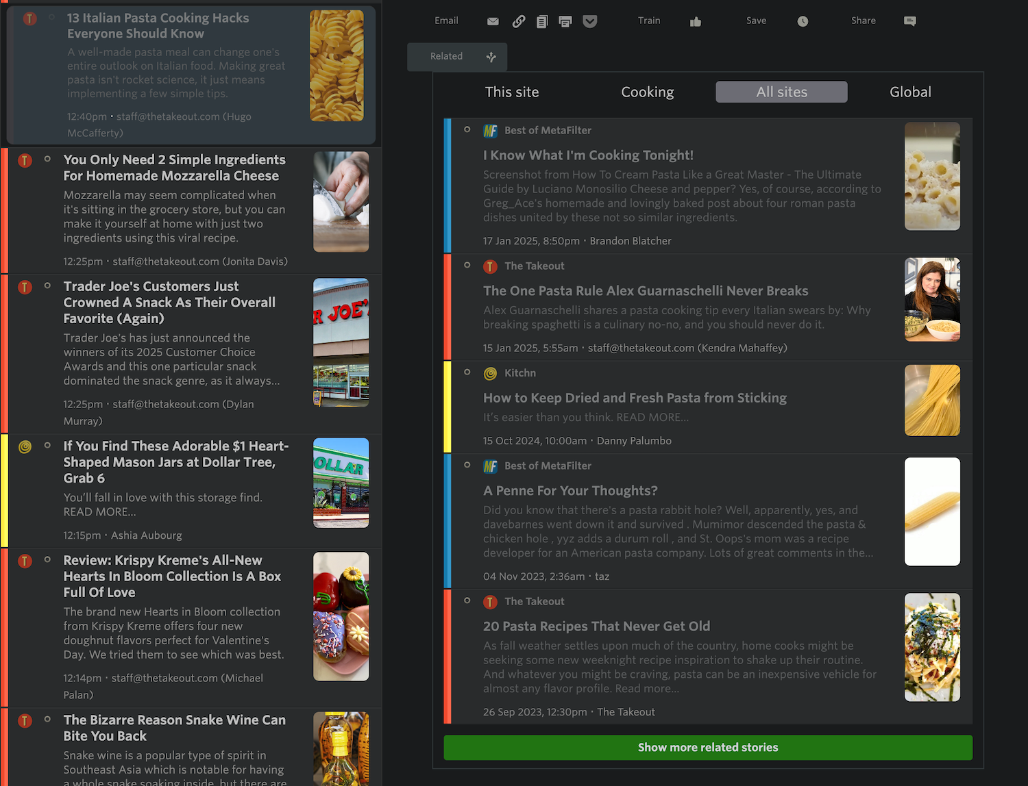
As you can see, this isn’t your normal related stories feature. It shows all of the related stories, segmented by the folders that a site is a part of. This folder control allows you to filter down to an individual site and up to every feed you subscribe to when finding related stories.
And it’s important to note that none of the data presented in the Discover Stories or Discover Sites dialog is trained on your personal data, like feeds that other people subscribe to in relation to any particular site. All of the data is extracted and grouped by the content of the RSS feed’s title, description, and the titles of the first few stories.
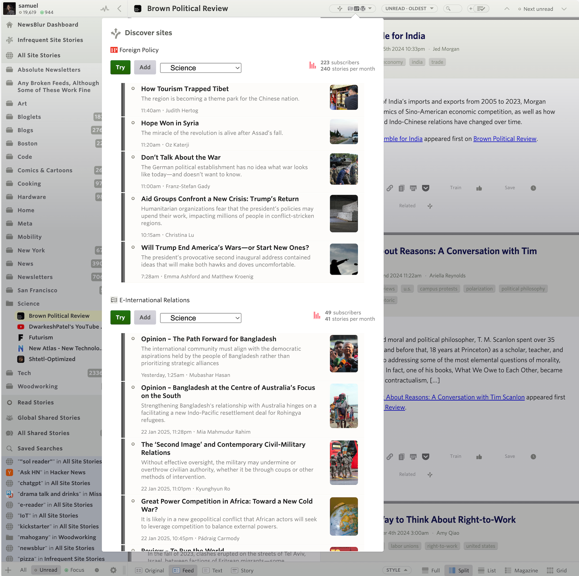
Above we see that Discover Sites is right on the money. An infinite scroll of related sites, showing story previews, and multiple interaction points that let you choose between trying out a site by reading one of the stories, adding it directly to a folder, or checking the statistics of the site. The stats dialog is great in this case because it gives you a feel for what other people like and dislike about the site.
I’m super proud of this release; it took years to build and a decade to plan. And while the Discover Stories feature is technically only available to Premium Archive subscribers, you can see related stories if another Premium Archive subscriber is subscribed to that site. I don’t think hiding those stories from free and premium users is worthwhile.
Please post your feedback on the NewsBlur forum, ideally as an “idea,” but you know I love responding to all feedback. For every person who writes up their thoughts on the forum, there are ten people who are thinking the same thing, so it’s worthwhile to hear from you, knowing the multiplier it represents.
-
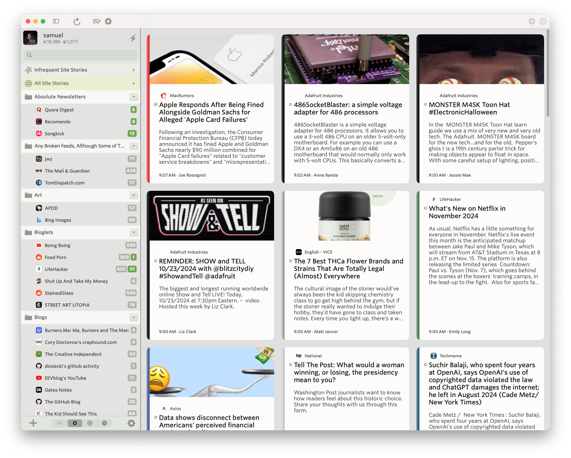
If you’re like me and like to have NewsBlur sitting open all day, then you’ll love the new NewsBlur macOS app. It’s a first-class app that supports all of NewsBlur’s features, from intelligence training to sharing/blurblogs.
Introducing the NewsBlur macOS app, available for free on the Mac App Store.
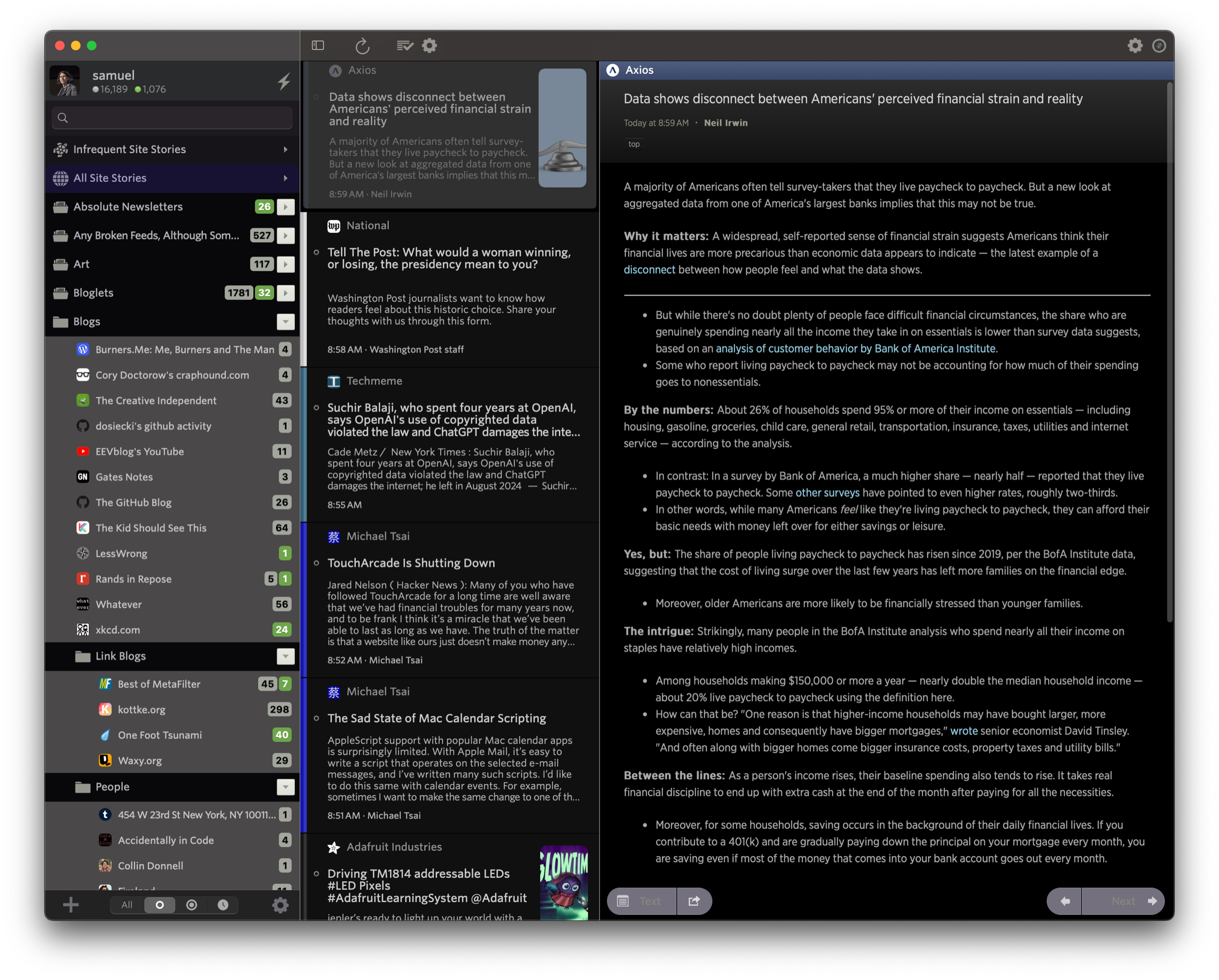
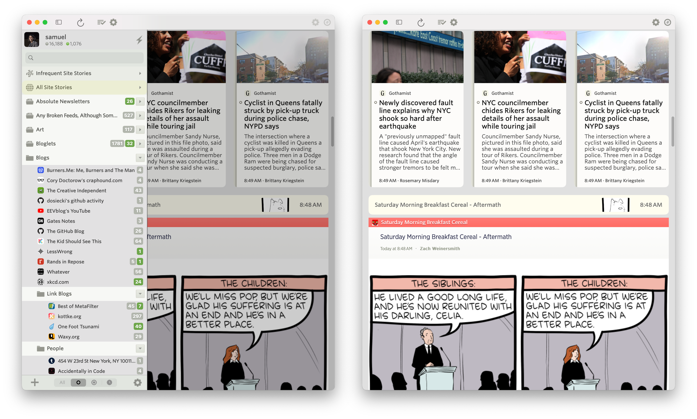
The macOS app also supports all of the themes, so it can turn itself into dark mode automatically.
It’s configurable and supports ay=utomatic hiding and showing of the feed list so you can focus on the stories you want to read. Use your mouse to swipe left and right on both stories and to swap which pane is visible.
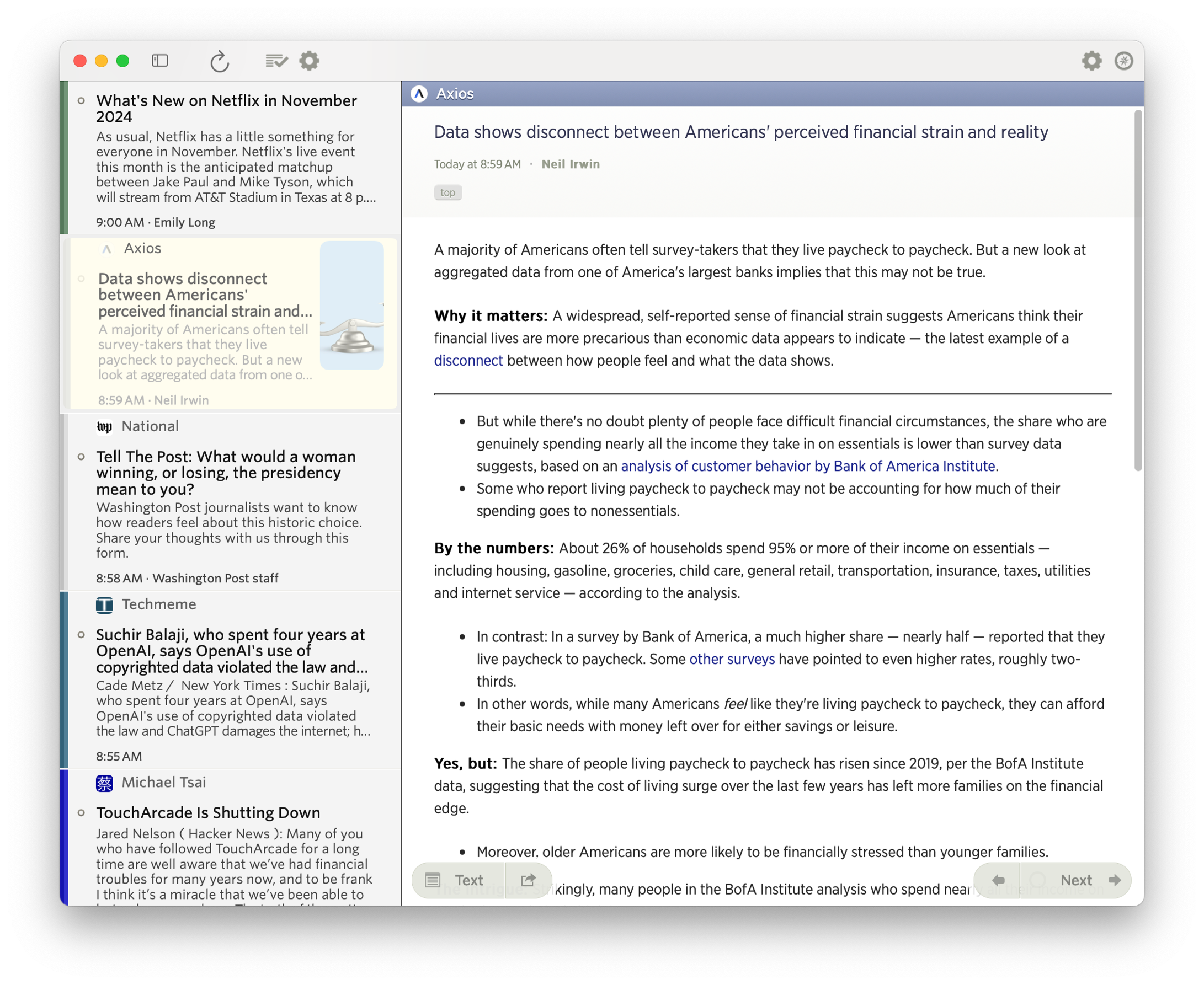
In the Grid view, you can swipe right with your mouse to temporarily show the feed list, giving you a compact view of your news stories without having to give up screen real estate.
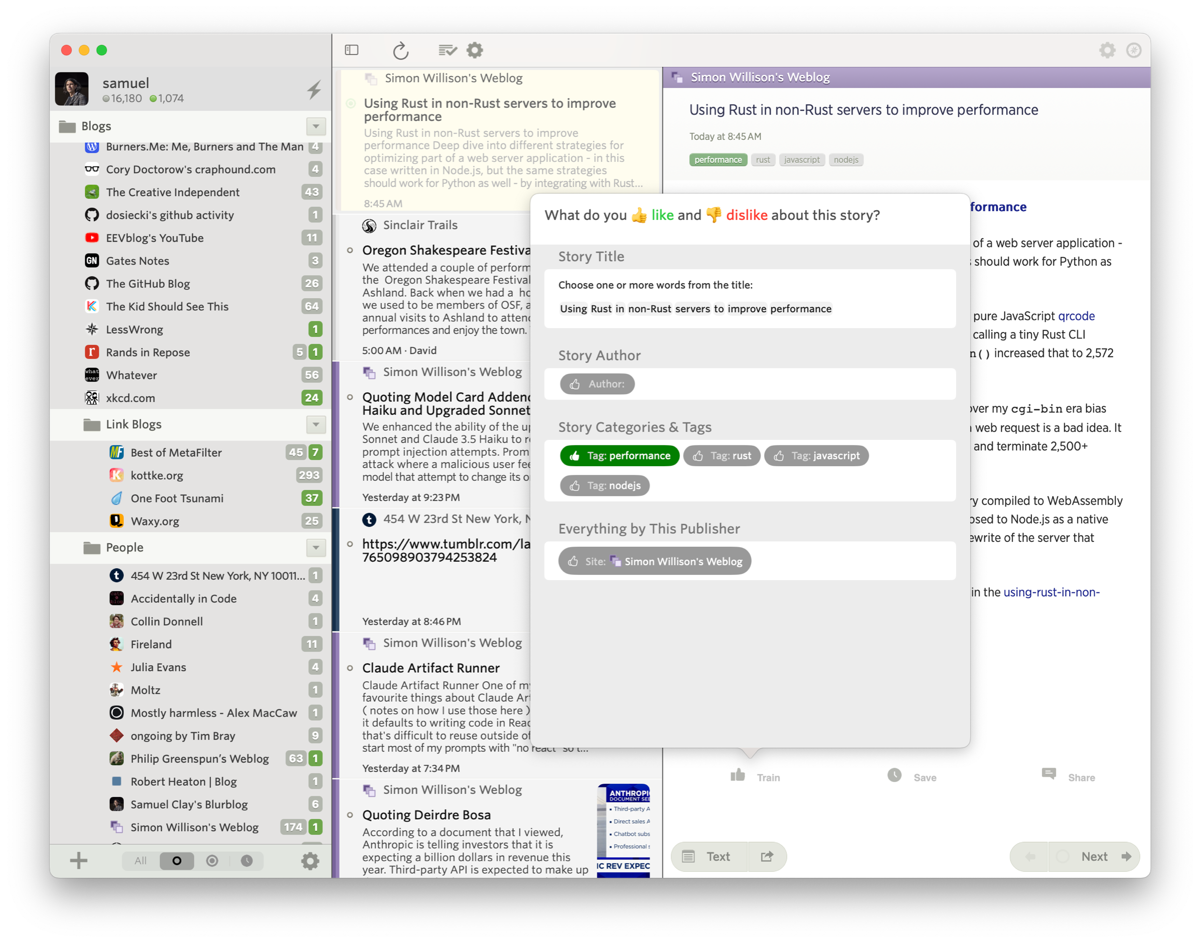
Training is supported natively, so you can hide those stories you don’t want to see while highlighting those thast you do.
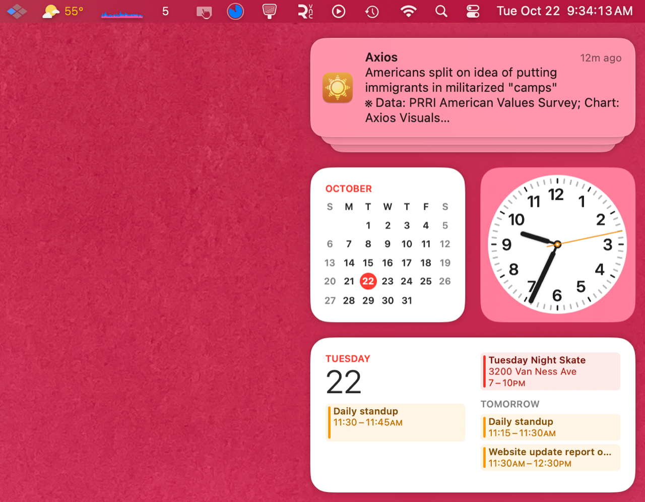
It’s important to be able to train, because you can set notifications to be sent from either your Unread list or your Focus list, ensuring you only see the notifications from sites you want to see. And clicking on those native macOS notifications takes you directly to the story in the new macOS app.
If you have any ideas you’d like to see on macOS, feel free to post an idea on the NewsBlur Forum.
Coming up soon are the discover feeds feature, where you can see related feeds based purely on semantic similarity (and not based on mined usage data), as well as real-time updates to the macOS app similar to the dashboard on the web.
subscribe via RSS
