-
It’s been three years to the day that Google Reader shut down. And here’s a feature they could never build. Introducing email newsletters in your RSS reader.
You can now forward your email newsletters over to NewsBlur and then read your email newsletters right in your browser/phone/TV/tablet. A couple dozen users have been beta testing this feature for the last couple of months and everybody agrees, this feature is amazing.

Newsletters are formatted to fit all of your screens, so it looks just as good on the web as it does on your phone.

Here’s the best part. If you get a lot of newsletters, you can group them into folders and even train them to highlight the newsletters you want to read first.
Setting up newsletters on NewsBlur is easy. Just follow the personalized instructions on the web by going to Manage > Email Newsletters on either the web dashboard or the manage menu.
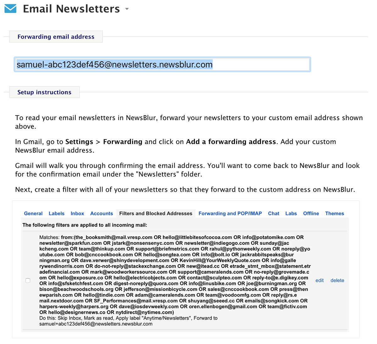
You might ask why not just subscribe your custom NewsBlur newsletter email address directly to the newsletter instead of forwarding copies of the newsletter. The answer is that if you want a single source of truth for where newsletters are going, you want that in your email client and not on NewsBlur. If you ever change news readers (and with new features like this, why would you want to) you’ll want to change only a single filter rule instead of dozens of newsletter emails.
And with this huge new feature, NewsBlur just became even better. NewsBlur has branched beyond RSS for a while now, fetching Twitter and YouTube stories even without RSS. With newsletters, NewsBlur becomes your single source.
If you have suggestions on what NewsBlur can help you read next, post an idea on the Get Satisfaction forums.
-
It’s been too long. Twitter unceremoniously knee-capped their API a few years ago and a number of solutions popped up to fix the loss. However, those stopgaps also closed and left us with no good ways to read Twitter while in NewsBlur. Until now, that is.

You can now subscribe to https://twitter.com/username to get individual Twitter accounts on NewsBlur. Put them all in a folder to recreate your tweetstream.

Not only do you get the full tweetstream for that user, but you can also filter out tweets that are replies, retweets, or contain any text in them. You can also train Twitter feeds to highlight tweets that contain photos, are retweeted or liked, or have a word you want.

YouTube also deprecated their API and NewsBlur came to the rescue with native YouTube API support. Now Twitter joins that list of native support, giving you a better Twitter experience than ever before.
And because this native Twitter support takes more work than normal RSS feeds do, this feature is only available to premium subscribers.
-
It’s like a whole new app. There’s so much to tell you about in the latest release of the NewsBlur iOS app. This is the release of all releases.
The biggest addition are the new themes. We have a total of four themes now: white, sepia, grey, and dark.
The dark theme is for when the lights are low (or off) and you want to read without disturbing anybody around you.

The grey theme gives you the best of both worlds. It’s a dark theme that gives you low light, but still bright enough to easily see.

Sepia is the paperback you carry around everywhere so you always have something to read. Preparation pays.

The iPad Pro gets full support and that means that keyboard shortcuts have been instrumented all over the app.

Maybe you’re thinking about how much the app just advanced. Maybe you’ve been waiting a long, long time for a dark theme ever since Android got it a year ago. Who knows, maybe you’re 100% on your iphone and that there’s just one or two tasks that you still need the website for.
Get ready for this. The Organizer is now on the iOS app. And this isn’t just any organizer. You can see all of your feeds, sorted in or out of their folders, ordered by number of subscribers, how often you read them, how often they publish, and even how recently they published.
Use these lists to find feeds that no longer publish or the feeds that publish too much. Move and delete whole groups of feeds at once. This organizer is the real deal. Try finding this feature anywhere else.
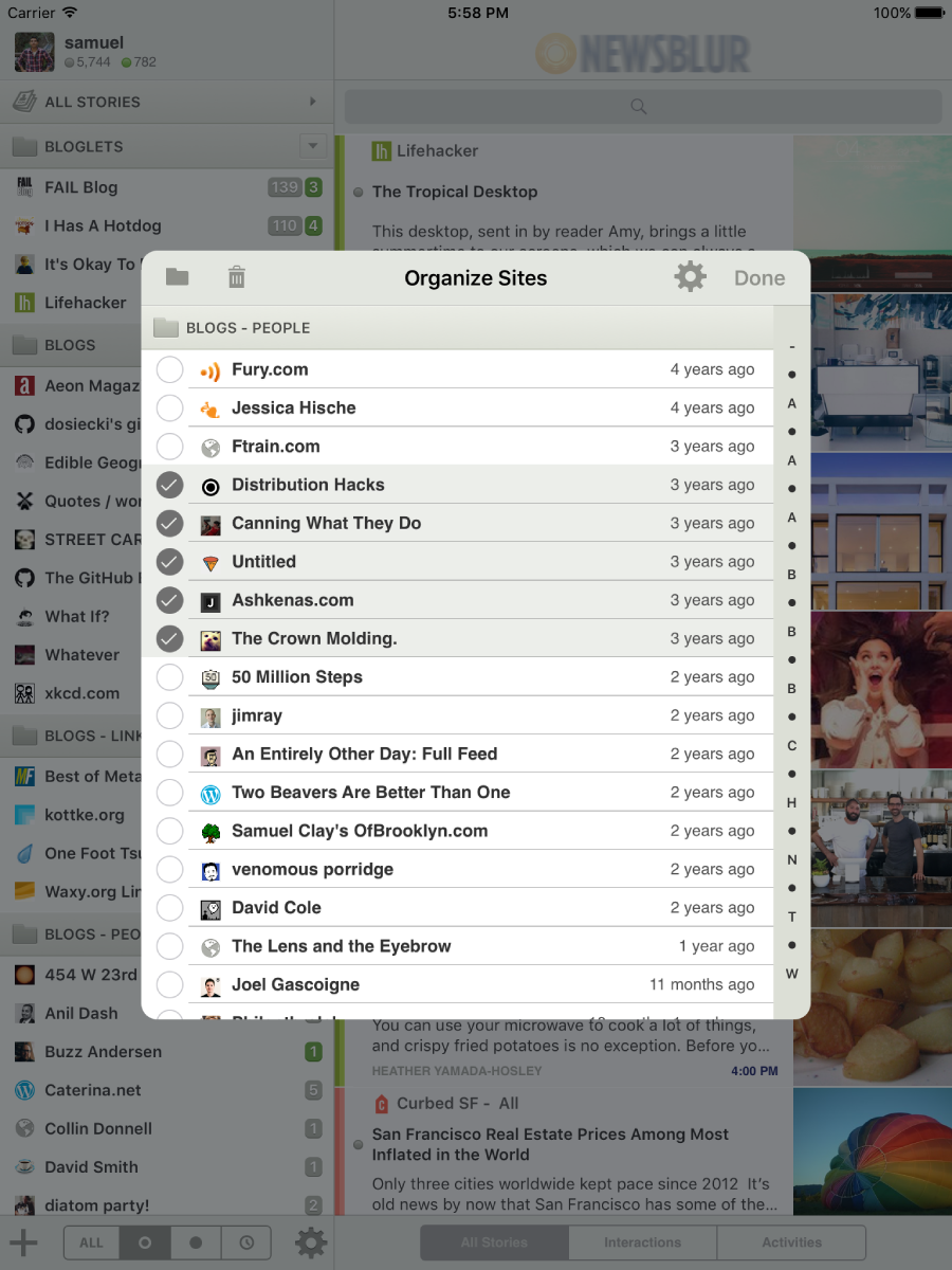
And if there’s an organizer, that means there’s a way to mute and unmute sites directly from your iPhone.

There’s plenty of other new features too:
- New icons app-wide
- New menus for deleting and muting feeds
- Custom domain support
- Mark all as read by long pressing
- Search and Subscribe improvements
And check it out, NewsBlur now has two additional developers working on the iOS app, David Sinclair and Nicholas Riley. They have worked for the last few months on making this update the biggest yet. Their mugs are now on the About page and I’m extremely pleased with their work. Nicholas built the keyboard support that iPad Pro owners will appreciate. And David gives us the new themes, new organizer, and all of the other goodies we’ve got.
This is the one to beat.
-
As performance updates go, this month’s upgrade to v4.8.0 of the NewsBlur Android app is a doozy. This one’s specifically made for those users with a heavier load of feeds.
If you have over a hundred feeds, everything will suddenly feel smooth, just like it already does for those with only a few dozen subscriptions. And if you find yourself climbing up to several hundred feeds from only a dozen, you’ll be in good company.

-
NewsBlur has been tracking story changes for a long, long time now (first mentioned on the blog five years ago in April 2011). But I felt it was time for an upgrade and today I’m pleased to launch some changes to the story tracker.
If you use a third-party client to read NewsBlur, like Reeder, ReadKit, or Unread, you may have noticed strange revision change highlighters that cross out what gets edited out by a publisher and highlights what gets added.
This is great, except you probably don’t want this turned on for every single story.
By default you will now only see the final edit of the story. And if you are on the web you will see a new Show Story Changes button in the heading of any story that has seen changes.

You can also toggle back and forth between showing and hiding story changes, so you can take a peek behind the curtains and still come back to the read the story in its final, finished form.

This should relieve the burden of having to implement a story change tracker in third-party clients when almost no other news readers have this feature. So third-party reading app makers neglected to include support, leading to a less than ideal NewsBlur reading experience. No longer!
-
The iOS app has enjoyed a feature that gives you a tiny preview of a story’s main image right in the story title. Today this feature launches on the web.
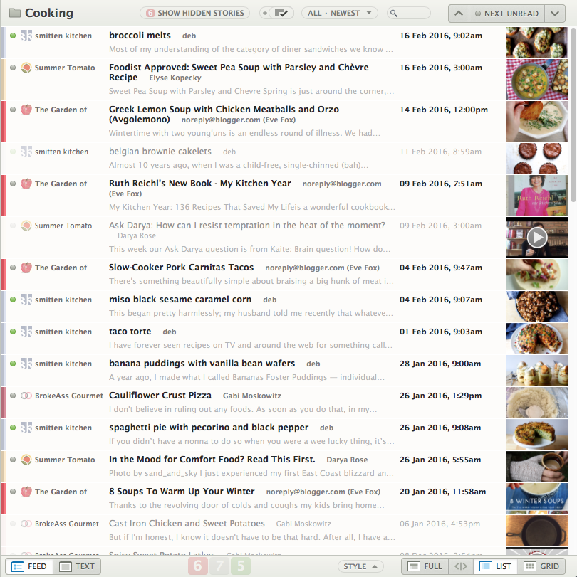
What I’ve noticed is that while I don’t use the image to identify which stories I want to read, I do use them to act as a signature of a story.
There’s precedence for this on NewsBlur. Every site already does this using the color of its favicon. NewsBlur liberally applies a two-tone color palette based on each feed’s favicon. This serves as a per-feed signature, giving context to a story when it’s in the same view as every other feed’s stories.

These story preview thumbnails serve as the same signature. Stories are best remembered through their colors and photos, so thumbnails act as a visual signature that’s easy to recognize. It works on a subconscious but perceptable level.

Of course you can turn them right off.
-
NewsBlur has an amazingly active third-party app community, thanks to the well documented NewsBlur API. Today I’d like to introduce you to two new apps built by developers on the NewsBlur API.
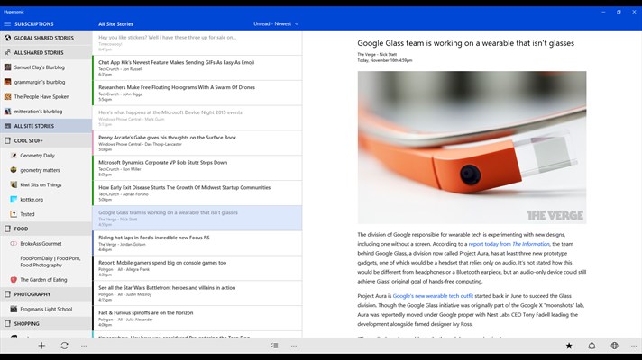
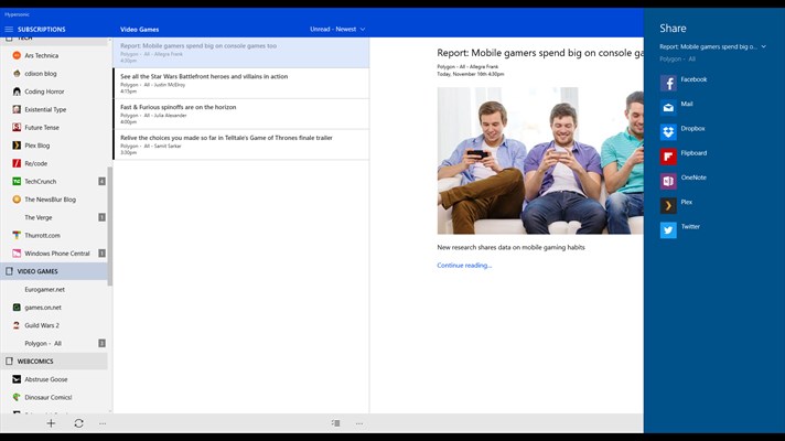
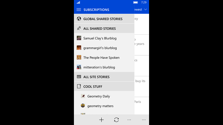
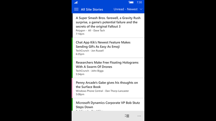
Hypersonic for Windows 10 & Windows Phone
Hypersonic is clean, simple, beautiful, and designed to run across both mobile and desktop devices.
Add My Feed for iOS
Add My Feed is an extension allowing you to effortlessly add RSS feeds to your online reader of choice.
When you encounter a site you would like to subscribe to, simply tap the Add My Feed extension and you’re done !
Add My Feed works in Safari and in any app supporting the standard iOS share sheet.
Both of these apps and many more are on the Goodies & Mobile Apps dialog. If you’ve developed an app for NewsBlur and would like to add it to Goodies (and have it blogged about here), let me know!
-
I’m not sure what else you would search for, honestly. If not vanilla pizza, then perhaps a sicilian, or montanara, a deep-dish, slices of neapolitan, whole-wheat thin-crust, or stuffed crust?

Well now you can search for pizza to your heart’s content on the NewsBlur Android app. Good luck with your tomato pie.
-
That’s why I’m pleased to introduce more advanced statistics for every single feed. The Statistics dialog now shows a heat graph of the times of day that stories are published as well as the days of the weeks.
Take a look at the NewsBlur support feed, which you can subscribe to here: http://www.newsblur.com/site/644144/get-satisfaction-for-newsblur

You can see the post-Google Reader shutdown bump starting in March 2013 and will notice that most of NewsBlur’s support happens during the week. (I like to take weekends off and work on side projects and the occasional NewsBlur feature.) But due to NewsBlur’s international audience, support comes in at all hours of the day.
And of course one of NewsBlur’s most popular publishers is Kottke.org, home of fine hypertext products. You can subscribe to kottke.org here: http://www.newsblur.com/site/39/kottke.org.

Amazingly, over the lifetime of NewsBlur’s statistics feature (which launched originally in 2010), Jason Kottke has been both prolific and regular in his postings of what’s good on the web. He sticks to a 9-5 schedule and works only on weekdays.
Anything else you’d like to see on the statistics panel? Post an idea over on NewsBlur’s Get Satisfaction support site.
-
Every NewsBlur client, from the three official clients (web, iOS, and Android) to all third-party clients, should now be showing better embeds for Twitter, Instagram, and Imgur. Just take a look at these screenshots.


And don’t forget that even YouTube gets special treatment on all three platforms. Here on the web, you can see that YouTube videos are automatically expanded to fill the screen.
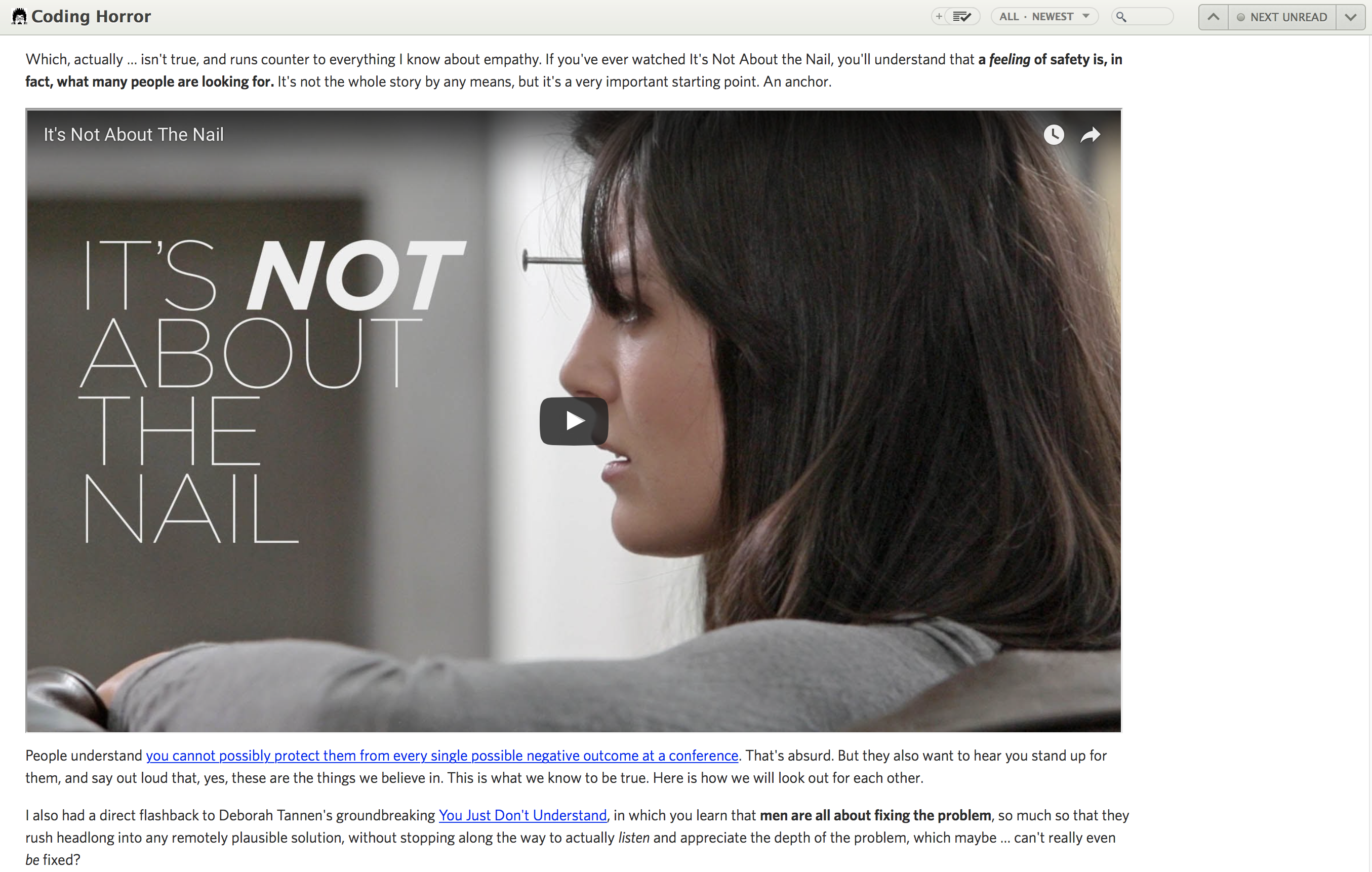
So there you go, enjoy the new embeds (also called oEmbeds, whatever that means). And if you have any suggestions for new embeds, just submit an idea to http://getsatisfaction.com/newsblur.
subscribe via RSS

